
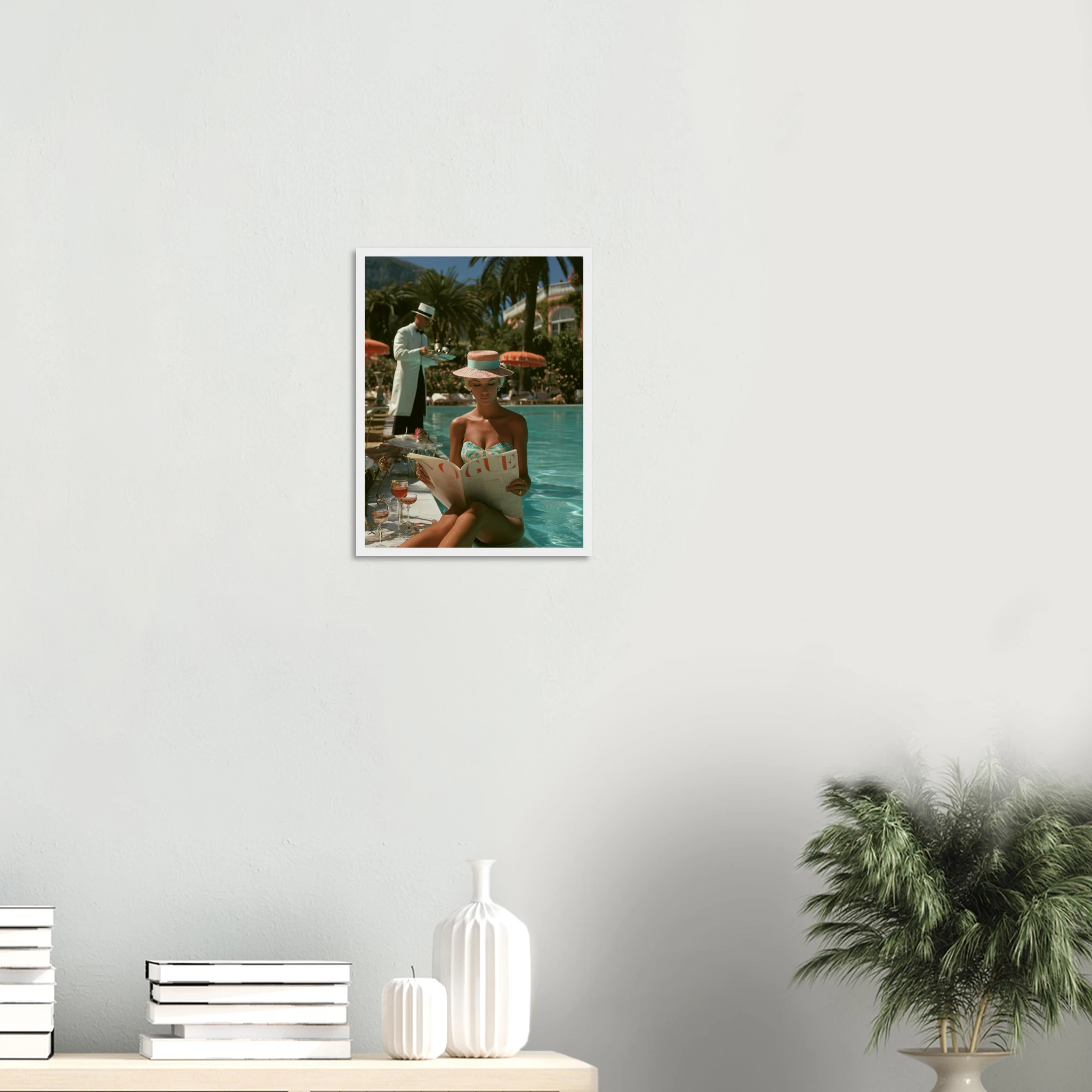
Fashion has always understood something that interior design often forgets: the image matters as much as the object. A single editorial photograph — the right composition, the right subject, the right light — can define a room’s register as precisely as any piece of furniture. Fashion wall art, done well, does exactly that.
The challenge is knowing what separates a fashion print that elevates a space from one that just fills it. Here is the difference.
Why Fashion Art Works Beyond the Fashion World
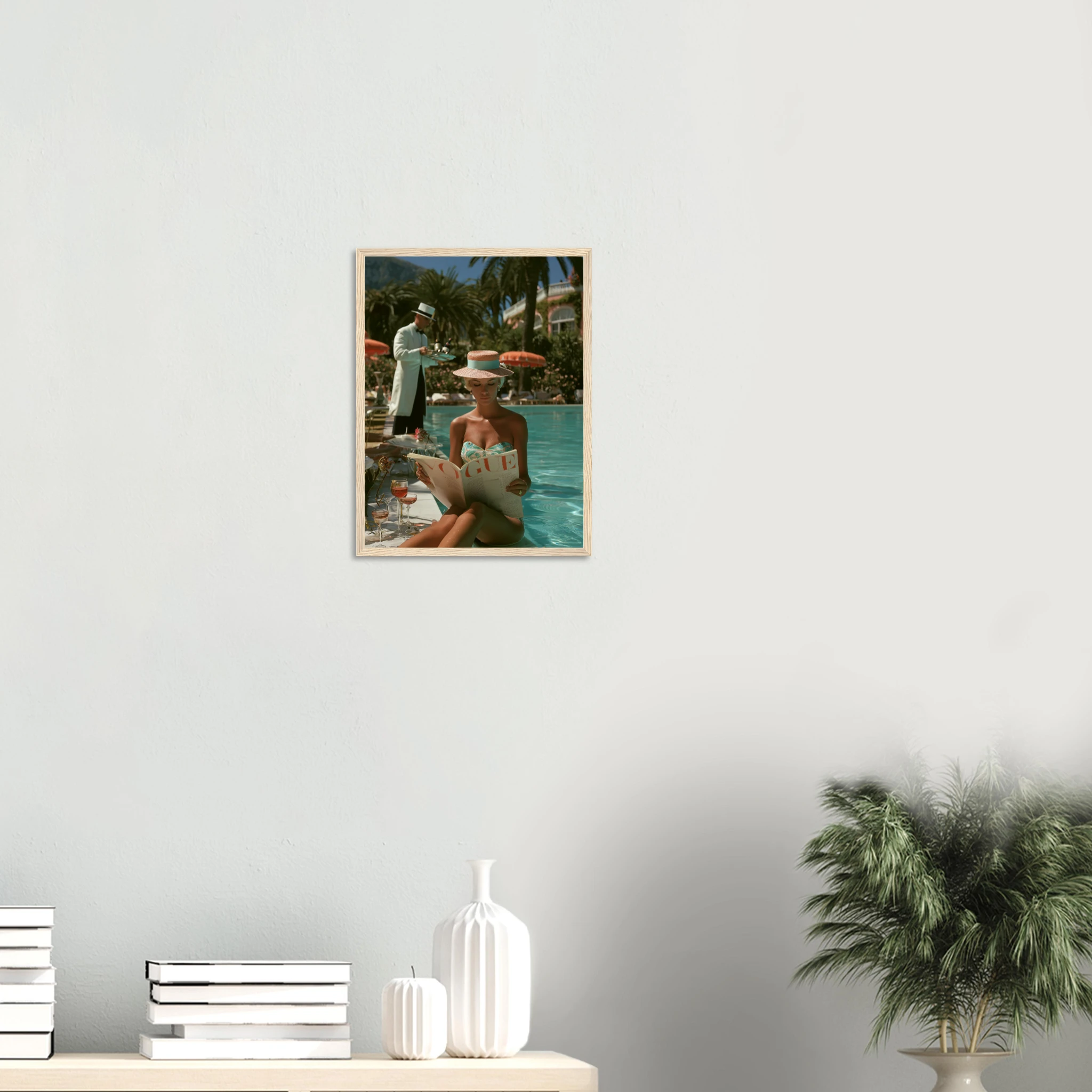
Fashion photography and illustration carry a visual grammar developed over a century — proportion, tension, negative space, light. These are the same principles that govern serious fine art. A great fashion image isn’t just a picture of a dress. It’s a study in composition that happens to use clothing as its subject.
That’s why fashion wall art works in spaces that have nothing to do with fashion. A strong editorial image in a bedroom, a living room, or a study doesn’t read as a fashion statement — it reads as confident taste. The subject matter signals culture and intentionality. The execution signals quality.
What it shouldn’t signal is aspiration borrowed from someone else’s brand. The best fashion art is image-first — it works because of what it looks like, not because of whose name is attached.
The Difference Between Fashion Art and Fashion Decoration
There is a meaningful distinction between fashion wall art and fashion decoration — and it’s worth understanding before you choose a piece.
Fashion decoration is recognisable by its references: logo-heavy prints, branded typography, images that only work if you know what they’re referencing. They read well to a specific audience and date quickly. They decorate a room without adding depth to it.
Fashion art is something else. It’s an image strong enough to hold its own without any external context — a figure in silhouette against a stark background, a close-up of fabric and light, an editorial composition that creates its own world. These pieces work in a room because they’re visually compelling, not because they reference something fashionable.
Aim for the latter. The test: does the image work if you strip out any text or branding? If yes, you have art. If no, you have decoration.
Scale and Placement: Where Fashion Prints Work Best
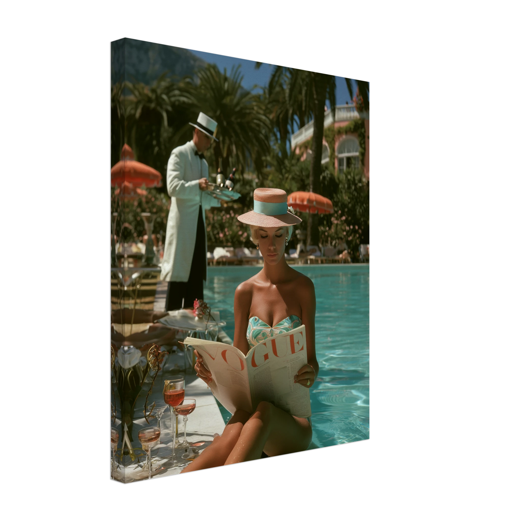
Fashion art rewards scale. A 40×50 cm fashion print tends to look like a poster. The same image at 60×90 cm or 80×120 cm reads as a deliberate choice — something hung with intention rather than filled in as an afterthought.
Prints that work here: the Fashion Lady Vogue Pool Vintage Framed Print, the Poolside Vogue Vintage Framed Print and the The Girl and the Porsche Framed Print — each available as a framed print, ready to hang. Browse the Fashion collection for more.
Placement matters equally. The most effective locations for fashion wall art are those where you need a strong singular presence — above a console, on the wall beside a full-length mirror, centred above a bed, or as a solo statement on a white wall with breathing room on all sides.
Fashion art can also anchor a gallery wall, but it works best as the dominant piece — one large fashion print surrounded by smaller, related works — rather than one of several equal-sized frames competing for attention.
Black and White vs. Colour: What Each Does
Black and white is the natural register of fashion photography, and it translates beautifully to wall art. The absence of colour strips the image to its essentials — form, contrast, texture, mood. A black and white fashion print integrates into almost any interior palette without competing. It adds sophistication without demanding attention from the room’s colour scheme.
Colour fashion art requires more careful placement — but when it’s right, the impact is immediate. A richly coloured editorial print against a neutral wall becomes the visual anchor of the room. In a space with warm terracotta or dark panelling, a colour fashion print can provide the exact counterpoint the room needs.
One reliable rule: match the temperature. Cool-toned fashion art (blues, greys, stark whites) works in contemporary, minimalist spaces. Warm-toned fashion imagery (ambers, skin tones, golden light) suits Mediterranean and warmer interiors.
Styling Fashion Wall Art by Interior
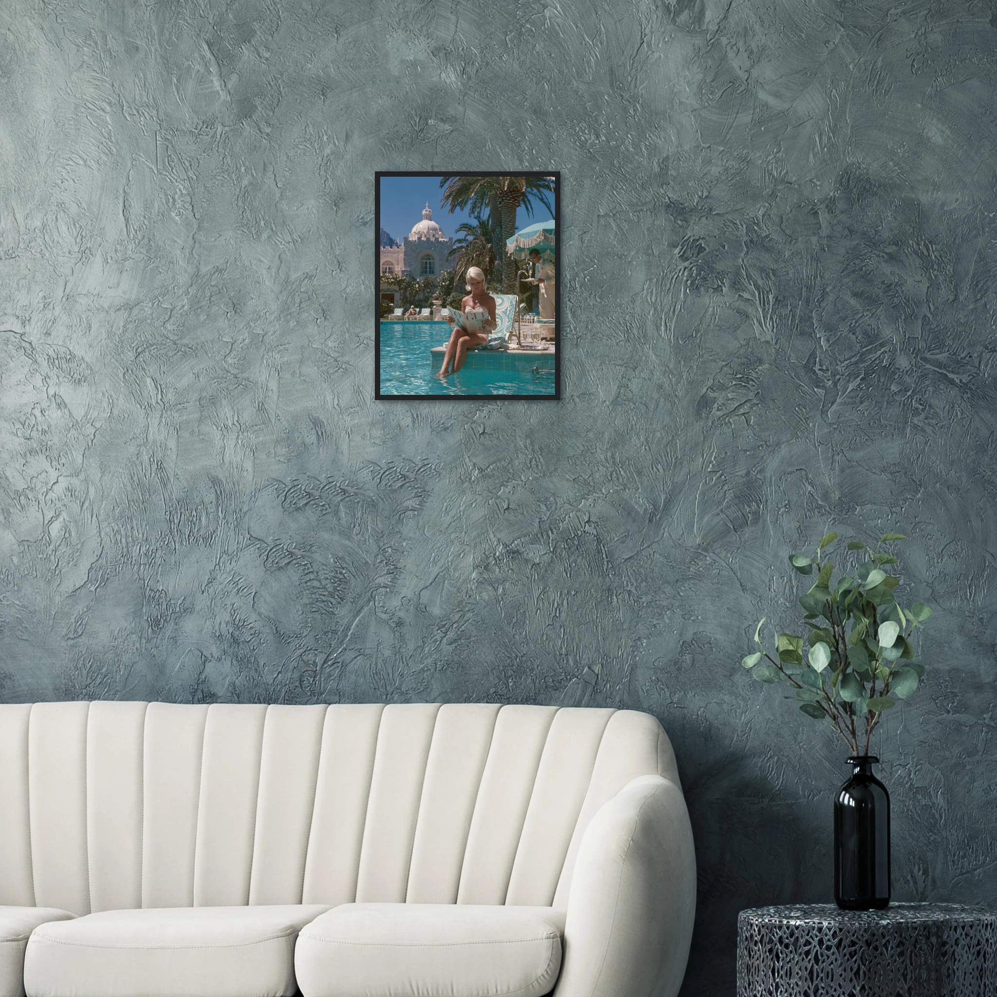
Minimalist and Scandinavian interiors: One oversized black and white fashion print, framed in black or natural wood. Let it be the only art in the room. The restraint amplifies the impact.
Mediterranean and warm-toned rooms: Fashion art with golden or amber tones — a figure in warm light, an editorial set in a sun-drenched landscape. The print extends the room’s warmth rather than interrupting it.
Dark or jewel-toned rooms: High-contrast fashion prints work best here — a stark figure against a pale background creates dramatic contrast with the deep walls. Avoid prints that are dark on dark; the composition disappears.
Dressing rooms and walk-in wardrobes: The natural home for fashion art. A single oversized editorial print — a silhouette, a close-up, a composed tableau — transforms a functional space into something more considered.
Common Mistakes (And How to Avoid Them)
Going too branded: Prints that lead with a logo or magazine masthead rather than the image itself date quickly and limit where they work. Let the image carry the weight.
Choosing too small: Fashion art at 30×40 cm tends to look like a reference rather than a statement. Go at least 50×70 cm, and consider 60×90 cm or larger for primary walls.
Clustering too many: Three fashion prints of similar scale in a gallery arrangement can work, but five or six tends to feel like a mood board rather than a curated space. Edit aggressively.
Ignoring the frame: A fashion print in a cheap frame loses half its impact. A thin black or gold frame on a strong fashion image reads as deliberate. Match the frame register to the room.
→ Explore fashion wall art at Atelier Marbella — editorial prints with a Mediterranean register, framed and ready to hang.
Read Also:
What to Put Above a Sofa: The Art of the Statement Wall
Old Money Aesthetic Wall Art: The Art of Quiet Elegance