
Kodak retired Kodachrome in 2009, and interior design has been trying to get its colour back ever since. The look is easy to recognise and hard to fake: saturated but never loud, warm in the highlights, slightly faded in the shadows, with grain you can almost feel. On a wall, it is the fastest way to make a room feel like it has a past. This guide explains what the Kodachrome aesthetic really is, why it is everywhere in 2026, and how to choose vintage photography wall art that carries it properly.
What the Kodachrome look actually is
Kodachrome was a slide film, and slide film rewards a certain kind of picture: strong light, simple composition, colours that sit next to each other without fighting. Reds went deep, blues leaned towards teal, skin stayed warm. Shadows kept a little density instead of collapsing into grey. The result is the faded-postcard quality that people now chase with filters.
What matters for a wall is that this colour is forgiving. It looks right in daylight and in lamplight, next to wood, linen or plaster. A print with the Kodachrome aesthetic is not nostalgia for its own sake. It is colour that feels lived in.
Why film colour is back on the wall
After a decade of cool white interiors, the 2026 trend reports keep pointing the same way: warmth, grain, the 1970s and a kind of Mediterranean optimism. People want rooms that look inhabited rather than staged. Film colour does that without a single piece of vintage furniture. It is the same instinct behind the Slim Aarons style and the Wes Anderson palette that we have written about before: a world that looks slightly better than real life, but never fake.
The palette: ochre, faded teal and a pink that never quite goes red
Look for ochre, terracotta, faded teal, blush pink and bone white. These are the colours of a Kodachrome summer, and they sit naturally with oak, linen, plaster and brass, the materials already found in most Mediterranean homes. If your walls are warm white or greige, almost any film-look print will work. On darker walls, choose the ones with the most pink and ochre: they glow instead of disappearing.
Four prints that carry the Kodachrome look
Not every vintage-looking image has the right colour. These four do, and each one is a Mediterranean Mood artwork you can order framed and ready to hang.
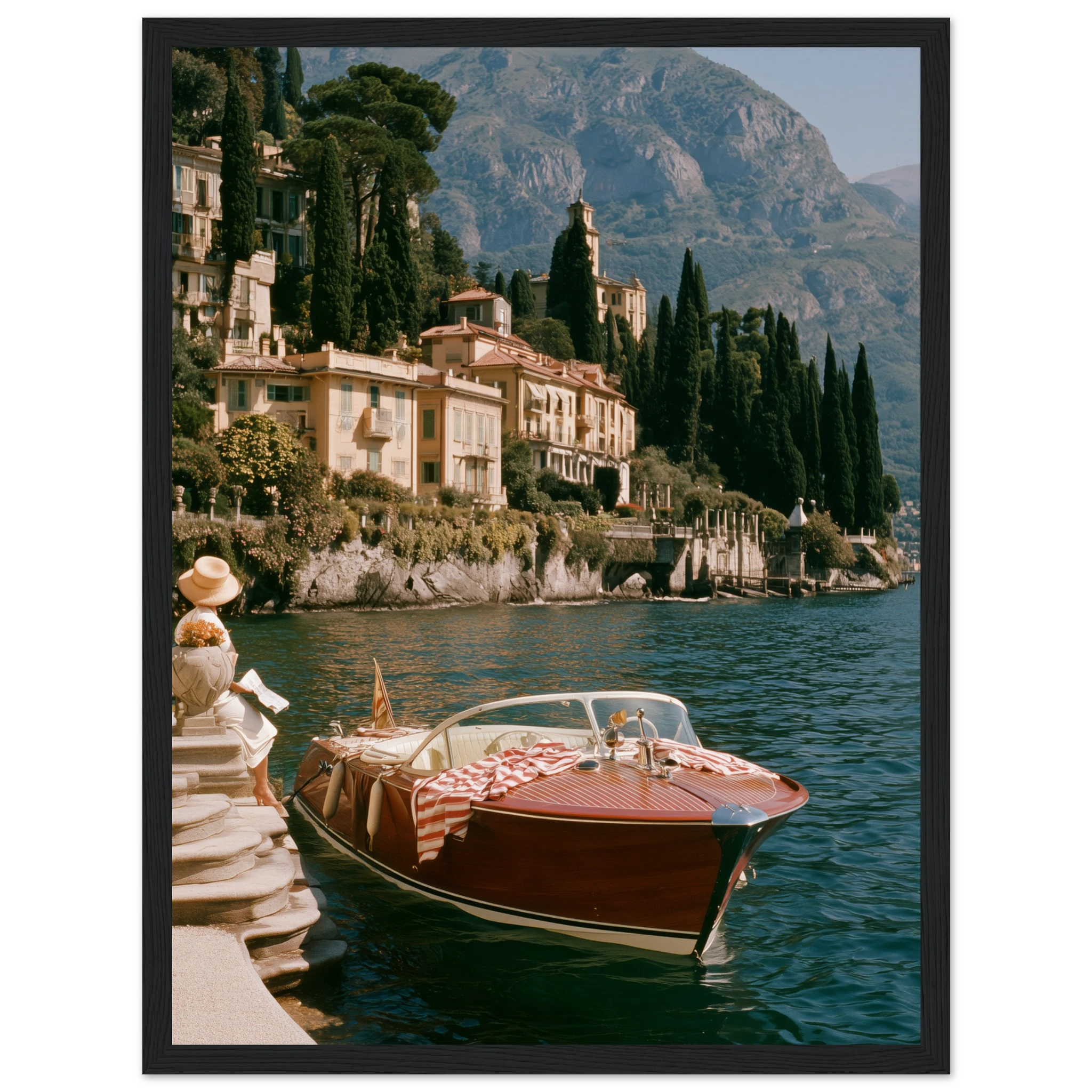
Riva Boat, Bellagio. A vintage wooden Riva moored at a stone jetty, striped towels drying on the deck, pastel ochre villas rising behind. It is shot the way Kodachrome saw Lake Como in the 1960s, warm and slightly faded.
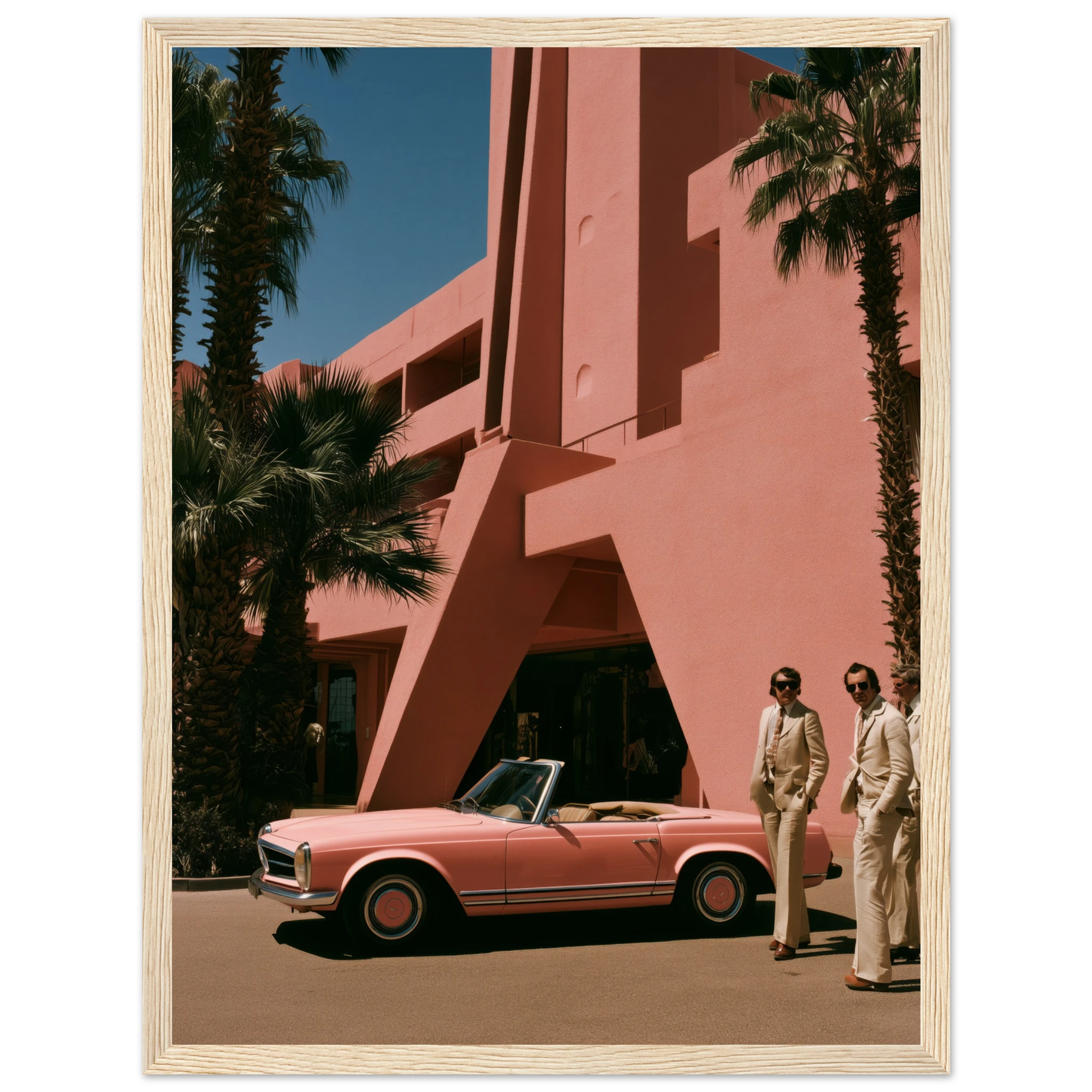
Pink Pagoda, Palm Springs. A pink Mercedes-Benz Pagoda parked in the desert sun outside a blush-pink hotel. It reads like a 1970s editorial, with hard shadows and colours turned up just enough.
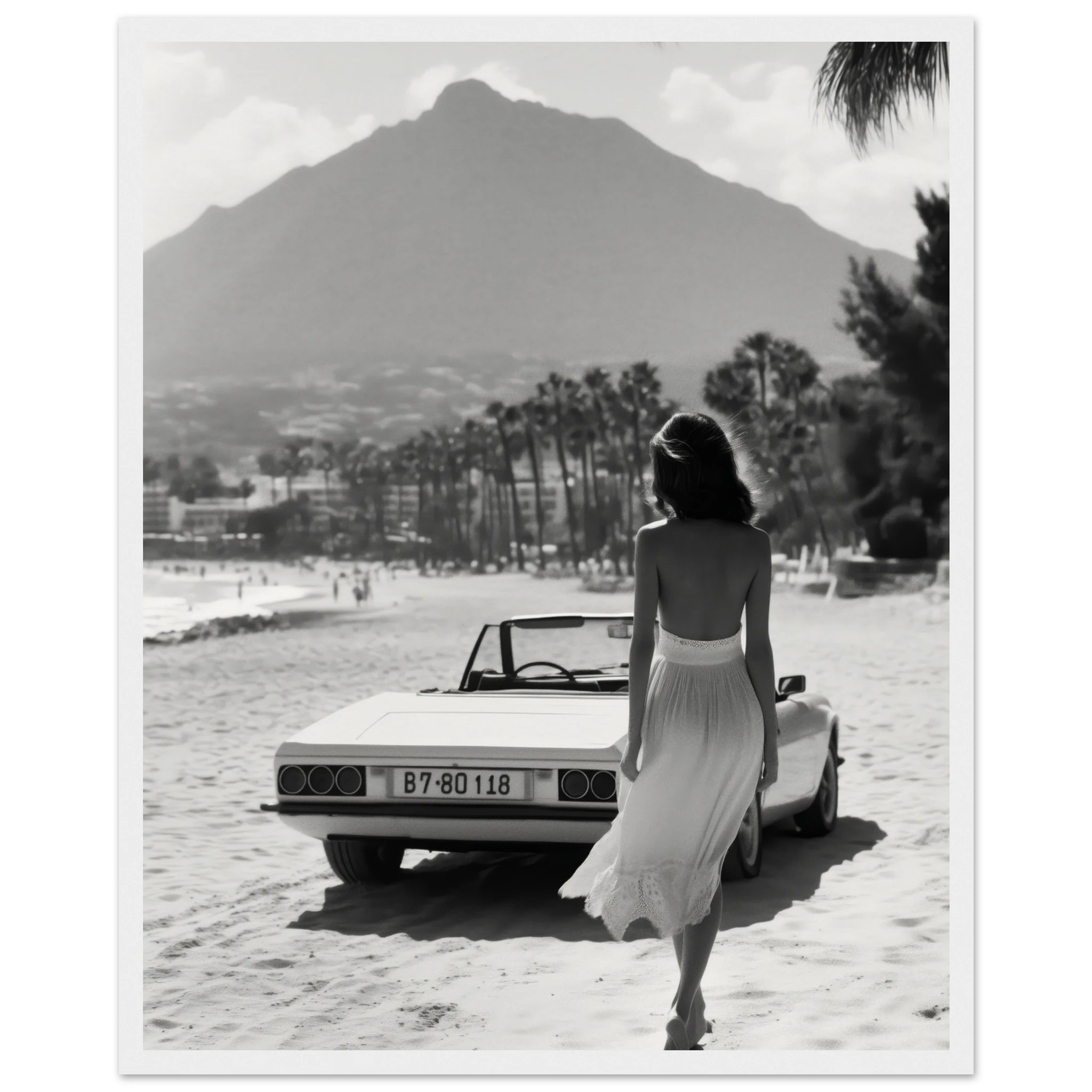
La Concha, Marbella 1970s. A woman in a backless dress, barefoot on the sand, a white convertible parked on the beach and La Concha mountain behind the palms. Cinematic grain, 1970s light, and a very local subject.
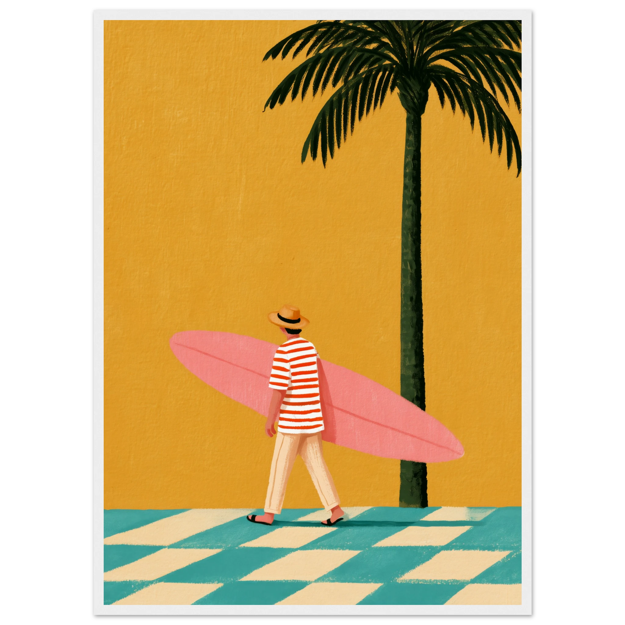
Pink Surfboard, The Surfer in Stripes. Sunny, retro beach-town calm in a single pink board and a striped towel. It is the lightest of the four, and the easiest one to place in a bedroom or hallway.
All four are framed prints in a solid wood frame, from 89.90 EUR.
How to tell a real film look from a filter
A filter usually flattens everything into one orange tint. Real film colour keeps its contrasts: the sky stays blue while the walls turn gold, and the shadows still have a faint cool edge. Check three things before you buy. First, the highlights should be warm but not yellow. Second, the darkest areas should keep some colour rather than turning grey or brown. Third, the grain should feel soft and even, not like noise added on top. If a print passes those three tests, it will still look good in ten years, long after the filter trend has moved on.
How to hang vintage photography wall art
Hang the centre of the print at about 145 cm from the floor, which is roughly eye level, and let the furniture below decide the width. Choose warm light: a 2700K bulb keeps the ochres and pinks alive, while cold white light turns them flat. Avoid direct midday sun on the print, since film colour looks best in soft light anyway. For the frame, black gives a graphic edge and natural wood a softer one; our black frame vs wood frame guide explains which suits which wall.
Mixing film-look prints without building a museum
Keep one colour story per wall. Three prints that share a warm tone, say ochre, pink and teal, will look curated even if the subjects have nothing in common. Mix one large print with two smaller ones, and leave a gap of 5 to 8 cm between frames. If you want a bigger composition, our gallery wall ideas show how to scale this up without losing the calm.
Frequently asked questions
What is the Kodachrome aesthetic?
It is the colour look of Kodachrome slide film: deep reds, teal-leaning blues, warm highlights, slightly faded shadows and visible grain. In art prints it means saturated but gentle colour that feels like an old holiday photograph.
Does vintage photography wall art have to be black and white?
No. Colour film shaped much of the vintage look people love today. Warm film colour often feels more current than black and white, and it is easier to match with a modern interior palette.
Which colours go with Kodachrome-style prints?
Warm neutrals work best: bone white, greige, oatmeal, terracotta and natural oak. Add one accent of faded teal or blush pink from the print itself, and the room will feel connected to the artwork.
What frame suits vintage photography wall art?
A solid wood frame, either black or natural, is the safest choice. Black sharpens the colour and suits white walls, while natural wood softens it and suits plaster or beige walls.
Read also
Slim Aarons Style Prints: How to Get the Look
Wes Anderson Aesthetic Wall Art
Italian Summer Aesthetic: Wall Art for the Riviera State of Mind