
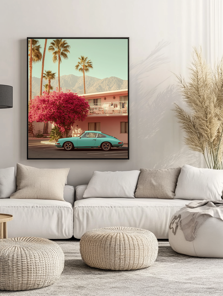
The home office has become one of the most photographed rooms in any house — and one of the least considered when it comes to art. Most people spend more time in their workspace than in their living room, yet the walls stay bare or get whatever was left over after the rest of the house was decorated.
Office wall art isn’t a finishing touch. In a space where you spend hours every day, the visual environment has a measurable effect on focus, creativity and mood. This guide covers what works in a workspace, what doesn’t, and how to make a choice that improves the room rather than just filling a wall.
Why Art in a Workspace Actually Matters
The research on this is consistent: people work better in environments that have been thought about. Not necessarily complex or busy environments — in fact, cluttered visual environments tend to reduce focus — but environments where some deliberate attention has been paid to what is on the walls, how the light falls, what the space communicates.
A workspace with no art is a functional space. It does the job. But the best home offices are environments you want to be in, not just places you have to be. Art is a significant part of what creates that difference — not because it’s decorative, but because it gives the room a quality it otherwise lacks: a sense of intention.
There’s also a practical dimension for anyone who takes video calls. What’s behind you matters. A thoughtful piece of art — a botanical print, a Mediterranean landscape, an abstract — signals taste and attention to environment in a way that a bare wall or a shelf of random books doesn’t.
What Actually Works in a Home Office

The workspace has specific requirements that are different from other rooms. The art needs to work as a background — something that supports concentration rather than demanding it.
Avoid overly complex or narrative-heavy pieces. Art that demands interpretation — busy compositions, multiple subjects, highly emotional content — competes with your cognitive bandwidth. In a bedroom or living room, this kind of engagement is welcome. In a workspace, it’s a distraction.
Prefer calm compositions. The best workspace art is present without being insistent. A landscape that draws the eye to a point of rest. An abstract that introduces colour without drama. A botanical that brings something organic and quiet into a typically technological space. These work as visual breaks — somewhere for the eye to land when it needs to pause — rather than as focal points competing for attention.
Scale to the wall, not the desk. Office art is usually hung on the wall behind the desk or directly in sightline from the seated position. At the typical viewing distance in a home office — two to three metres — you need a print large enough to hold the wall. 50×70cm is often a minimum; 70×100cm is frequently more appropriate.
The Best Art Styles for a Home Office
Abstract Colour Fields
Horizontal colour field abstracts — soft gradients, muted palette, minimal compositional incident — are the most effective category for workspace art. They introduce colour and atmosphere without demanding attention. In a Mediterranean palette (terracotta, sage, dusty cobalt), they bring warmth to what is typically a cool, functional environment.
Prints that work here: the Porsche 911 Classic and WW2 Planes Wall Art Framed Print, the Ancient Olive Tree Framed Print and the Lamborghini Countach Framed Print — each available as a framed print, ready to hang. Browse the Cars collection for more.
These are also the most camera-friendly choice for video calls — enough visual interest to read well on camera, calm enough not to distract from the conversation.
Landscape and Architectural Photography
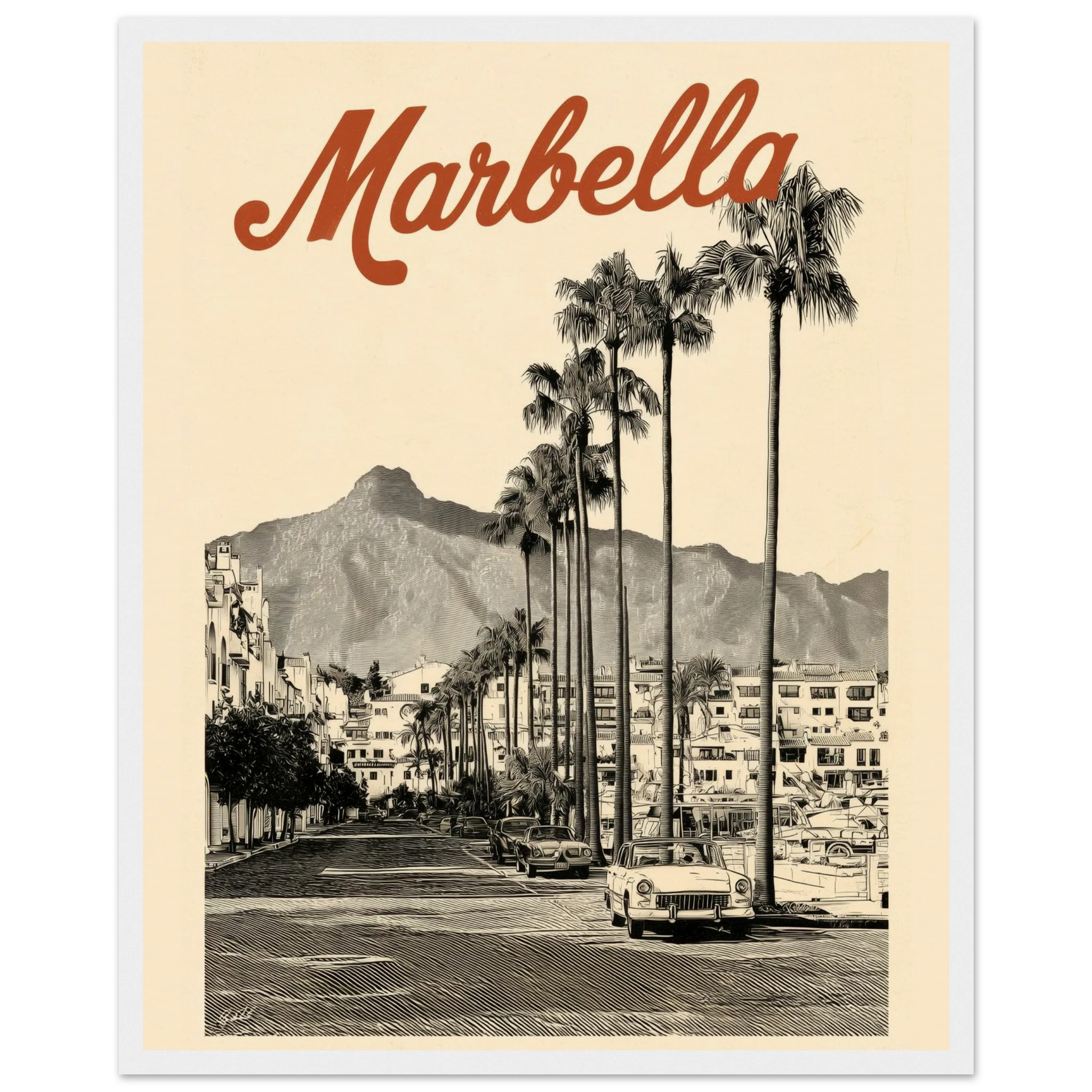
A landscape print in a workspace functions as a visual horizon — somewhere the eye can travel when it needs rest from the screen. The most effective choices are images with genuine depth: a coastal view, a Mediterranean hillside, an architectural detail with strong perspective. The sense of distance is the functional property.
Aerial photography — a Mediterranean beach club from above, a Mykonos village from a drone — works particularly well in home offices because the elevated perspective creates a sense of scale that counters the often confined feeling of a dedicated workspace.
Botanical Prints
There’s consistent evidence that exposure to natural imagery — plants, landscapes, organic forms — reduces stress and improves focus in working environments. Botanical prints bring this quality into a workspace without requiring you to maintain actual plants. A well-composed botanical study in muted greens, terracotta and cream is a reliable choice for any home office aesthetic.
Motivational Architecture
A strong architectural print — a Bauhaus building, a modernist interior, a Mediterranean courtyard — brings a quality of aspiration that suits a workspace without becoming a motivational poster cliché. The difference is in the execution: an architectural photograph with genuine compositional quality is art; a typography-over-landscape print with an inspirational quote is not.
Placement and Scale
Behind the desk (video call wall). The most considered placement in a home office. The print is in your direct sightline and in the background of every video call. Choose something with a clear, calm composition that reads well at camera distance — typically two to three metres. Avoid very busy prints that become visual noise at this distance.
Opposite the desk (focal point). A print placed on the wall you face while seated gives you a visual destination — somewhere to look when you’re thinking. This placement suits something with more compositional depth: a landscape with distance, an architectural print with perspective. The eye needs somewhere to travel.
Side wall (peripheral). A side wall print is visible in your peripheral vision but doesn’t demand attention. This is an excellent placement for something more expressive or colourful — it contributes to the atmosphere of the room without competing with whatever you’re working on.
Browse our office wall art collection — calm, considered prints designed to improve your workspace without distracting from your work.
Colour and Productivity
Colour psychology in workspaces is well-documented, though often oversimplified. A few principles that hold up in residential office contexts:
Blue tones are associated with focus and calm. A print with cobalt, dusty blue or slate as its dominant colour suits workspaces where sustained concentration is the primary requirement.
Green tones — sage, olive, forest green — are associated with reduced eye strain and a sense of natural calm. They work particularly well in workspaces that are otherwise very neutral or white.
Warm neutrals — terracotta, ochre, warm sand — bring warmth to functional spaces without stimulating energy in the way that brighter colours do. The Mediterranean palette falls here, and it’s consistently effective in home office contexts.
Avoid very high-saturation colour in primary workspace positions. A bright red or electric yellow print behind your desk introduces visual tension that accumulates over a working day. These colours work better in peripheral positions where they contribute energy without demanding attention.
The Atelier Marbella Approach to Workspace Art
The prints that consistently work best in home offices from the Atelier Marbella collection are the ones where the subject creates distance: aerial views of Mediterranean coastlines, colour field abstracts with horizontal emphasis, botanical studies that bring something organic into a digital environment.
These are pieces that work while you work — that sit in the background of your day and make it better without asking anything of you. Which is exactly what workspace art should do.
FAQ
What art is best for a home office?
Calm, considered pieces that support concentration rather than compete with it. Abstract colour fields, landscape photography with depth, and botanical prints are the most effective categories. Avoid overly complex or emotionally demanding compositions in positions you’ll look at all day.
What size art should I put in my office?
For the wall behind or opposite your desk, 50×70cm is a minimum; 70×100cm is more effective at typical office viewing distances. A print that’s too small will disappear on the wall and fail to have any impact on the room.
What colour art is best for productivity?
Blue and green tones are most associated with focus and reduced eye strain. Warm neutrals (terracotta, sage, ochre) bring warmth without stimulating energy. Avoid highly saturated colours in primary sightline positions — they create visual tension that accumulates over a working day.
What should I put on my office wall for video calls?
A single, calm print with a clear composition reads best on camera. A botanical study, a landscape print, or a soft abstract in warm neutrals signals taste and attention to environment without being distracting. Avoid very busy or colourful prints that compete with you visually on screen.
How many prints should I put in a home office?
Usually one or two, placed deliberately. A single strong piece behind or opposite the desk is more effective than multiple smaller prints competing for attention. If you add a second piece, put it on a side wall where it contributes to atmosphere without being in your direct sightline.