
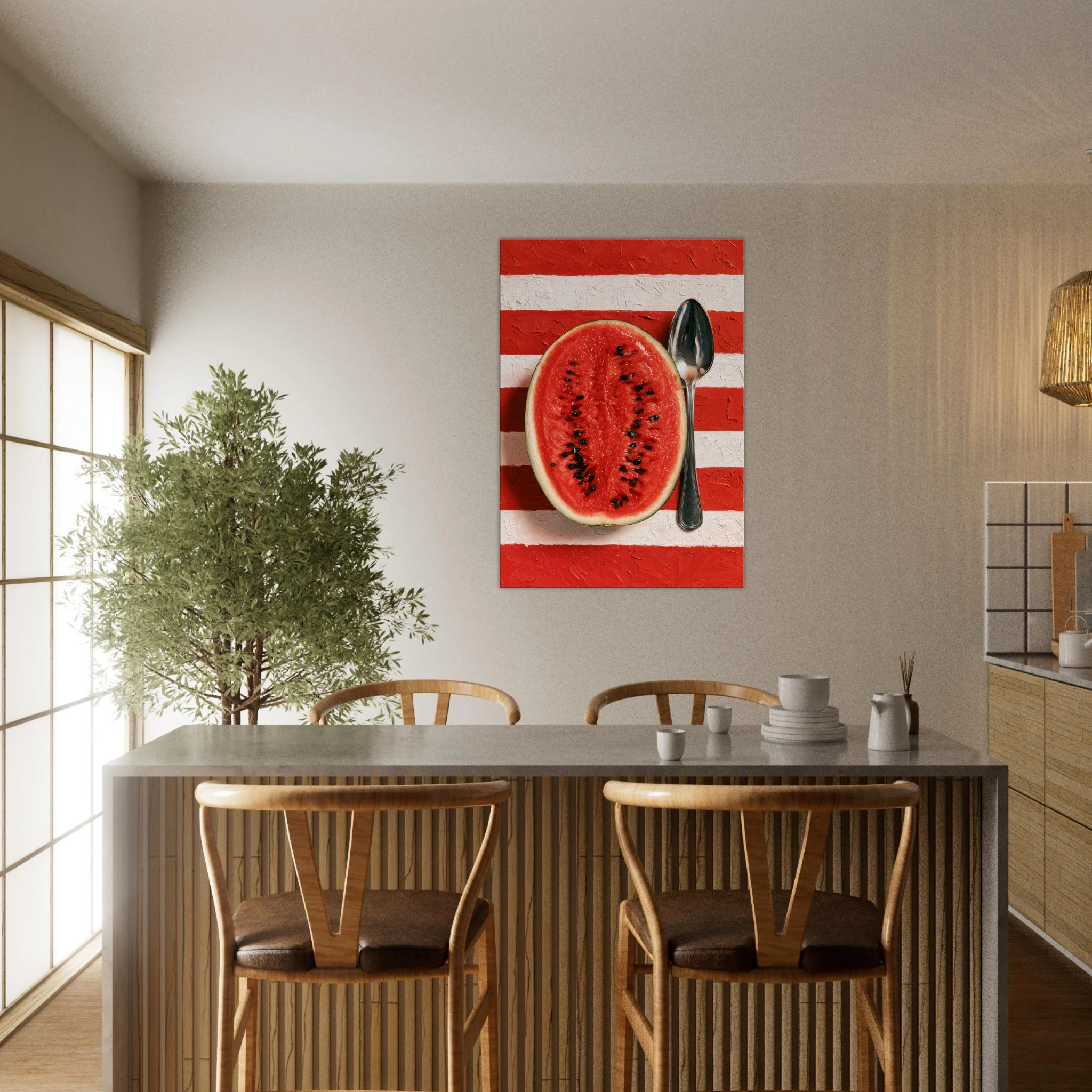
Kitchen still life wall art is one of the most underrated categories in interior design. Mention food art and most people picture faded prints of garlic braids or a rooster. That’s not what we’re talking about. The still life tradition — from Chardin to contemporary painting — has always been about more than subject matter. It’s about light, composition, and the pleasure of looking. The kitchen, of all rooms, is where that kind of looking happens most naturally.
This guide covers what makes a kitchen still life work, how to place it, and why the best kitchen art isn’t decorative — it’s a statement.
The Still Life Tradition: A Short Argument for Food Art
The still life is one of the oldest genres in Western painting. Dutch Golden Age masters made entire careers from bowls of fruit, dead game, and half-peeled lemons catching the light. The genre fell out of fashion for a century, then came back — because it never really answered to fashion. A well-composed still life is about proximity, texture, and the poetry of ordinary objects. A halved watermelon, a silver spoon, a cluster of heirloom tomatoes on a warm terracotta ground — these are not small subjects. They’re invitations to slow down.
The kitchen is the one room in the house where people actually move slowly. They prepare, they wait, they taste. It’s where art can breathe — and where a still life finds its most natural context.
What Makes a Kitchen Still Life Work
Not all food art works in a kitchen. The quality of the image matters far more than the subject. Three criteria separate art that elevates a kitchen from art that merely decorates it:
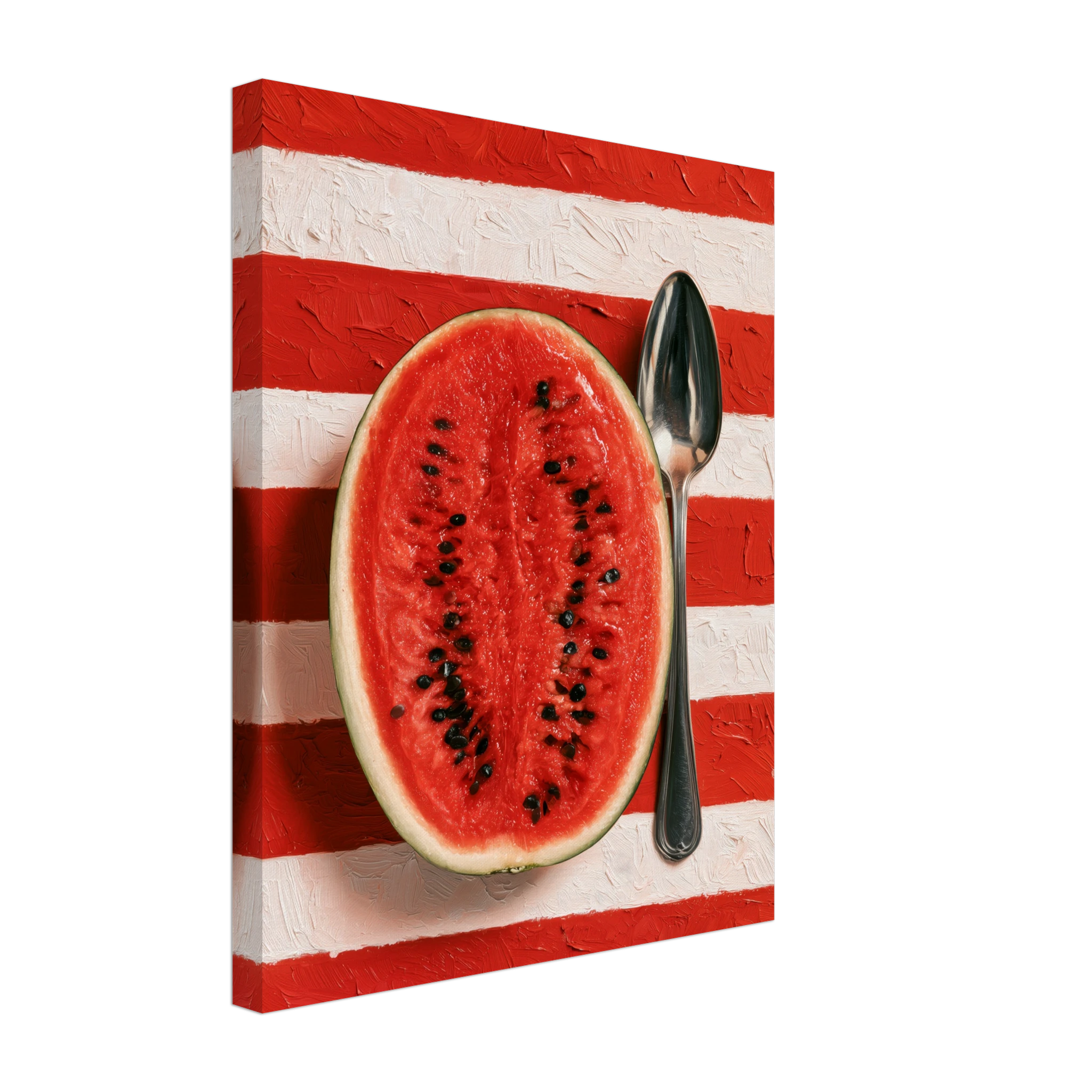
Colour confidence. The best kitchen still lifes aren’t subtle. Lemons on a blue linen cloth. Tomatoes against cream. A watermelon — intensely red — on bold impasto stripes. The kitchen holds strong colour because it’s already a space of contrasts: light and shadow, heat and cool, movement and stillness. A still life that hedges on colour disappears.
Painterly texture. The physicality of the medium matters. A still life with visible brushwork — impasto, palette knife, the evidence of hand — brings warmth that photography rarely achieves. In a kitchen where surfaces tend toward the hard and reflective (tile, steel, stone), that warmth is counterbalance, not decoration.
A clear point of view. The weakest kitchen art tries to be generic. The strongest has a specific perspective — a chosen light source, a deliberate crop, a background that reads as a decision rather than an afterthought. The viewer should feel that someone looked carefully at this subject before committing it to canvas.
Placement: Where to Hang Kitchen Still Life Art
Kitchens present specific placement challenges: limited wall space, competition with cabinets and appliances, exposure to steam and heat. These are all solvable.
Above the dining table. If the kitchen has an eat-in area or opens to a dining space, the wall at the head of the table is the strongest placement for a statement still life. The print should be wide enough to register across the table — 70×100cm minimum, ideally wider. See our full dining room wall art guide for specific sizing.
The wall above the counter. If there’s a stretch of wall above the worktop — between cabinets, or on an end wall — a single portrait-format still life at 50×70cm or 70×100cm is the correct call. Avoid hanging art directly above the hob: steam and heat will damage even a framed print over time.
As part of a gallery arrangement. Three smaller prints in a horizontal line — 40×50cm or 30×40cm each — work well above a long counter or shelf. A botanical study of tomatoes, a still life of lemons, a third with a more abstract subject: thematic collection without visual weight. See our gallery wall ideas guide for arrangement principles.
Format choice. For kitchens, framed prints are often the better choice over unframed matte — the frame protects the paper from moisture. Canvas is also resilient. Unframed matte works in open-plan kitchens that don’t accumulate steam. Read our matte vs canvas guide for a full comparison.
Three Still Lifes Worth Considering
Watermelon & Silver Spoon is the boldest piece in the collection — a halved watermelon against broad red and white impasto stripes, a vintage silver spoon beside it. The composition is graphic and immediate. Up close, the brushwork in the background is physical and tactile. From across the room, it reads as pure colour and geometry.
Lemons on Marin — Mediterranean Still Life takes a quieter approach. Lemons on a blue cloth, light falling from one side, the shadows doing the compositional work. A Côte d’Azur still life — luminous, unhurried, very specifically Mediterranean. Works in kitchens where the palette runs to blue, white and warm wood.
Heirloom Tomatoes — Botanical Study is the most precise of the three. Specimens arranged and painted with the care of scientific illustration, but on a warm terracotta ground that makes it anything but clinical. Works on its own or as part of a kitchen gallery arrangement.
FAQ
Is food art appropriate for a kitchen?
Yes — but execution matters more than subject. A well-composed still life is no less sophisticated than abstract or landscape art. The still life tradition has been central to fine art for four centuries. The problem with most kitchen art isn’t the subject — it’s the quality.
What size print works best in a kitchen?
For a standalone statement piece, 70×100cm is the minimum in most kitchens. For smaller spaces or above a counter between cabinets, 50×70cm works well. For a gallery arrangement, 30×40cm or 40×50cm per print. See our full art print size guide for room-by-room measurements.
Canvas or framed print for a kitchen?
Either works. Framed prints offer more protection from moisture — recommended for kitchens with significant steam. Canvas is durable and requires no framing. Unframed matte prints are best for open-plan kitchens that don’t accumulate steam.
Should kitchen art match the kitchen colours?
Relate, not match. A still life should pick up at least one colour present in the kitchen while introducing contrast. Art that blends in completely adds nothing. Some tension between the print and the room is usually correct.
Read Also
- Dining Room Wall Art: The Wall That Guests Remember
- Art Print Sizes: How to Choose the Right Format for Your Wall
- Matte vs Canvas Print: Which Finish Is Right for Your Wall?
- Gallery Wall Ideas 2026: Beyond the Basic Grid
Read also: Lemon Wall Art for the Kitchen: Citrus Prints with a Mediterranean Pulse