
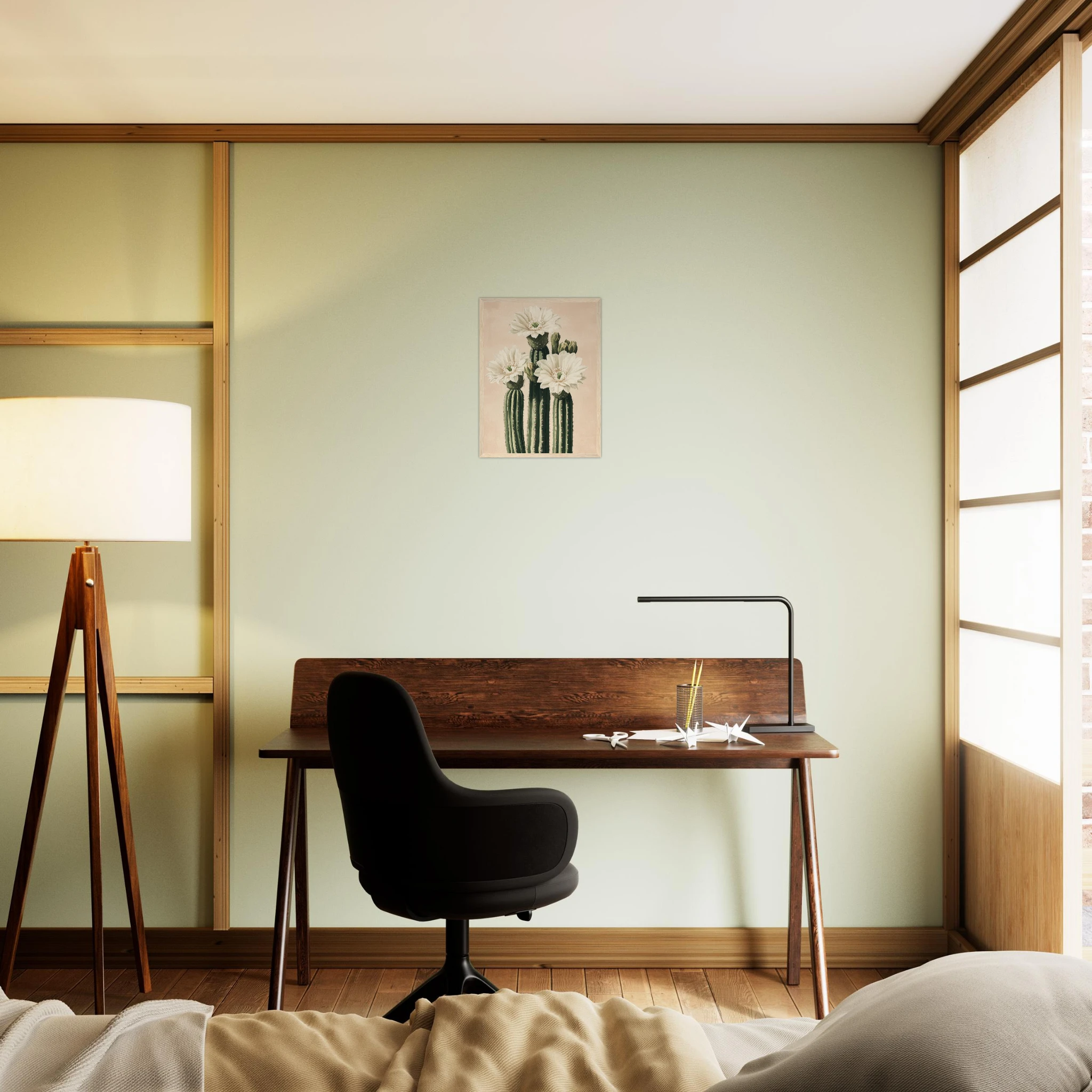
Above the bed wall art is the single most impactful decorating decision you can make in a bedroom. It sets the tone for the entire room — the colour palette, the mood, the story the space tells. Get it right and the bedroom feels intentional. Get it wrong and nothing else saves it.
This guide covers everything: the right size, the right style, how high to hang it, and what actually works in a real bedroom (as opposed to a staged one). Plus a curated selection of prints worth considering.
Why the Wall Above the Bed Is the Most Important Surface in the Room
The wall above the headboard is eye-level when you walk in, the first thing you see when you wake up, and the backdrop for every photo taken in the room. Interior designers call it the focal point — and for good reason. Every other element in the room (bedding, lamps, furniture) reads in relation to it.
That’s why leaving it bare rarely works. An empty wall above the bed doesn’t feel minimal — it feels unfinished. And why throwing something up “just to fill the space” almost always disappoints. The art above the bed deserves real thought.
The good news: the constraints here are actually helpful. Unlike a living room wall, the space above the bed has a clear brief — calming, personal, beautiful. That narrows the field considerably.
The Size Rule Nobody Tells You About
The most common mistake with above-the-bed art is going too small. A print that looks perfectly sized on the floor looks lost once it’s on the wall, floating above a queen or king bed.
The rule of thumb used by most interior designers: the art (or arrangement of art) should span roughly two thirds of the width of the headboard or bed. For a standard double bed (135cm wide), that means a print of around 90cm across. For a king (150–180cm), you’re looking at 100–120cm minimum.
If you’re going with a single large framed print, a 70×100cm or 60×80cm format almost always reads better than something smaller above a full-size bed. If that feels too bold, a diptych — two prints of equal size, hung with a small gap — gives you the visual weight without committing to one large piece.
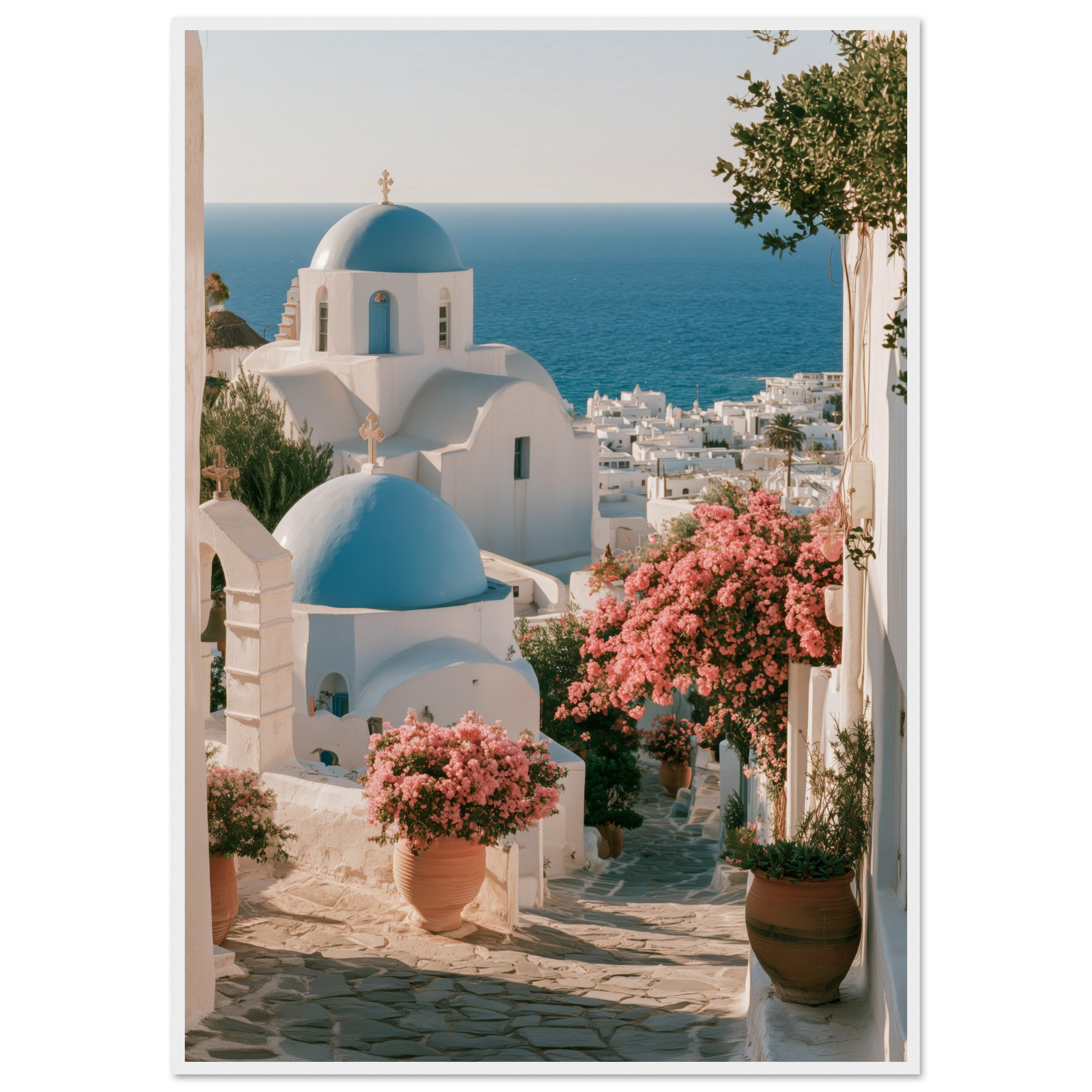
The Aegean Blue Domes Framed Print is a strong above-the-bed choice — the deep Mediterranean blue reads calming and grounded, and the architectural subject gives it weight without feeling busy.
Which Styles Work Best Above a Bed
Not every style of art works equally well in a sleep space. The bedroom is where you rest, recover, and start the day — so the art you choose should serve that function, not undermine it.
What works well:
Landscapes and seascapes — A view (even an imagined one) is consistently cited as one of the most restful subjects for a bedroom. Mediterranean coastlines, open skies, calm water — these create a sense of space that makes a room feel larger and more serene.
Botanicals and nature — Plants, flowers, and nature-based subjects bring organic calm to a bedroom. A well-executed botanical print — not overly busy, not overly minimal — sits quietly and never overstays its welcome.
Architectural subjects — Courtyards, doorways, arches. These have structure without aggression, and the geometry gives the eye somewhere to rest. Moorish, Mediterranean or classical styles work especially well in this context.
What to be careful with: High-contrast abstract prints, very dark subjects, or imagery with visual tension (dynamic car shots, for example) can feel energising in the wrong way for a sleep space. Not a rule — but worth considering.
Single Large Print or Gallery Wall — How to Choose
Both approaches work, but they create different effects.
A single large print is the cleaner, bolder choice. It makes a clear statement, is easier to hang, and tends to read as more intentional. This is the approach to take if you want the bedroom to feel considered and calm — which is usually the goal. The bigger the print, the more confident and resolved the room looks.
A gallery wall above the bed works when the arrangement is disciplined — not a random mix of frames and sizes, but a structured grid or a tight horizontal row. The risk of a gallery wall above the bed is that it reads as busy when you want the opposite. If you go this route, keep the frames matching and the palette tight.
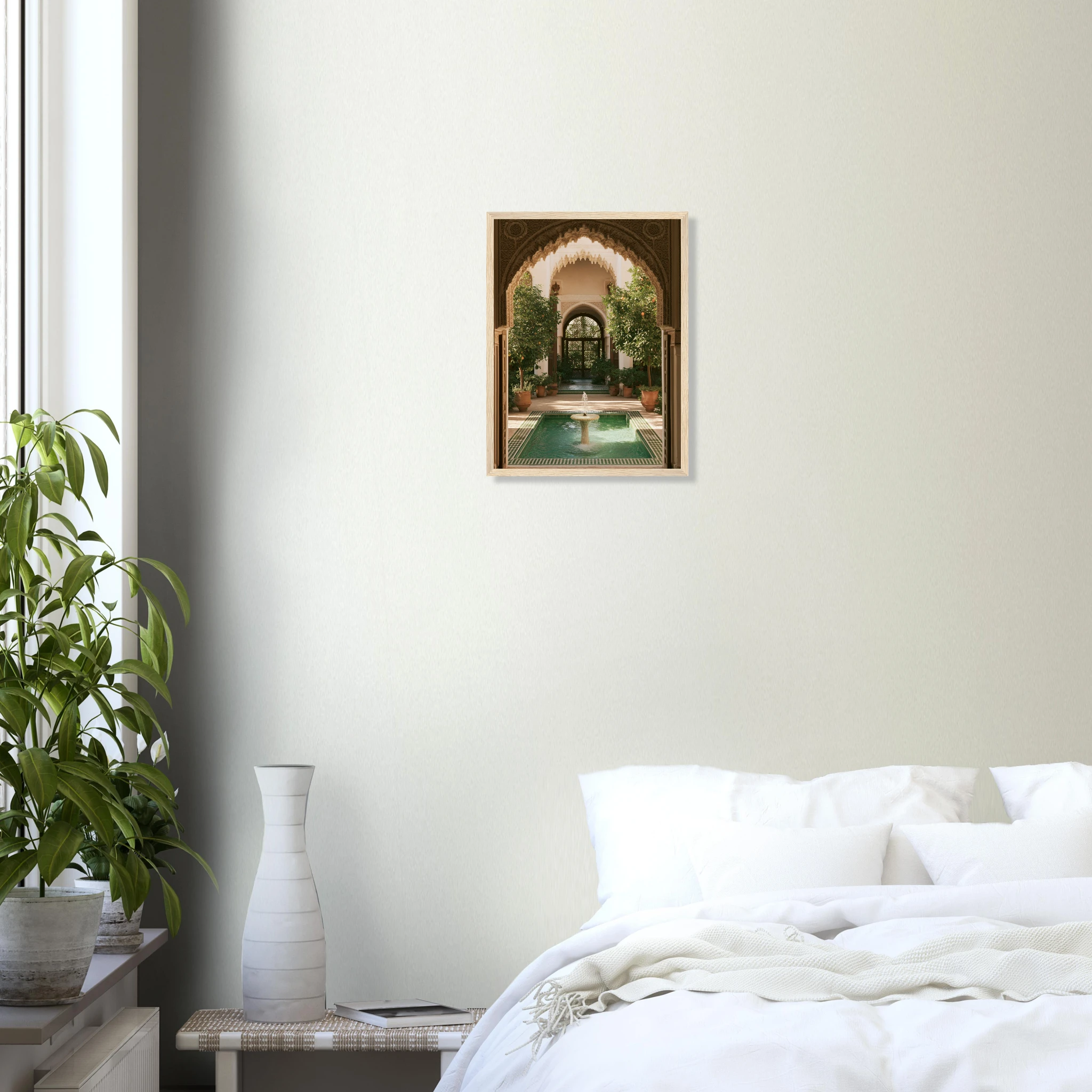
The Andalusian Courtyard Framed Print is a good example of architectural art that works beautifully as a single centrepiece above a bed — calm geometry, warm Mediterranean tones, no visual aggression.
How High to Hang Art Above the Bed
The standard mistake: hanging art too high. In a bedroom especially, art hung at gallery height (eye level when standing) often ends up floating above the headboard with an awkward gap that looks unintentional.
The correct approach: leave 15–20cm between the top of the headboard and the bottom of the frame. That gap is enough to visually separate the two elements without losing the connection. If you have a low or no headboard, use the same rule from the top of the mattress.
If you’re doing a gallery wall, measure the centre of the arrangement — not the top — and treat that as your reference point.
One more thing: centre the art with the bed, not with the wall. In rooms where the bed is off-centre (against one wall, for instance), this matters. The print above the bed reads as part of the bed composition, not as a standalone wall moment.
The Bedroom Aesthetic Guide: Matching Art to Your Interior
The art you choose above the bed should connect to the room’s palette — but it doesn’t need to match exactly. A print that shares one or two colours with the bedding and curtains will feel cohesive. A print that shares zero colours needs to be strong enough to stand alone as a contrast statement.
A few combinations that consistently work well:
White linen bedroom → warm-toned Mediterranean landscapes, botanical prints with earthy greens, architectural subjects in sandstone tones. The contrast is clean without being cold.
Dark bedroom (navy, deep green, terracotta walls) → large prints with pale backgrounds, or bold graphic subjects that hold their own against a saturated wall. Avoid prints with dark backgrounds that disappear into the wall.
Neutral/beige bedroom → almost anything works. This is the easiest bedroom to style art into. Lean into colour for contrast or tone-on-tone for quiet luxury.
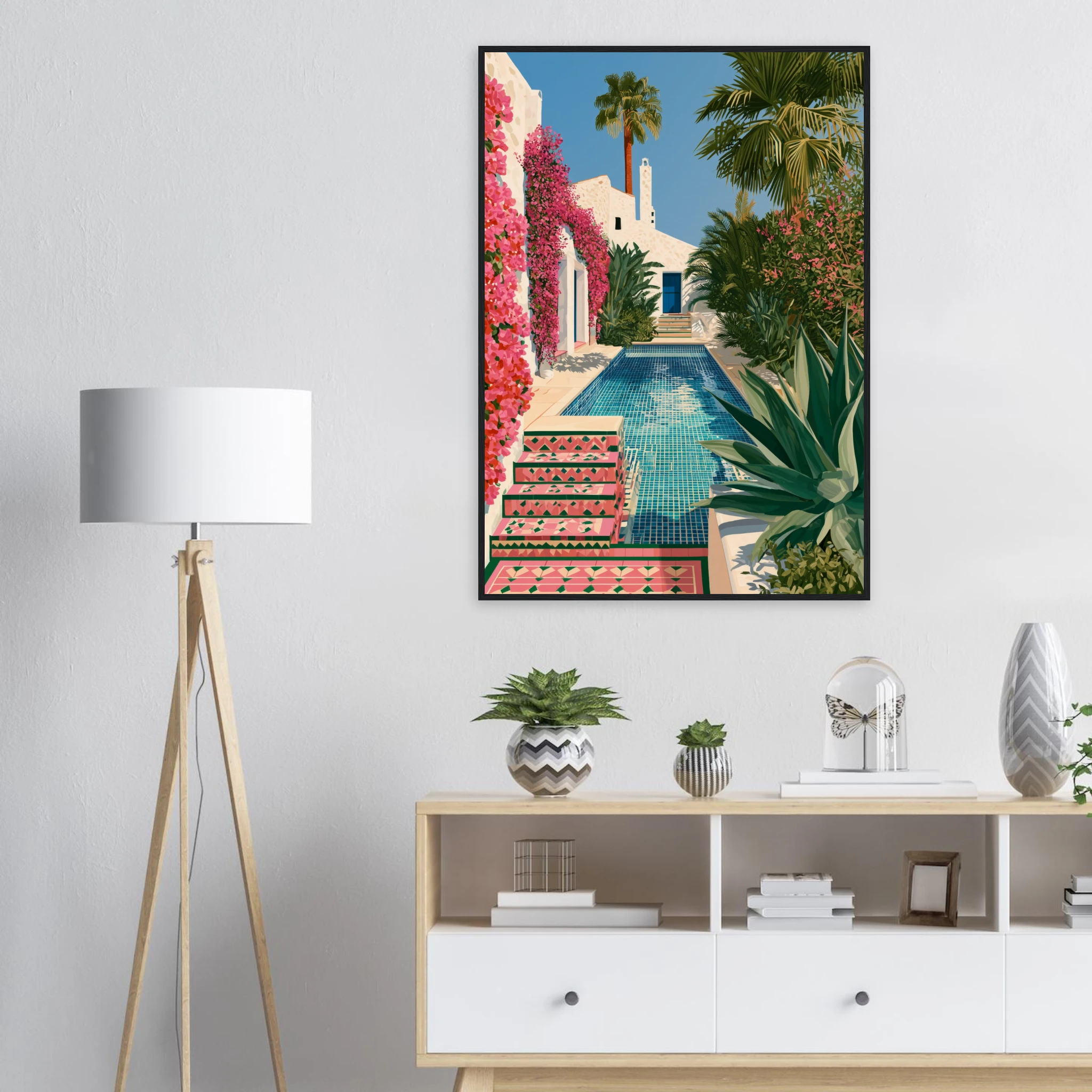
The Villa Rosa — Andalusian Pool Framed Print works particularly well in white or warm neutral bedrooms — the terracotta and green palette brings Mediterranean warmth without overpowering the room.
Read Also
→ Bedroom Wall Art: How to Choose a Print That Changes a Room
→ What to Put Above a Sofa: The Art of the Statement Wall
→ How to Frame a Print: The Complete Guide
FAQ — Above the Bed Wall Art
What size art should go above a king bed?
For a king bed (150–180cm wide), aim for a print or arrangement that spans at least 100–120cm. A single print at 70×100cm or wider is ideal. Two prints hung side by side can also achieve this width while keeping the individual pieces manageable.
How high above the headboard should art be hung?
Leave 15–20cm between the top of the headboard and the bottom edge of the frame. This keeps the art connected to the bed visually without the two elements merging into each other.
Is a canvas or a framed print better above the bed?
Both work, but framed prints tend to feel more polished and finished above a bed — the frame adds structure and weight that suits the focal-point role of this wall. A canvas works well for a more casual, Mediterranean or boho aesthetic where the texture of the print adds to the atmosphere.
Can I hang art directly above the bed if I have a low ceiling?
Yes — in fact, a low ceiling makes the above-the-bed placement even more effective, as the art doesn’t need to be hung high. Keep the print closer in scale to the headboard and consider a horizontal format to emphasise width over height.