
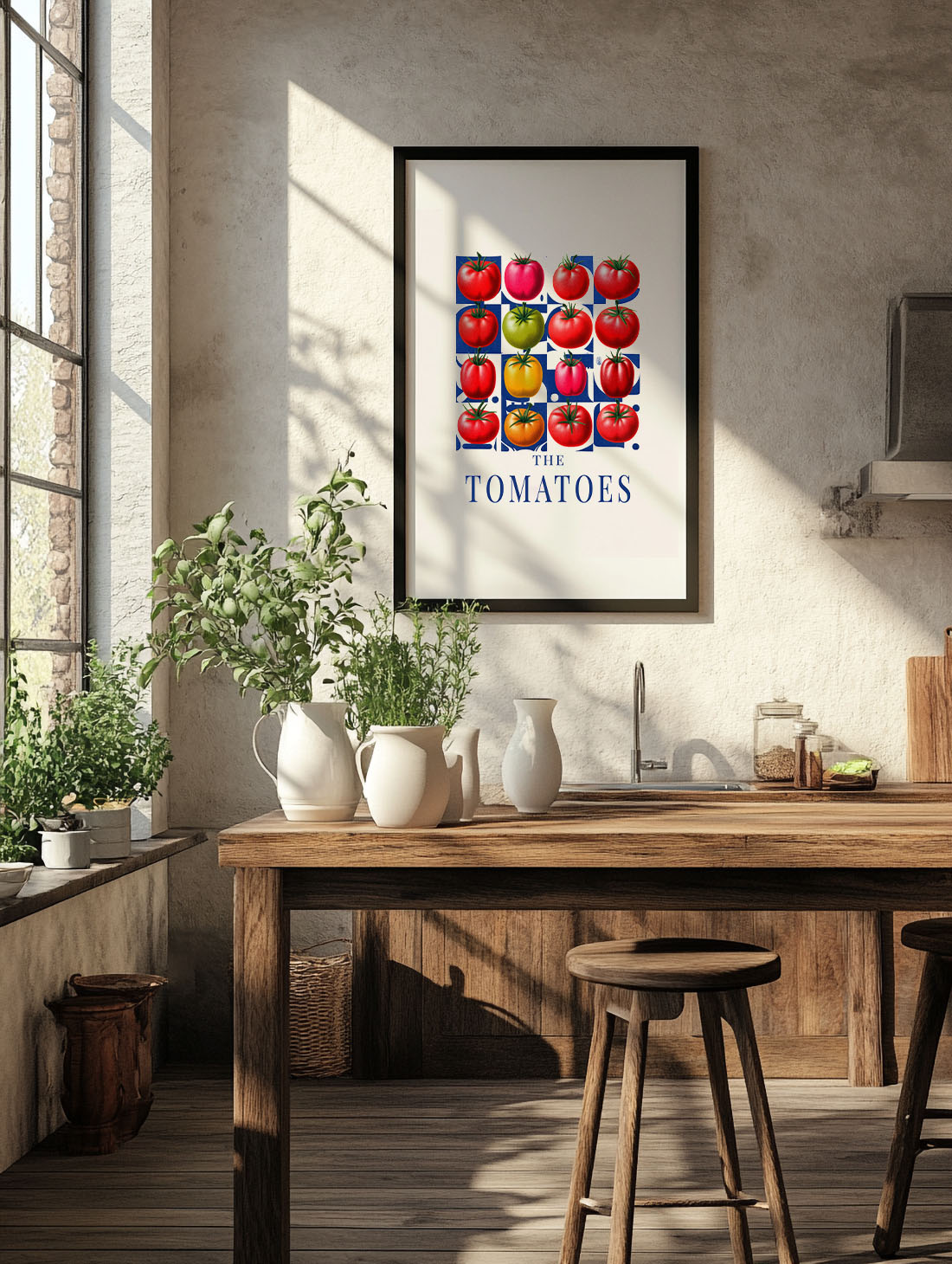
Kitchen wall art is one of the most overlooked decisions in interior design. People spend weeks choosing tiles, countertops, and pendant lights — then hang a grocery-store print above the stove and call it done. There is a better way. And it starts, almost always, with Italy.
The Italian kitchen has always understood something the rest of the world is only catching up to: that food is culture, and culture belongs on the wall. A bunch of sun-blistered tomatoes. A bowl of aubergines still warm from the market. Figs split open on a white cloth. These are not still lifes — they are a point of view. They make a kitchen feel like somewhere worth spending time.
Table of Contents
- Why the kitchen deserves serious wall art
- The Italian kitchen print — what it actually means
- Food art prints vs. botanical prints
- How to choose kitchen wall art that lasts
- Size, placement, and the one rule that always works
- Our edit — Mediterranean food prints for the kitchen
- FAQ
Why the Kitchen Deserves Serious Wall Art
The kitchen is where the day starts. Coffee, morning light, the first real conversation of the day. In the best homes — the ones that feel considered rather than just decorated — the kitchen is as thoughtfully curated as the living room. Maybe more so.
Yet most people treat kitchen walls as an afterthought. A clock. A chalkboard. A print that came with the frames. The result is a room that looks finished but doesn’t feel alive.
The right kitchen wall art does something different. It adds warmth without pattern clutter. It creates a focal point that works whether the kitchen is minimal or maximalist. And done well, it turns a functional room into one you actually want to linger in.
The Italian Kitchen Print — What It Actually Means
When we say Italian kitchen print, we don’t mean a red-and-white checkered poster with a pasta fork and the word CUCINA in block letters. That era is over.
What we mean is the aesthetic that comes from actually spending time in Italian kitchens: the produce that arrives from the market still covered in soil, the colours that verge on violent (the red of a Roma tomato, the purple-black of an aubergine in August), the casual abundance of it all.
A proper Italian-inspired food art print captures that. Not the idea of Italy, but the feeling of it. Sun. Weight. Something worth slowing down for.
This is what distinguishes a print that elevates a kitchen from one that just fills a wall.
Food Art Prints vs. Botanical Prints: Knowing the Difference
Botanical prints are everywhere right now — and for good reason. They’re versatile, sophisticated, and work in almost any room. But in a kitchen, they can feel disconnected from the space’s purpose.
A food art print is specific. It belongs in the kitchen the way a good knife does. It references the life that happens in that room without being literal about it — no “Bon Appétit” in script, no cartoon vegetables. Just colour, form, and subject matter that feels right in the context of cooking, eating, and gathering.
The distinction matters because kitchens have a lot of visual noise already — appliances, cabinets, ingredients, light fixtures. A print that belongs in the room anchors the space. One that doesn’t adds to the noise.
When choosing between a botanical and a food print for your kitchen, ask: does this image feel like it could have been found at an Italian market, a Provençal farmhouse, or a Marbella villa garden? If yes, it belongs. If it feels more like a greenhouse, reconsider.
How to Choose Kitchen Wall Art That Actually Works
The most common mistake is buying a print based on how it looks on screen, then discovering it disappears against the wall. Kitchen walls are often tiled, textured, or painted in warm neutral tones — all of which compete with low-contrast prints.
Three things that reliably work in a kitchen:
- High contrast subjects — deep purples, rich reds, and dark greens read well against white subway tile or warm beige plaster
- Simple compositions — one subject, clearly lit, with breathing room. A single bunch of tomatoes works better than a chaotic still life
- The right finish — matte prints handle kitchen humidity better than canvas in most conditions. Framed prints under acrylic glass offer the best protection without the clinical look of plexi
Above all, choose something you’ll want to look at while waiting for the pasta water to boil. That’s the real test.
Size, Placement, and the One Rule That Always Works
Kitchen walls are often broken up by windows, cabinets, and splashbacks, which limits the available hanging space. The instinct is to go small. Usually that’s the wrong call.
A single large print — 50×70 cm minimum, ideally 70×100 cm — makes a statement and reads as intentional. Three small prints in a row look like indecision. When space is genuinely limited, one medium print hung slightly higher than expected (eye level when standing, not sitting) works better than a cluster.
The one rule: don’t hang kitchen art above a heat source. Above the sink, above a window, or on the wall opposite the cooking area are all better options. The art lasts longer, and you see it more.
Our Edit — Mediterranean Food Prints for the Kitchen
At Atelier Marbella, our kitchen wall art draws from the Mediterranean larder: the produce, the light, the unhurried quality of a market morning in the south. These are some of our favourites for the kitchen.
The Tomatoes — Roma tomatoes on a white surface, lit as if the sun came through a Sicilian window at noon. High contrast, deeply saturated, and surprisingly versatile. Works with white, stone, and dark kitchen aesthetics.
Eggplants — Purple-black aubergines, the kind you find piled at every southern market from Barcelona to Naples. Rich colour, minimal composition. One of those prints that looks better in person than online.
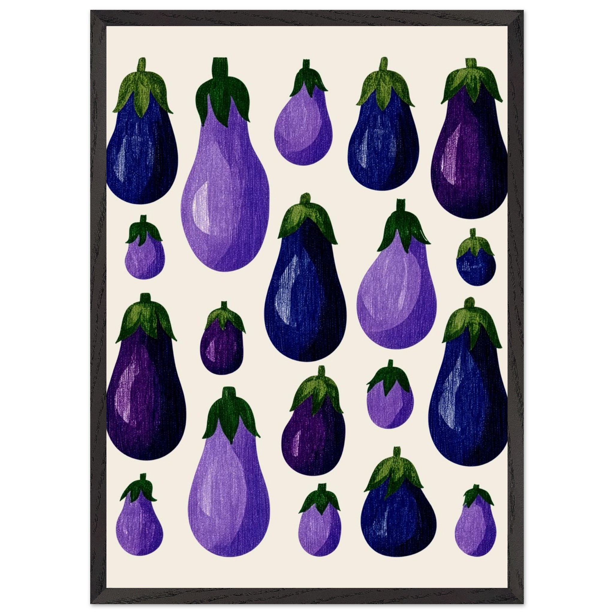
Figs — Split open on a white cloth, warm light, that specific pink that figs have when they’re perfectly ripe. Quieter than the tomatoes, but no less present.
Watermelon Art — Bold, graphic, summer-bright. A kitchen piece for people who aren’t afraid of colour. The kind of print that makes a room feel like a holiday.
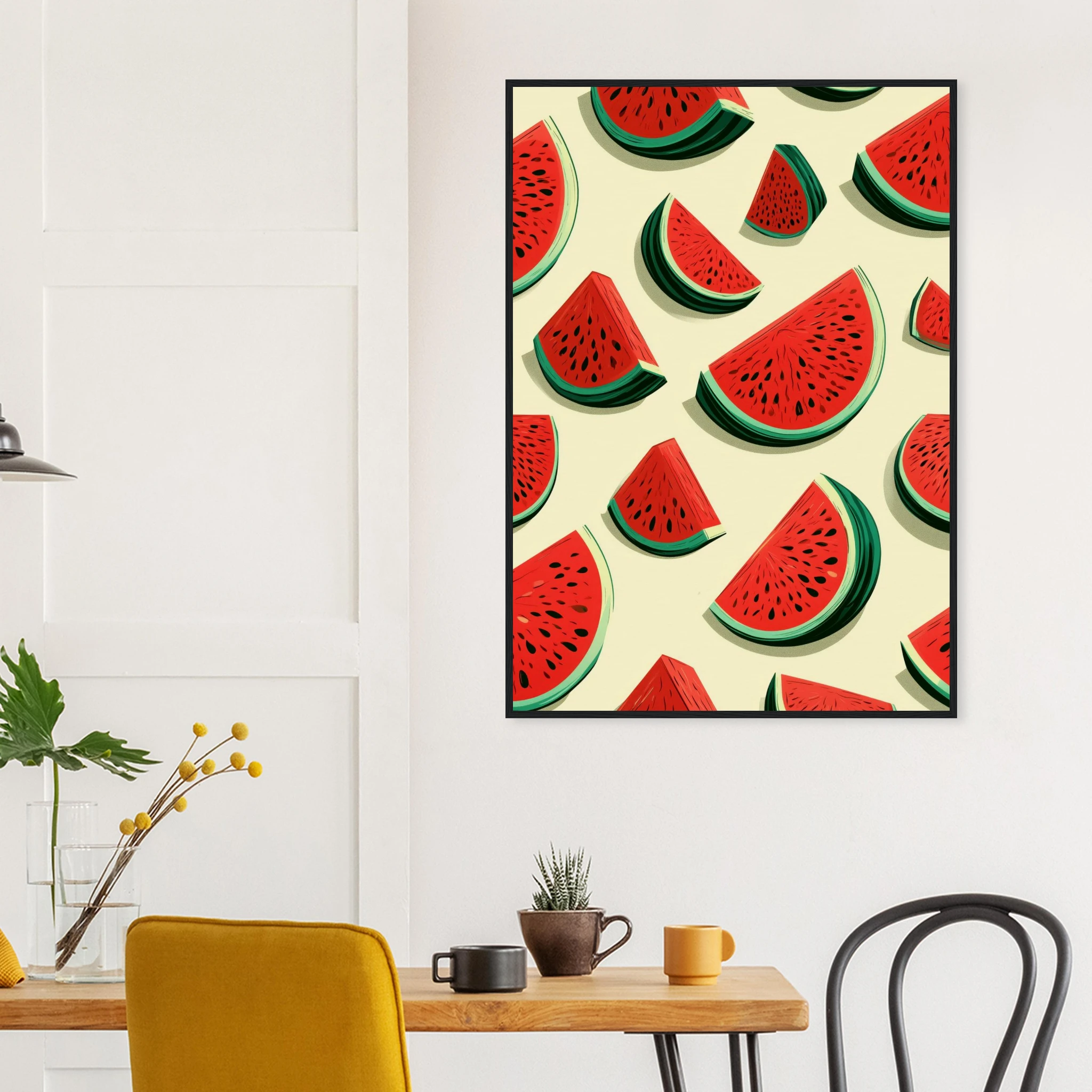
Browse the full collection at Atelier Marbella — all prints available as framed, canvas, or matte, with free delivery across Europe.
FAQ — Kitchen Wall Art
What type of wall art works best in a kitchen?
Food art prints, botanical prints, and Mediterranean-inspired photography all work well. The key is to choose something with strong contrast and a simple composition — kitchens have a lot of visual noise and the art needs to hold its own. Matte or framed prints (rather than canvas) tend to handle kitchen humidity better.
What size print should I hang in the kitchen?
Go larger than you think. A 50×70 cm print is the minimum for a meaningful visual presence. If the wall allows, 70×100 cm makes a real statement. Small prints tend to look lost between cabinets and appliances.
Can I hang art above the stove or hob?
It’s not recommended — heat, steam, and cooking splatter will damage the print over time, even behind glass. The wall above the sink, opposite the cooking area, or beside a window are all better placements.
Is a framed print or canvas better for the kitchen?
Framed prints (with acrylic glass) offer better protection in kitchen environments — the glass shields the print from humidity and light splatter. Canvas is fine in dry kitchens but can warp or fade faster in rooms with a lot of cooking steam.
Where can I find Italian-style food art prints online?
Atelier Marbella offers a curated selection of Mediterranean food prints — tomatoes, aubergines, figs, watermelon — shot with the specific quality of southern European light. All available as framed prints, canvas, or matte, with free delivery across Europe. Explore the full collection here.