
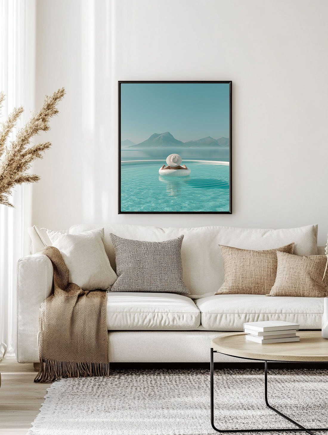
Quiet luxury doesn’t announce itself. No logos, no excess, nothing trying too hard. It’s the linen sofa in a neutral room, the marble side table, the single artwork on an otherwise bare wall that makes you stop.
It’s the dominant design conversation of 2026 — and wall art is where most people get it wrong.
What Quiet Luxury Actually Means in Interior Design
Quiet luxury as an interior style borrows from fashion: the idea that restraint is the ultimate statement. Think of it as anti-maximalism without the coldness. Spaces feel considered, layered, and deeply personal — without looking like a showroom or a mood board screenshot.
The palette leans into warm neutrals: sand, ivory, warm grey, raw linen. Materials are natural: stone, wood, textured plaster. And every object earns its place.
Wall art is where the philosophy gets tested. In a quiet luxury interior, one wrong print — the wrong scale, the wrong energy, the wrong finish — undoes everything else in the room.
The Art That Belongs on a Quiet Luxury Wall
There’s a short list of what works.
Photography with depth. Not stock imagery, not the kind of print you’ve seen in a hotel corridor. Editorial photography — a coastline at the wrong hour, an animal caught mid-stillness, a pool that feels private — carries the emotional register that quiet luxury demands.
Botanical and natural subjects. Lemons on aged plaster. A loose-ink bird. Botanical illustration treated with the seriousness of fine art. These prints add warmth and organic texture without competing with the architecture of the room.
Abstract with restraint. Not chaotic. Not neon. Abstract work that reads as painterly rather than graphic — gestural brushstrokes, muted cobalt and sand, the kind of canvas that looks like it was collected rather than ordered.
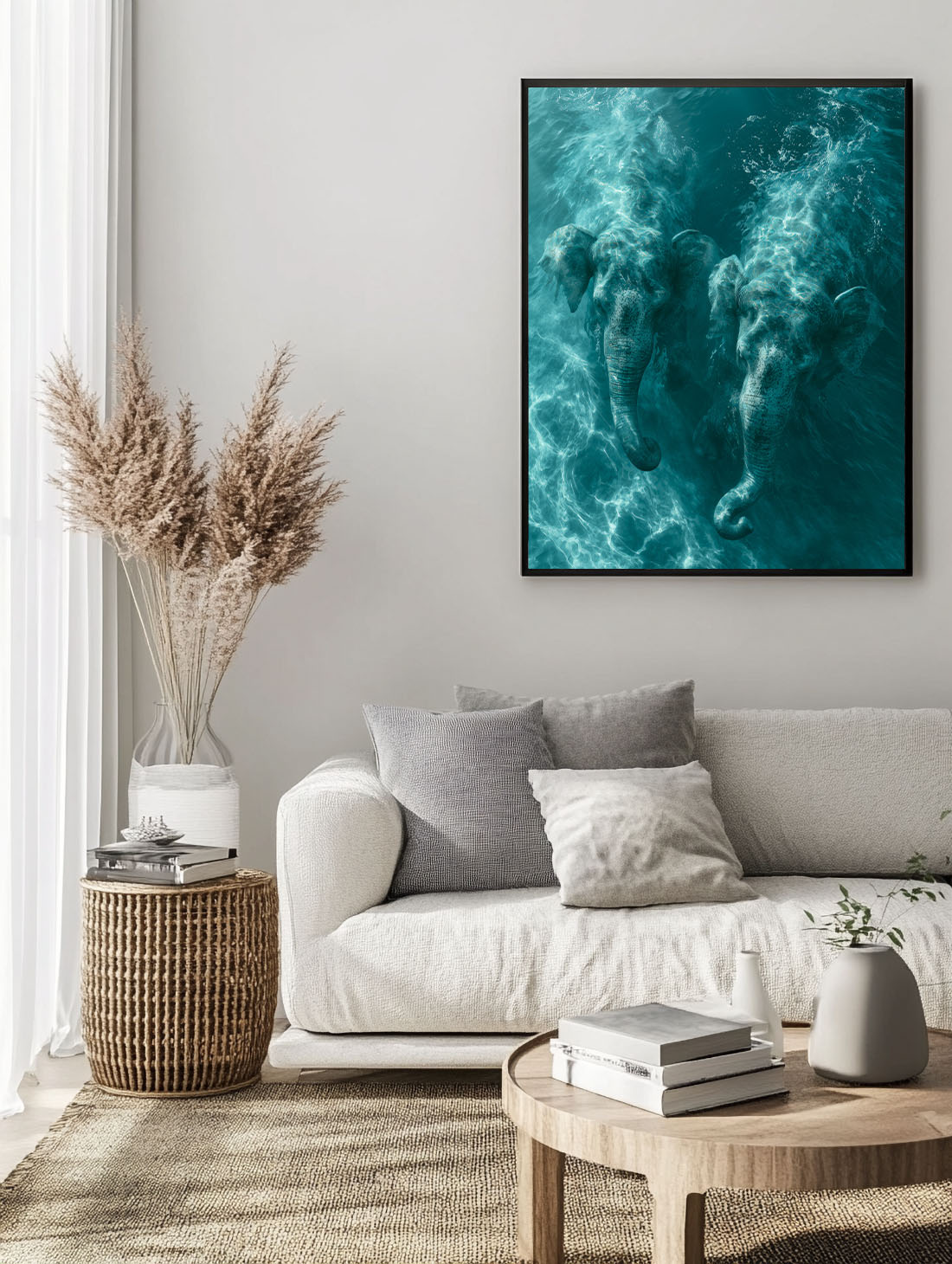
Animal art with presence. Not cute, not decorative. An elephant walking the edge of a sunlit beach. A leopard in bougainvillea. Subjects that carry weight and stillness — that feel like editorial choices rather than impulse buys.
Scale: The Thing People Get Wrong
Quiet luxury is not minimal. It’s intentional. One large-format print positioned correctly does more than four small prints arranged nervously on a wall.
In a living room, a 70×100 cm print anchors the sofa. In a bedroom, 50×70 cm at eye level above a bedside table creates intimacy without crowding the space. In a hallway, a single vertical format at the end of the corridor gives the whole space a destination.
The mistake is going too small, then filling the space with more. Scale once, correctly, and the room resolves itself.
Finish and Frame: The Details That Define It
Matte art print is the quiet luxury default. No glare, no surface noise — just the image. It reads as gallery-quality because it is.
Framed prints in raw wood, thin black, or natural oak stay in register with the palette. Heavy ornate frames break the register immediately.
Canvas works when the image is large and the room can breathe around it. A gallery-wrap canvas with no frame — image continuing around the edges — reads as collected and considered.
How to Style a Quiet Luxury Wall (Without Overthinking It)
Start with one wall. Pick the most visible surface — the one you see when you enter the room, or the one opposite natural light.
Choose one print, sized correctly for the wall. Centre it at eye level, or hang it slightly higher to elongate the room. Don’t fill the surrounding space with anything else — let the print hold its own.
If you want more than one artwork, group maximum two or three. Keep the spacing tight (5–8 cm between prints), align on a shared horizontal axis, and treat the group as a single object on the wall.
The rest of the room does the work.
How to Recognise Quiet Luxury Art
Quiet luxury art has a few things in common. The palette is restrained, with muted tones instead of bright primary colours. The composition is calm, with plenty of space around the subject. The print quality is high, with matte paper, a fine grain and no glossy shine. And there are no logos, slogans or loud elements that ask for attention.
What it does have is atmosphere. A quiet luxury print rewards a longer look: the light on a wall, the texture of stone, the way a horizon sits in the frame. It is the visual equivalent of a well-cut linen shirt.
Three Prints for a Quiet Luxury Interior
Es Vedrà is pure restraint: a single silhouette, soft tones, and a calm that fills the room.
Sunken Courtyard — Andalusia has the architectural quiet of a private villa, with warm stone and measured light.
Sierra Nevada from the Shore gives you scale and stillness, ideal above a neutral sofa. See the rest in our Mediterranean Mood collection.
The Quiet Luxury Prints at Atelier Marbella
The prints that register in this aesthetic: Elephant Duet in the Sea, White Hat Infinity Pool, and the Bougainvillea Leopard and Sea — all shot with the natural palette, the outdoor light, and the restraint that this interior language requires.
Browse the full collection at Atelier Marbella — printed on fine art paper, framed in materials that hold the register, and sized for walls that mean it.
Read also:
→ How to Choose the Right Print Size for Any Wall
→ Mediterranean Wall Art: How to Bring the South Into Your Home
Frequently Asked Questions
What is quiet luxury in interior design?
It is a style that favours quality, texture and restraint over visible branding or bold decoration. Think natural materials, neutral palettes and a few well-chosen pieces.
What kind of art suits a quiet luxury home?
Calm, atmospheric images in muted tones, printed on matte fine art paper and framed simply in wood or black.
Can I mix quiet luxury with colour?
Yes, as long as the colour is muted and used sparingly. One warm accent in a neutral room is enough.