
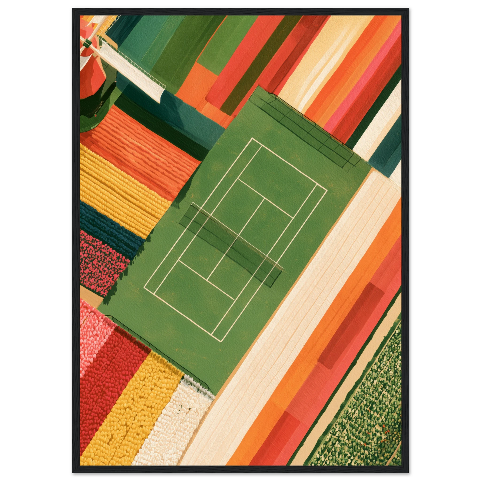
Wes Anderson wall art is any print that borrows the director’s visual grammar: strict symmetry, a pastel palette, a deadpan, front-on composition and a quiet sense of nostalgia. You do not need film stills to get the look. A centred pink facade, a pastel car on an empty runway or a perfectly ordered flower court does the same job, and it sits far more comfortably in a real home.
What Makes an Image “Wes Anderson”
The style is recognisable because it follows a few simple rules, and those rules are easy to spot in a print. The first is symmetry. The subject sits dead centre, the horizon is level and the left side mirrors the right. The second is the flat, frontal camera: no dramatic angles, no tilted horizon, just a scene that looks like a stage set. The third is a restrained palette of pastel pink, mint, butter yellow, powder blue and cream, often with a single stronger accent such as red or teal.
Finally, there is the period detail. Vintage cars, mid-century signage, striped awnings and old hotels give the image a feeling of a past that never quite existed. That mix of precision and nostalgia is exactly why the look has become one of the strongest Mediterranean Mood trends of the year, and why it pairs so well with sunny, travel-inspired interiors.
The Palette: Pastels That Still Feel Grown-Up
Pastels have a reputation for looking childish, but the Wes Anderson approach avoids that trap. The colours are slightly dusty, never neon, and they are balanced by neutral areas such as sand, cream or pale stone. In a print, this means a soft pink building against a clean sky, not a wall of candy colours. Hung in a room, such an image reads as calm and sophisticated, which is why it works equally well in a living room, a bedroom or an entryway.
A useful rule is to pick one dominant pastel and let the rest of the room support it. If the print leans pink, bring in warm woods, linen and terracotta. If it leans mint or turquoise, add cream textiles and a touch of brass. This keeps the palette cohesive without turning the space into a theme park.
Four Prints That Capture the Look
These four artworks from the Atelier Marbella collection follow the same visual logic: centred subjects, soft colour and a gentle retro mood. All are shown here as framed prints, ready to hang.
Lido: A Pastel Riviera Facade
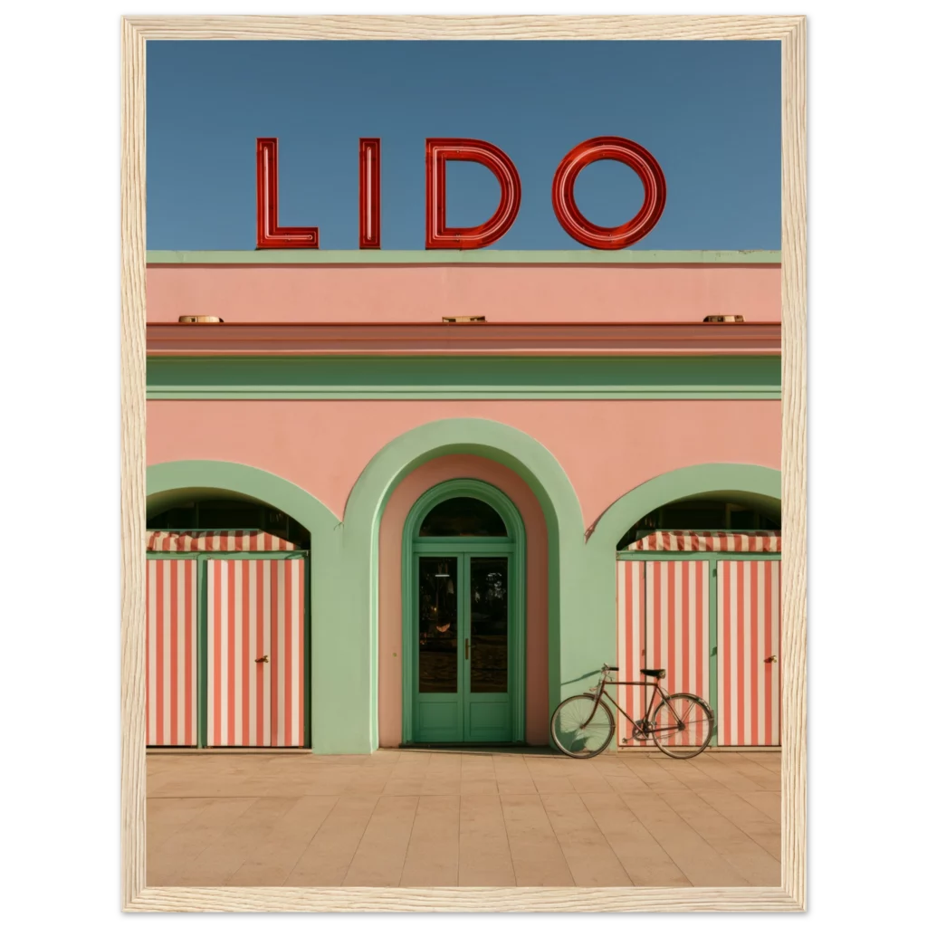
The Lido, Italian Riviera 1950s framed print is the purest example. A symmetrical bathing-club facade, striped cabanas and a single bicycle give it the deadpan charm of a travel brochure from another era. It is a natural choice above a sofa or a console.
Tulip Court: Order and Colour
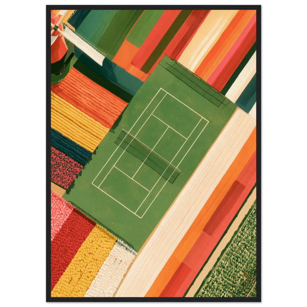
The Tulip Court, Keukenhof framed print turns a flower garden into a perfectly composed courtyard. Neat rows, balanced geometry and soft spring tones make it the most graphic of the four. It brings colour without noise, which suits bright, minimal rooms.
Marbella Beach Club: Vintage Travel Poster
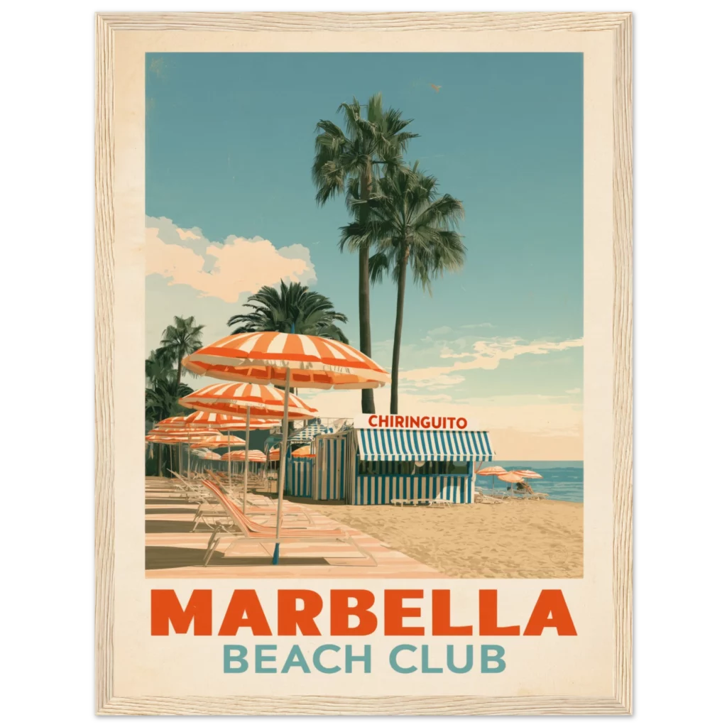
The Marbella Beach Club framed print uses the language of the vintage travel poster: clean shapes, a flat sky and a sunny, slightly dreamy mood. It is ideal for a dining room or a hallway where you want a memorable focal point.
Palm Springs Runway: Pink Cadillac, Turquoise Plane
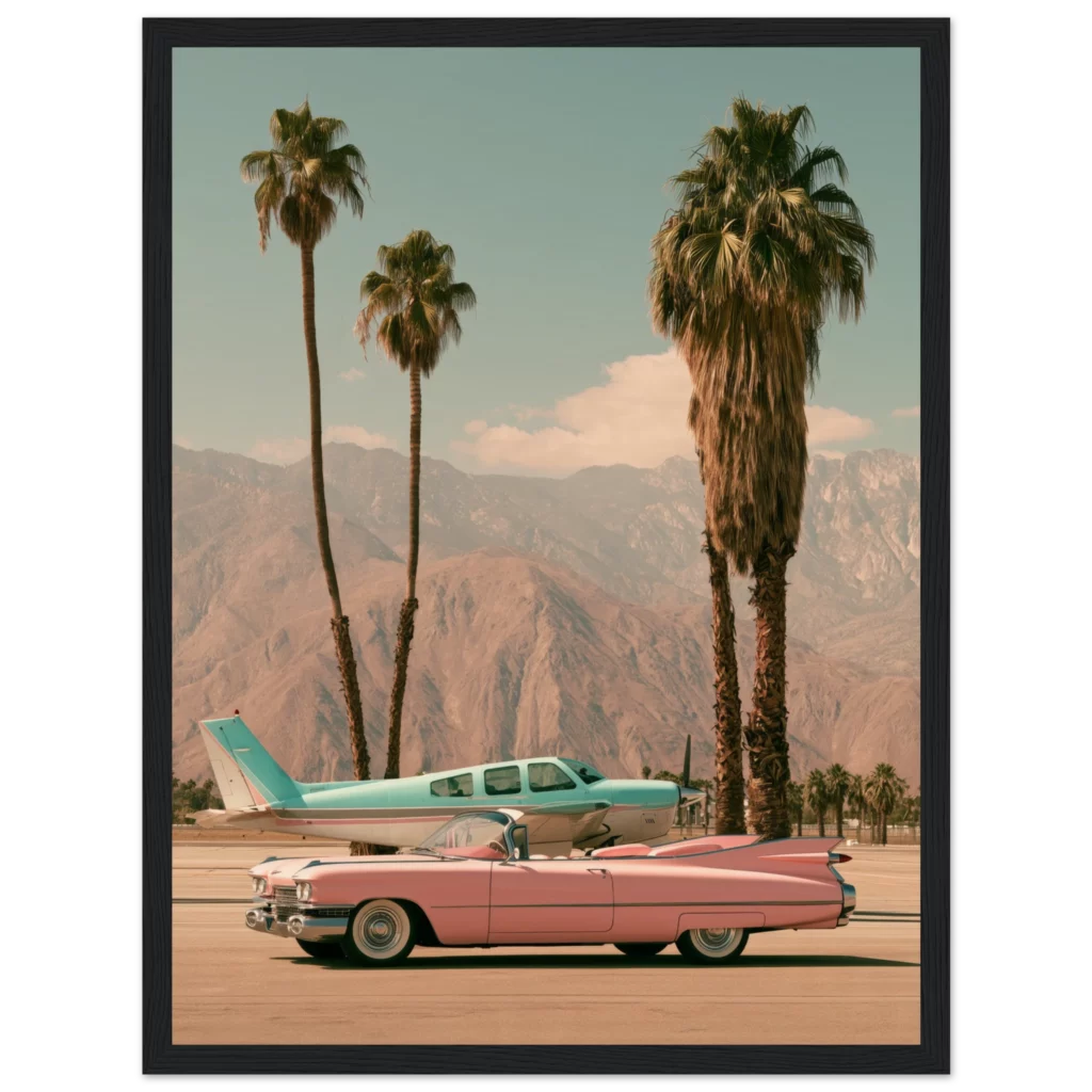
The Palm Springs Runway framed print pairs a pink Cadillac convertible with a turquoise vintage plane on an empty runway, with palms and desert mountains behind. Two pastel machines, one centred scene: it is the most cinematic of the group, and it also lives in the cars collection.
How to Hang Symmetrical Art
Because the style depends on balance, how you hang the print matters as much as the print itself. Centre it on the wall or on the furniture below it, not just on the room. Place the middle of the frame at about 145 cm from the floor, or 15 to 25 cm above a sofa or console. A level, centred print echoes the symmetry inside the image, and the whole wall feels intentional.
For a bolder effect, hang two identical formats side by side with a gap of 5 to 8 cm. Mirrored pairs fit the aesthetic perfectly, as long as the colours are related. Mixing two pastels from the same family, such as pink and sand, keeps the pair harmonious.
Choosing Frames and Mounts
Pastel scenes look best in simple frames. Natural oak or pale wood keeps the mood warm and light, while a slim black frame sharpens the geometry and makes the colours pop. Avoid ornate gilded frames, which fight with the minimalism of the image. If you want a classic gallery look, a cream mount around a smaller print adds the same stage-set feeling the style is known for. You can compare options in our black frame vs wood frame guide.
Styling the Room Around a Pastel Print
Start with the print, then edit the room. Keep large surfaces neutral, such as cream walls, linen sofas and natural wood. Then repeat one colour from the artwork in a small object: a ceramic vase, a cushion, a lamp base. Retro touches like a rattan chair or a mid-century lamp reinforce the nostalgic note without overloading the space. For more ideas on blending pastel prints with warm Mediterranean interiors, read our guide to Slim Aarons style prints.
Common Mistakes to Avoid
The first mistake is mixing too many pastels. Three hues in one frame are fine, but five different pastel prints on one wall quickly become chaotic. The second is hanging a symmetrical print off-centre, which breaks the effect. The third is choosing a size that is too small. A centred print should fill about two thirds of the width of the furniture beneath it, so the composition feels anchored.
Frequently Asked Questions
What is Wes Anderson wall art?
It is wall art inspired by the director’s visual style: centred, symmetrical compositions, soft pastel colours and nostalgic details such as vintage cars or retro signage. The prints do not need to show film scenes, only to share the same look and mood.
Which colours suit a Wes Anderson aesthetic?
Dusty pink, mint, butter yellow, powder blue and cream are the core colours. A single stronger accent, like teal or red, adds contrast. Keep the rest of the room neutral so the pastel print remains the centrepiece.
Which room is best for pastel symmetrical prints?
Living rooms, bedrooms and entryways work especially well, because a centred print above a sofa, bed or console reinforces the symmetry. Dining rooms and hallways also suit travel-poster style pieces.
Should I choose framed or canvas prints?
Framed prints suit this style best, because the clean frame sharpens the geometry. Canvas gives a softer, more relaxed look, while matte prints are ideal for gallery walls or custom framing.