
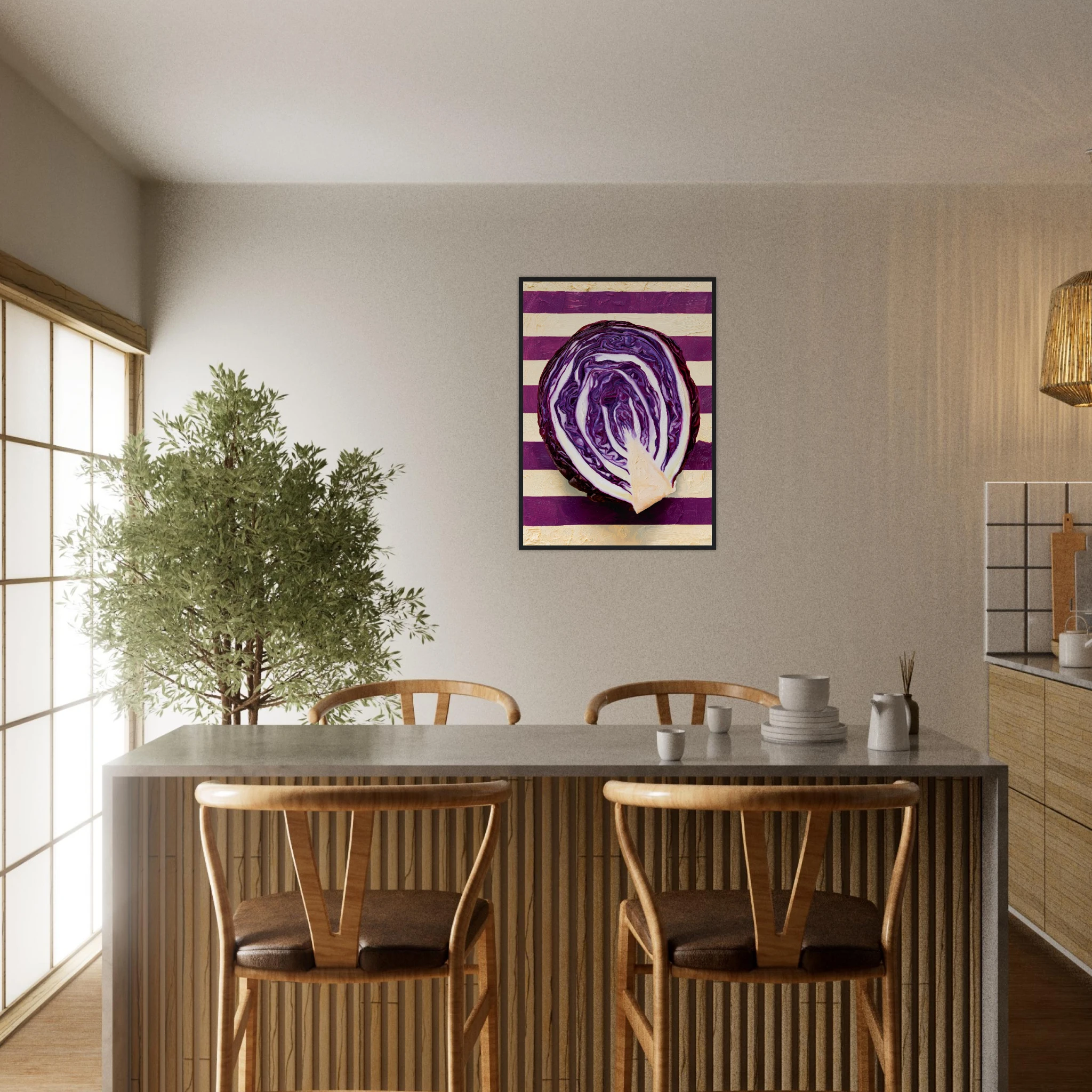
Choosing between a black frame and a wood frame is the single decision that most changes how a print behaves on a wall. Black draws a clean line around the image and sharpens contrast. Wood softens that edge, warms the colours inside it and ties the print to the furniture around it. Neither is better in the abstract; the right one depends on the artwork, the wall colour and the materials already in the room. This guide walks through how each frame reads, where each belongs and how to decide when you are still unsure.
What a Black Frame Does to a Print
A black frame works as a drawn outline. It separates the image from the wall, increases the perceived contrast of everything inside and gives even a quiet subject a graphic, deliberate presence. On a white or pale plaster wall, the effect is close to a gallery hang: crisp, architectural, slightly formal.
It also has a practical advantage. Black is the most forgiving finish in a mixed room, because it sits comfortably next to metal fixtures, dark window frames and stone. In a villa with black steel doors or slim dark joinery, a black frame repeats a note the architecture has already played.
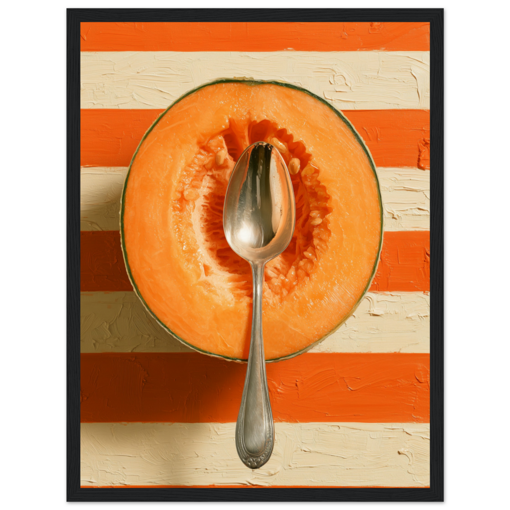
The trade-off is weight. On a very dark wall a black frame disappears and the print seems to float; on a small image it can feel heavy. Pieces with strong colour fields, such as the orange and cream stripes of The Cantaloupe, are the best candidates because the colour holds its own against the dark edge.
What a Wood Frame Does to a Print
A wood frame reads as furniture rather than outline. The grain and the warm tone pick up the colours of the artwork instead of containing them, which makes the print feel part of the room instead of placed on it. It is the natural choice beside oak tables, rattan, linen and terracotta, and in any space where the palette leans warm.
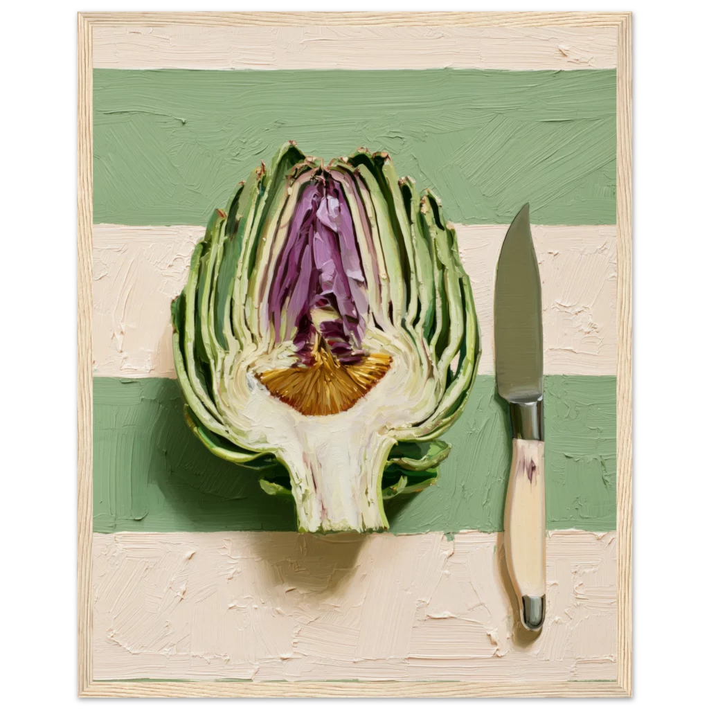
Wood is also gentler with soft subjects. Muted greens, creams and earth tones can look severe inside black but settle beautifully inside a natural finish. The Artichoke, with its sage and cream stripes, is a good example: the wood frame echoes the pale ground and lets the violet heart of the vegetable do the talking.
Match the Frame to the Wall Colour
Start with the wall, not the print. On white and warm white walls, both finishes work, so the decision falls to the artwork and the furniture. On beige, greige and sand tones, wood tends to blend gracefully while black adds definition; if the wall is already low-contrast, black gives the print something to stand against. On deep colours such as green, navy or charcoal, a black frame vanishes, and a lighter wood or white frame separates the image far better.
A useful test is to hold a dark sheet of card and a light timber sample against the wall in daylight. Whichever one makes the colours of the print look clearer is usually the right frame.
Match the Frame to the Room
Look at what the frame will sit beside. Kitchens and dining rooms with wooden tables, chairs or shelving usually welcome wood, because the frame joins an existing conversation. Rooms with metal, glass, stone or black hardware prefer black. Living rooms with a mix of both can go either way, and the more reliable move there is consistency: pick one finish for a group of prints rather than alternating.
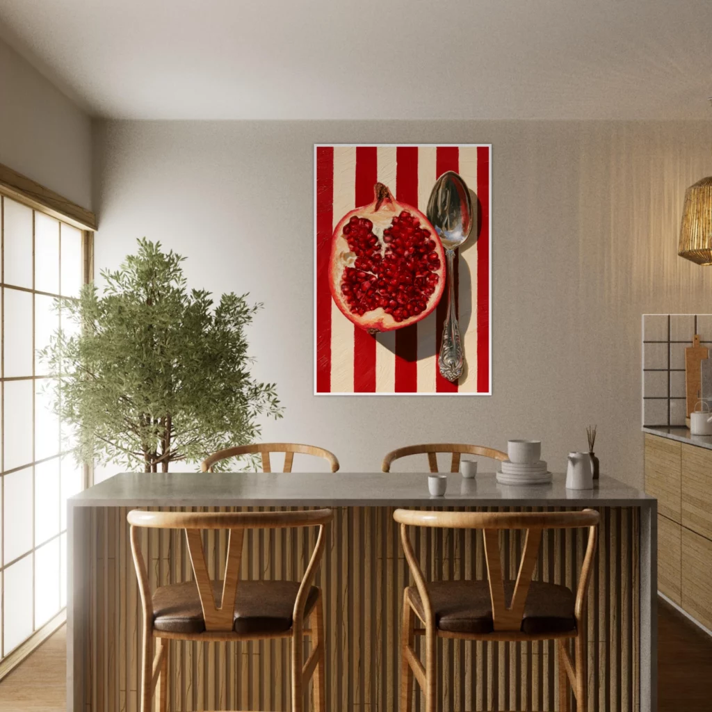
In a dining room with timber chairs and a pale wall, a single bold print such as The Blood Pomegranate carries the wall, and the frame should recede into the room instead of competing with it. Our kitchen collection is built around exactly this kind of hang.
Black Frame vs Wood Frame: A Quick Comparison
If you need a short rule: choose black for contrast, graphic subjects, modern or industrial interiors and walls that are light; choose wood for warmth, soft palettes, natural materials and rooms where the furniture already carries timber tones. Black says outline, wood says furniture. If the print has strong dark areas near its edge, wood or white avoids a double-dark boundary. If the print is pale and delicate, black gives it structure.
Sizes, Groups and Gallery Walls
Frame colour interacts with size. Large prints can carry a black frame without feeling heavy, while small prints often look better in lighter wood. For gallery walls, keep to a single finish across the group so the arrangement reads as one composition. If you are still working out dimensions, our guide to art print sizes pairs naturally with this decision, since the right format and the right frame are usually settled together.
Our Red Cabbage Framed Print shows the principle well. Its violet and white stripes read cleanly in either finish, so the frame becomes a matter of room rather than artwork. Each Framed Print is offered in black, wood and white, so the choice can follow the wall rather than the other way round.
Frequently Asked Questions
Is a black frame or a wood frame better for a small room?
Wood is usually the softer choice in a small room because it adds warmth and does not outline the print as sharply. Black works well if the walls are light and you want a crisp, graphic look. In either case, keep the frame slim and avoid mixing finishes on one wall.
Can I mix black and wood frames on the same wall?
It can work, but it is harder to get right. Mixed finishes need a clear logic, such as black for one group and wood for another in a separate zone. For a single wall or a gallery arrangement, one finish looks calmer and more deliberate.
Which frame suits a colourful print?
Black suits bold, saturated artwork because it frames the colour and keeps the edges sharp. Wood suits colourful prints in warm palettes, where the grain echoes the tones inside. If you are unsure, hold both options against the wall in daylight and pick the one that makes the colours clearer.
Does frame colour affect how the print looks on a white wall?
Yes. Against white, black adds maximum contrast and a gallery feel, while wood adds warmth and a more relaxed, residential tone. Both are safe choices on white; the decision depends on the mood you want the room to have.