
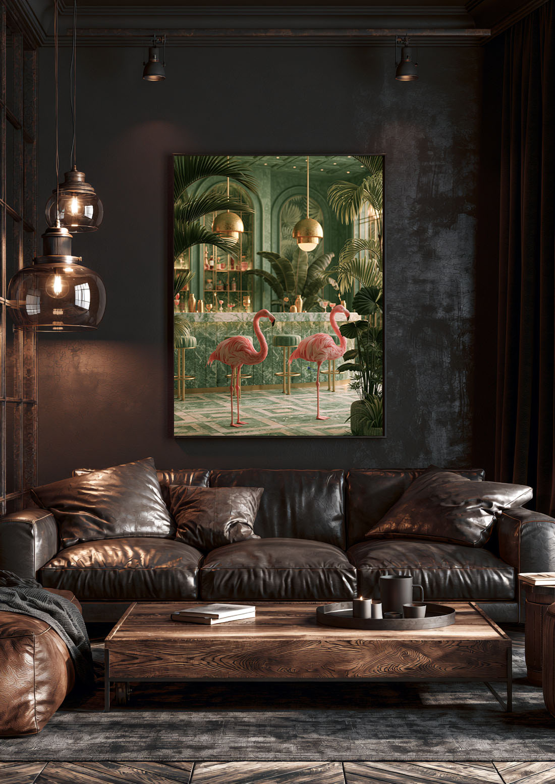
There is a moment in every well-designed living room when you stop looking at the furniture and start looking at the wall. Living room wall art is the thing that does that — not the sofa, not the rug, not the lighting. The right print holds the room together the way a well-chosen piece of music holds a dinner party. You don’t always notice it consciously. But you notice when it’s wrong.
This is a guide to getting it right.
Why the Living Room Demands More Than Decoration
The living room is the room where you spend the most time looking up. Unlike a bedroom — where art is seen for a few quiet minutes each day — the living room is where you sit for hours, where guests arrive and form their first impression of how you live.
This means the stakes are higher. A print that might be quietly charming in a hallway needs to be genuinely arresting above a sofa. It needs to have something to say.
The mistake most people make is treating living room wall decor as an afterthought — something to fill the space once everything else is in place. The rooms that actually work tend to be built the other way around: the art comes first, or at least early enough to shape everything else.
Scale: The First Decision, and the One Most People Get Wrong
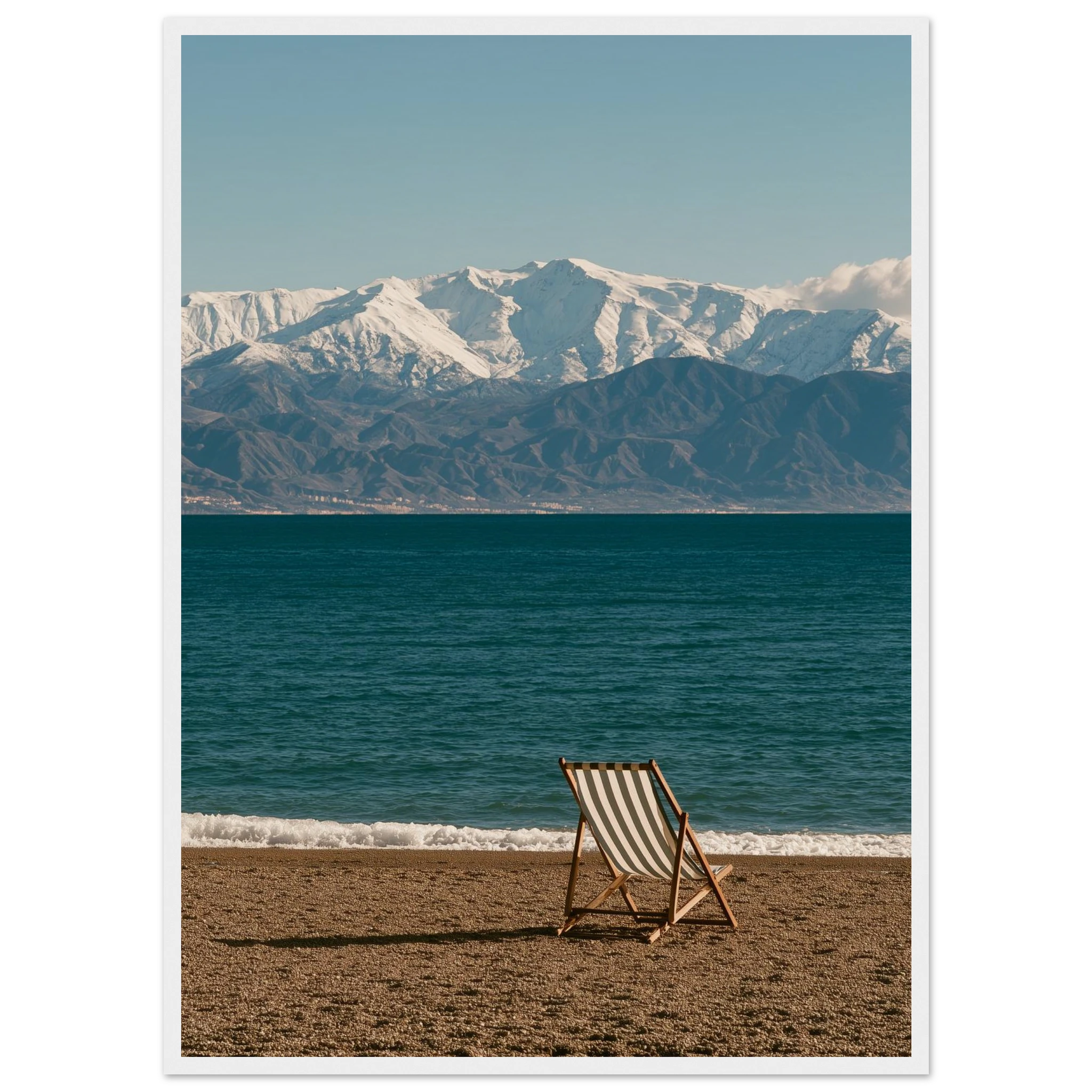
Most art in most living rooms is too small.
A single print that could comfortably hang in a corridor does almost nothing on a four-metre wall behind a large sofa. The visual logic of the room requires something that meets the scale of the space — which in practice means going larger than feels instinctively right.
For a large wall art living room, the general principle is that the print should span 60–75% of the width of the furniture below it. For a three-metre sofa wall, that typically means a print of 120–150cm wide. Narrower than that and the art floats — it doesn’t anchor.
A few practical reference points:
- 50×70cm — works on a narrow wall, accent corner, or staircase. Too small for a primary sofa wall.
- 70×100cm — the minimum viable size for most living room features. Works well in pairs.
- 100×140cm and above — true statement territory. One print this size reads from across the room.
The alternative to a single large print is a gallery wall arrangement, which achieves scale through composition. But a single large print, placed well, is harder to get wrong.
Subject Matter: What Actually Works in a Living Room
Not all prints are suited to all rooms. The living room calls for art with presence — something that holds up to extended viewing, that doesn’t exhaust itself in the first five seconds.
Prints that work here: the La Concha — Marbella 1970s Framed Print, the Marbella Cadillac and Leopard Framed Print and the Calanque Anchorage Framed Print — each available as a framed print, ready to hang. Browse the Mediterranean Mood collection for more.
A few categories that consistently work:
Landscapes and Mediterranean scenes. A coastal view, a sun-drenched terrace, an olive grove in afternoon light — these prints create an atmosphere rather than just an image. They reward living with. Over time, they become part of how the room feels rather than just what it looks like.
Animals with character. Not decorative wildlife, but prints where the subject has personality — a leopard caught mid-movement, a flamingo with an air of complete indifference, a giraffe in golden light. These bring wit and warmth without being whimsical.
Automotive art. For a certain kind of living room — one with low furniture, clean lines, some leather — a well-composed print of a Ferrari or Porsche is as valid as any landscape. The subject is secondary to what the image communicates: precision, movement, something made with intention.
What tends not to work: art that’s merely pretty. Prints that were chosen because they match the cushions. Anything that looks like it came as part of a set.
Browse the full range of art prints for living rooms to find the piece that fits the room — and the mood.
Placement: Where the Art Lives Changes What It Says
The sofa wall is the obvious choice, and often the right one. It’s the first thing guests see when they enter, and the backdrop against which most of the room’s life unfolds. A statement wall art piece placed here sets the tone for everything else.
Height matters as much as scale. The centre of the print should hang at roughly eye level when standing — approximately 145–150cm from floor to centre. This is higher than most people instinctively hang art.
Above a fireplace is the second most common placement. Here, the size of the mantel matters: the print should be no wider than the mantel itself, and ideally slightly narrower. The vertical space between mantel and print should be 15–20cm — enough to breathe, not enough to disconnect.
A third option that’s underused: the wall visible from the kitchen or entrance. This turns the art into a focal point that organises the entire open-plan space — not just the seating area.
Print Finish: Matte or Canvas for a Living Room?
The finish changes how a room feels more than most people expect.
Matte art prints have a flat, light-absorbing surface that keeps the focus entirely on the image. They feel contemporary and editorial — closer to what you’d see in a gallery or on the pages of a design magazine. In a living room with natural light, matte prints eliminate the glare that can make a room feel restless.
Canvas prints have texture and depth. They suit rooms with a warmer, more layered aesthetic — exposed wood, linen, collected objects. Canvas works particularly well for landscape-driven art or large-format pieces where the tactile quality of the surface adds something.
For the average modern living room, matte is usually the stronger choice. For more on how the two compare, see our full guide to matte vs. canvas prints.
The One-Print Rule vs. the Gallery Wall
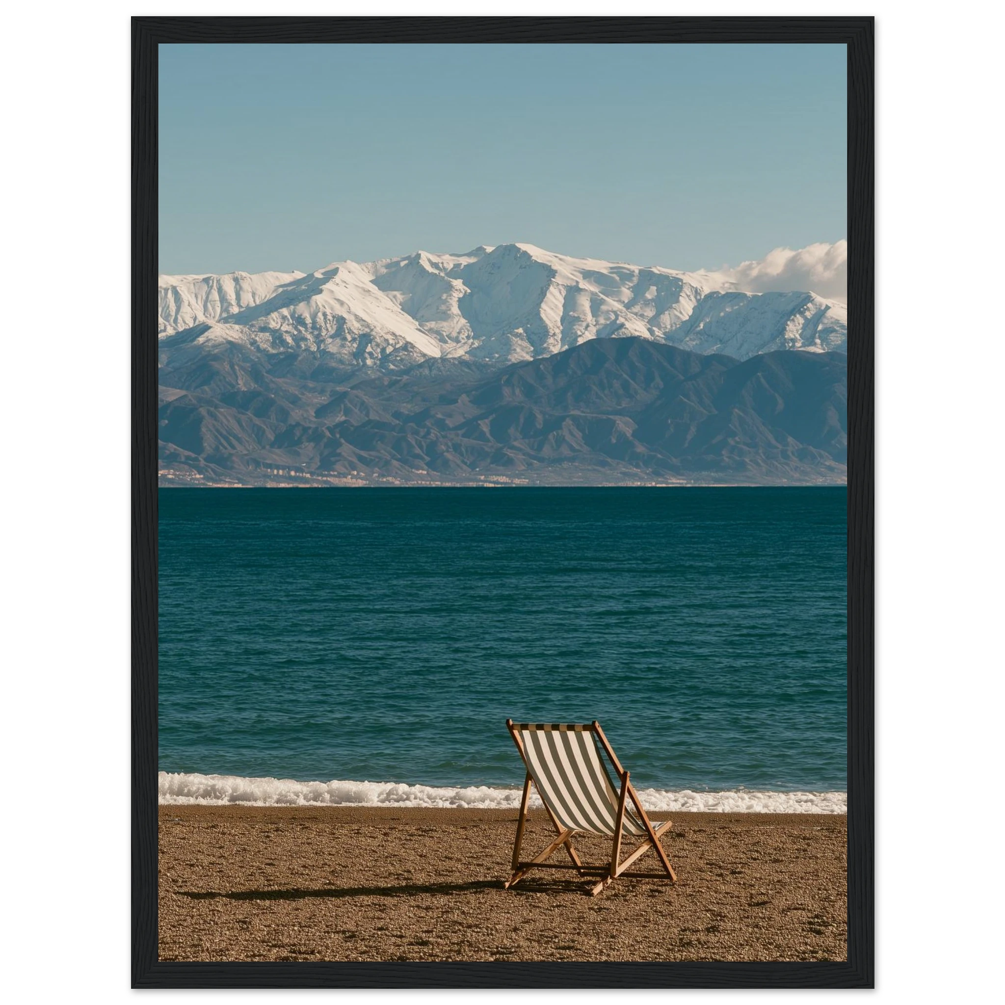
Both approaches work. They communicate different things.
A single large print makes a clear, confident statement. It says: we know what we like. It’s easier to execute well because there are fewer decisions — you choose the print, you choose the placement, you’re done. The risk is that if the print doesn’t quite work, there’s nothing to distract from it.
A gallery wall is more layered, more personal, better suited to rooms that are themselves more eclectic. It takes longer to assemble and requires real thought about composition — but when it works, it feels like a room that’s been lived in rather than installed.
The combination that rarely fails: one large anchor print at the centre, two smaller prints flanking it at a slightly lower height. The structure of a gallery wall with the confidence of a single statement.
See our guide on how to build a gallery wall for the full breakdown.
Read Also
- Bedroom Wall Art: How to Choose a Print That Changes a Room
- Botanical Art Prints: The New Neutral for Modern Interiors
- Matte vs. Canvas: Which Print Finish Is Right for You?
FAQ
What size art print works best for a living room wall?
For a standard sofa wall, the print should be 60–75% of the sofa’s width. In practice, this usually means 100×140cm or larger. When in doubt, go bigger — art that’s too small disappears in a living room.
How high should I hang art in a living room?
Hang so the centre of the print sits at approximately 145–150cm from the floor. This places it at standing eye level. If hanging above furniture, allow 20–25cm of space between the top of the piece and the bottom of the frame.
Should living room wall art match the decor?
It doesn’t need to match — it needs to belong. A print that’s been chosen to coordinate with cushion colours tends to look considered but lifeless. Choose art for its own quality, then let the room adapt around it.
Is one large print better than multiple smaller prints in a living room?
One large statement print is usually easier to get right and has more visual impact. Multiple smaller prints work well as a gallery wall but require more planning. A single oversized print is the stronger choice for a first-time buyer.