
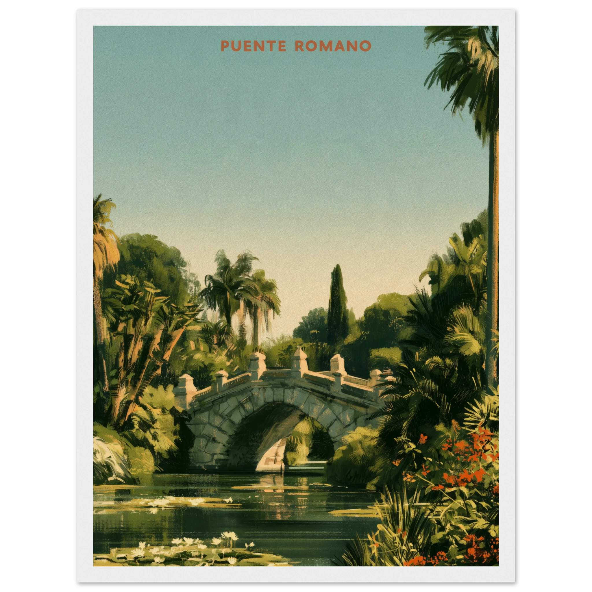
A maximalist gallery wall is not a wall that has more art on it. It is a wall where every piece earns its place, and the crowding itself becomes the composition. Done well, a maximalist gallery wall reads as abundance, not clutter — the same instinct that made “curated maximalism” one of the defining interior moves of 2026, the dopamine-decor cousin that trades primary colour for density and story.
The difference between a wall that feels generous and one that feels chaotic usually comes down to three decisions made before a single nail goes in: what anchors the arrangement, how the pieces relate to one another, and how much restraint you apply to the frames themselves. This is the version of maximalism a villa can actually live with.
What “Curated Abundance” Actually Means
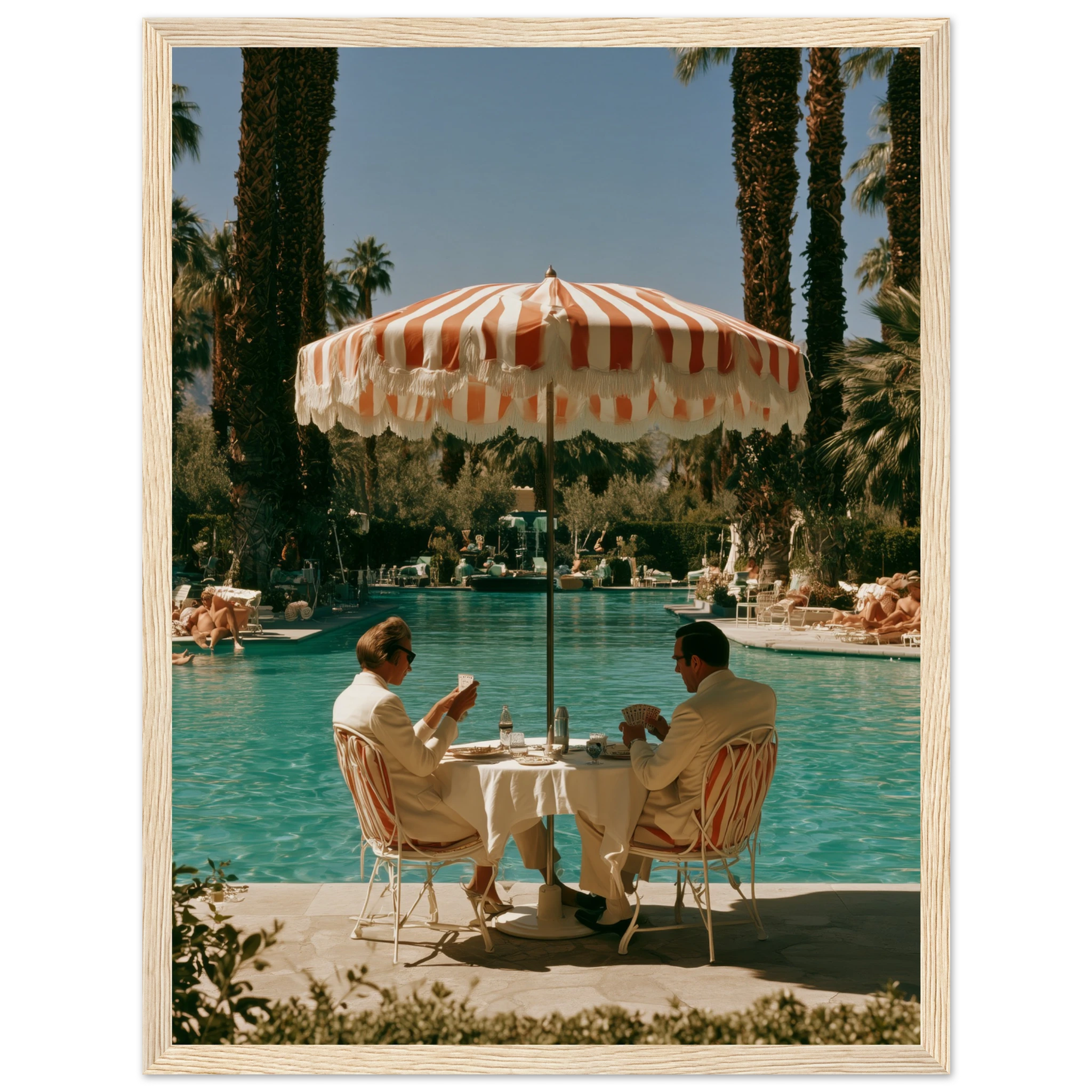
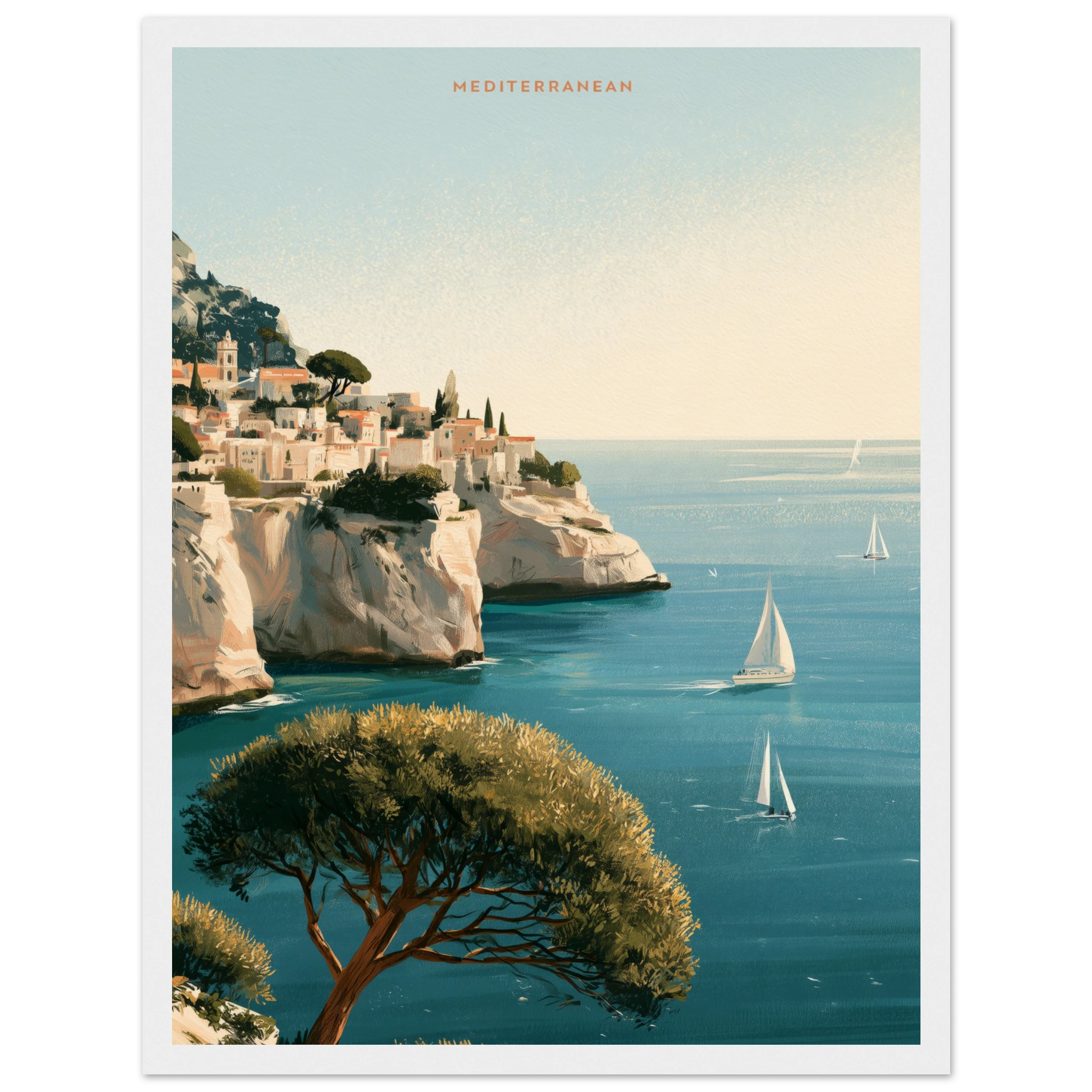
Curated abundance is the opposite of impulse collecting. It is a wall built from pieces that share a logic — a palette, a subject, a feeling — even when the individual images look nothing alike. A card game beside a pool, a coastal villa at dusk, a garden view rendered like a vintage travel poster: three completely different scenes that sit together because they all speak the same language of golden light and unhurried afternoons. That shared undertone is what stops a dense wall from reading as random.
Real maximalism has editing behind it. Every piece that makes the final wall replaced two that did not.
Start With an Anchor Piece
Every gallery wall needs one piece the eye lands on first — usually the largest frame, or the one with the strongest single colour. Puente Romano Gardens, with its dense green vista and vintage travel-poster palette, works as that anchor: big enough to hold the centre, quiet enough not to fight with what goes around it.
Hang the anchor first, at standard eye-height centre (roughly 145–150 cm to the middle of the frame), then build outward. Everything else is measured against it, not against the wall.
Build in Threes, Not Grids
Grids read as tidy, not abundant. A maximalist gallery wall works better in odd-numbered clusters — three, five, seven pieces — staggered at slightly different heights so the eye keeps moving instead of settling into rows. Gin Rummy — Palm Springs Pool, with its Slim Aarons-style card game poolside, and The Mediterranean Coast, a desert villa at dusk under Moroccan arches, sit naturally either side of an anchor at slightly uneven heights — near enough to read as one composition, staggered enough to avoid the grid effect.
Leave 5–8 cm between frames in a dense cluster — tight enough to read as one gesture, loose enough that each piece still gets its own breath.
Mixing Palettes Without Losing Cohesion
The trick most people miss with a maximalist wall is that cohesion does not require matching colours — it requires a shared temperature. Warm gold light, faded film tones, the same slightly nostalgic saturation running through every frame, even across very different subjects. We wrote about this instinct at length in Dopamine Decor Wall Art: the goal is never uniformity, it is a family resemblance strong enough that a stranger could pick the odd piece out if it belonged to a different wall.
Formats reinforce the point, too. A cluster works best when the pieces aren’t all identical sizes — a 70×100 anchor beside two 50×70 supports beside a smaller 30×40 accent reads as intentional rather than assembled from a single order. It also gives the eye a hierarchy to follow: big first, then the mid-sized pieces, then the small one that rewards a closer look.
Framing Consistency vs Contrast
This is where most maximalist walls fall apart. If every image has a different subject and a different palette, the frames need to agree — one wood tone, one finish, sized consistently across the wall. Save the contrast for the art, not the hardware. We cover sizing and mount logic in full in How to Frame a Print, but the short version for a gallery wall: pick one frame colour for the whole cluster and let the images do the talking.
A Real Example Wall
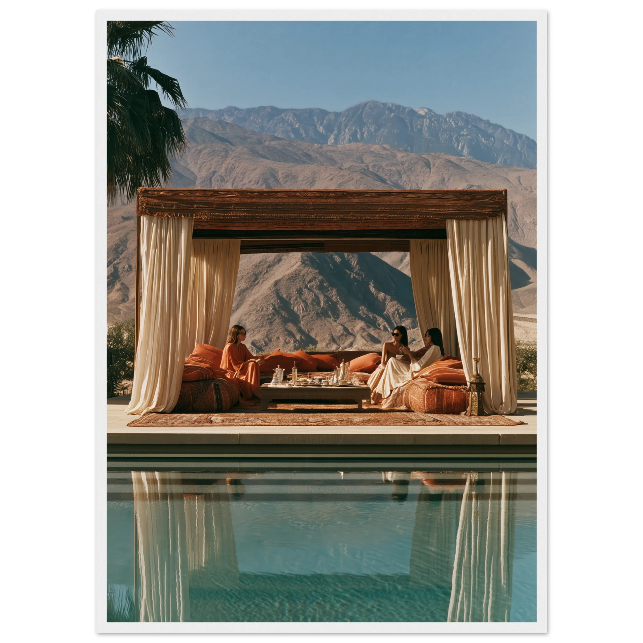
Take a five-piece cluster built around warmth and travel-poster nostalgia: Puente Romano Gardens as the anchor, Gin Rummy — Palm Springs Pool and The Mediterranean Coast staggered either side, and Desert Tea — Palm Springs Cabana closing one corner with its mint-tea-and-desert-light palette. Four completely different scenes — a garden, a card table, a coastline, a cabana — held together purely by light and mood. That is curated abundance working as intended.
Browse the full Mediterranean Mood collection for more pieces that share this same warm, travel-poster undertone — the easiest way to keep adding to a wall like this without breaking the palette.
Where to Start If You Only Have One Wall
You do not need seven frames to try this. Start with three: one anchor, two supporting pieces staggered slightly off-grid. Live with it for a few weeks before adding a fourth or fifth. The best maximalist walls are rarely finished in one afternoon — they accumulate the way a well-travelled home does, one piece that earns its place at a time.
Frequently Asked Questions
How many pieces do I need for a maximalist gallery wall?
Three is the practical minimum — enough to create a staggered, off-grid composition. Most curated abundance walls settle between five and nine pieces, added gradually rather than hung all at once.
Should all the frames match?
Yes, in colour and finish. One consistent frame tone across the whole cluster is what lets the images vary in subject and palette without the wall feeling disorganised.
How much space should I leave between frames?
5 to 8 cm works for a dense, intentional cluster. Closer than that starts to feel crowded rather than curated; further apart and the pieces stop reading as one composition.
What if my pieces are from completely different collections?
Look for a shared temperature rather than a shared subject — warm golden tones, faded film colours, or a consistent sense of light will hold very different images together far better than trying to match themes.