
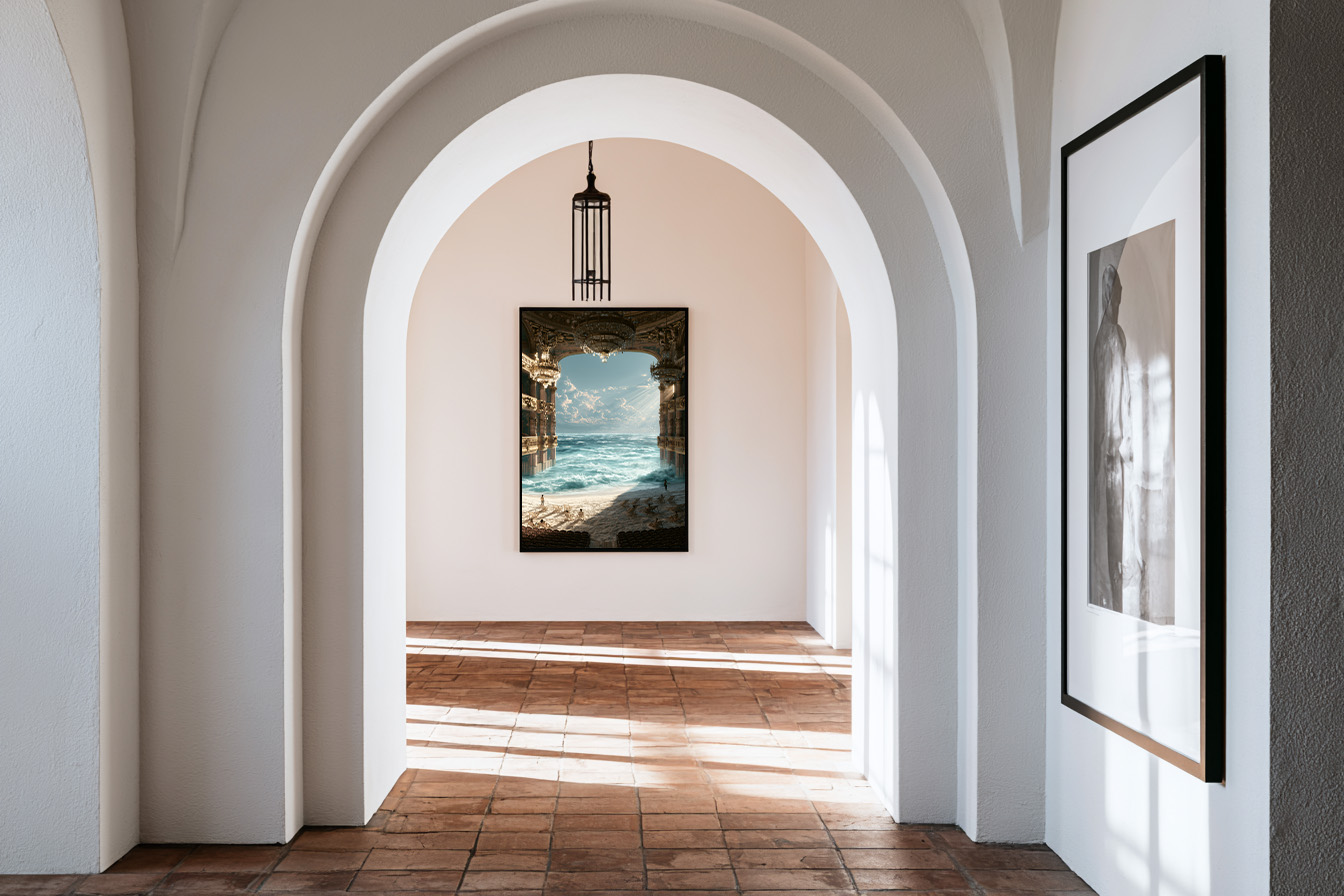
Choosing wall art is not just about finding a print you love — it is about finding a print that works with the room it is going into. Wall art color matching is the skill that separates an interior that feels considered from one that feels assembled. Get it right and the room coheres. Get it wrong and the best print in the world will look like it arrived by accident.
This guide covers the logic of colour in wall art: how to read a room’s palette, how to choose a print that works with it, and when to break the rules intentionally.
How to Read Your Room’s Colour Palette
Before choosing a print, you need to understand the colour language of the room it is going into. Every room has three colour layers:
The dominant colour is the main wall colour or the colour of the largest surface — typically the floor, walls, or a large sofa. This colour sets the temperature of the room: warm (terracotta, ochre, cream) or cool (slate, sage, white).
The secondary colour appears in upholstery, rugs, and large furniture pieces. It usually complements or contrasts the dominant colour.
The accent colour shows up in cushions, vases, trims, and small decorative objects. This is the colour the room already uses to create visual interest — and it is often the best starting point for choosing wall art.
When choosing a print for a room, look at the accent colour first. A print that echoes or amplifies the accent colour will feel like it belongs. A print that introduces an entirely new colour may feel like an interruption.
The Three Approaches to Wall Art Color Matching
There are three valid approaches to matching a print to a room’s colour palette. Each produces a different result.
Tonal matching — choosing a print that shares the same colour temperature as the room. A warm-toned room (terracotta walls, oak floors, linen sofa) paired with a warm-toned print (Amalfi golden light, Mediterranean sun, sunset tones) creates a room that feels unified and immersive. Everything speaks the same language. The risk is that the room can feel flat without enough contrast.
Accent amplification — choosing a print that picks up and amplifies one of the room’s existing accent colours. If the room has sage green cushions and a sage green throw, a print with green botanical tones will feel intentional and curated. This is the easiest approach to get right and the most commonly recommended.
Deliberate contrast — choosing a print that introduces a colour not present elsewhere in the room, for impact. A warm ochre print in a cool grey and white room. A vivid coral in a room of soft neutrals. This approach is the hardest to execute and the most rewarding when it works — it creates a focal point that commands the room. The key is confidence: contrast only works when it looks intentional, not accidental.
Warm vs Cool: The Most Important Distinction
The single most useful framework for wall art colour matching is temperature: warm versus cool. Almost every colour decision in interior design comes back to this distinction.
Prints that work here: the Aegean Blue Domes Framed Print, the Aperol Blue Framed Print and the Heirloom Tomatoes — Botanical Study Framed Print — each available as a framed print, ready to hang. Browse the full collection for more.
Warm rooms have walls in cream, beige, terracotta, sand, or warm white. Floors in honey oak, warm wood, or terracotta tile. Furniture in tan leather, rust, mustard, or warm grey. These rooms call for prints in warm tones — Mediterranean sun, golden light, earthy landscapes, warm fashion editorial. Introducing a cool blue or cold grey print into a warm room creates a visual jarring that most people sense without being able to name.
Cool rooms have walls in pure white, cool grey, pale blue, or sage. Floors in light bleached wood, white marble, or polished concrete. Furniture in cool linen, charcoal, or slate. These rooms absorb cool-toned prints naturally — architectural photography, black and white work, cool botanical prints, blue Mediterranean photography. A very warm print can work here as deliberate contrast, but it needs to be strong enough to read as intentional.
If you are uncertain which temperature your room is, look at the white in the space. Warm white has a cream or yellow undertone. Cool white has a blue or grey undertone. The white tells you everything.
Neutral Art in Colourful Rooms
One of the most reliable solutions to the wall art colour matching problem is to choose a print that is largely neutral — black and white, sepia, cream and gold — and let the room’s colour do the work around it. This approach works in any room because it removes the risk of colour conflict entirely.
A black and white fashion portrait in a colourful maximalist room becomes an anchor — a moment of visual silence amid the noise. A cream and gold abstract in a jewel-toned room adds warmth without competition. Neutral art is not a compromise. In a strongly coloured room, it is often the strongest choice.
→ Browse the Atelier Marbella collection — Mediterranean prints in warm and cool palettes, available framed, canvas, and matte with free delivery across Europe.
The Mediterranean Palette and How It Behaves
At Atelier Marbella, the palette we work with is specific: the warm, golden light of the Mediterranean summer. Terracotta and stone. Turquoise water and bleached concrete. The particular quality of light at 4pm in Marbella, Amalfi, or the Costa Brava — warm without being red, bright without being harsh.
This palette behaves predictably in interiors. It amplifies warm rooms and warms cool rooms. It works exceptionally well against:
Dark walls — navy, charcoal, forest green, deep terracotta. The warm Mediterranean tones pop against dark backgrounds and make the print feel luminous. This is one of the most underused combinations in residential design.
Warm neutrals — cream, sand, warm white, pale beige. The print becomes part of a tonal composition: the room and the art speak the same language at different volumes.
Natural materials — linen, rattan, raw wood, stone. Mediterranean art and natural materials share a reference point. They belong together in the same way that a photograph from Capri belongs on the wall of a room with terracotta tiles and a lemon tree in the corner.
FAQ — Wall Art Color Matching
How do I match wall art colour to my room?
Start with your room’s accent colour — the colour that already appears in cushions, vases, or small objects. A print that echoes or amplifies that colour will feel like it belongs. Alternatively, match the temperature: warm prints for warm rooms, cool prints for cool rooms.
Can I put a colourful print in a neutral room?
Yes — a single colourful print in a neutral room creates a clear focal point. The key is to commit: one strong colour print works better than several competing ones. The neutral room gives the print space to breathe and command attention.
Should wall art match the sofa or the walls?
Neither, specifically — wall art should work with the overall palette rather than match any single element. That said, if you are hanging a print above a sofa, consider the sofa’s colour first since it is the closest visual relationship.
What colour wall art works in any room?
Neutral prints — black and white, cream and gold, sepia tones — work in any room regardless of palette. They add visual interest without colour conflict. If you are uncertain about colour matching, a neutral print is always a safe and sophisticated choice.
Read Also:
→ Black and White Art Prints: The Case for Monochrome
→ Living Room Wall Art: The Statement Piece That Anchors a Room