
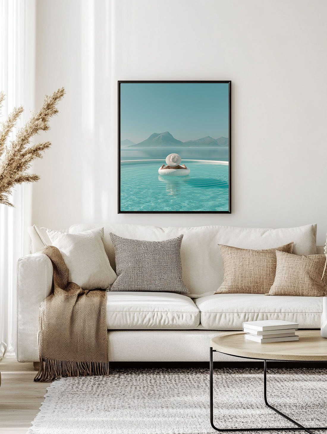
Choosing wall art for beige walls sounds straightforward until you’re standing in front of a screen full of prints and nothing quite looks right. Beige is deceptively complex — it reads differently depending on whether it leans warm, cool, or greige, and the wrong art can make a carefully considered wall feel flat. Here’s how to get it right.
First: Understand Your Beige
Not all beige is the same. Before choosing wall art for beige walls, identify the undertone of your specific shade. Hold a white piece of paper next to the wall in natural light — your beige will read as either warm (yellow, orange, or pink undertones), cool (grey or green undertones), or neutral. This tells you which colours in artwork will harmonise and which will clash.
Warm beige pairs beautifully with ochre, terracotta, rust, deep green, and warm blacks. Mediterranean prints, botanical art, and earthy lifestyle scenes all feel at home against warm beige.
Cool beige / greige suits dusty blue, sage, taupe, charcoal, and muted pinks. More graphic or editorial prints tend to work well here.
Wall Art for Beige Walls: Colours That Always Work
Deep green and botanical tones — olive, sage, forest green. The contrast between warm beige and rich botanical greens is one of the most satisfying combinations in interior design. An olive branch print on a beige wall needs nothing else.
Terracotta and warm rust — Mediterranean prints with earthy warm tones sit against beige without effort. The colours feel like they belong to the same palette.
Warm black and charcoal — a high-contrast print in warm black adds definition without fighting the wall colour. Fashion prints, graphic lifestyle scenes, automotive art.
Dusty blue and soft teal — particularly effective with warm beige. A coastal or Mediterranean print in these tones reads as effortlessly calm against the right shade of beige.
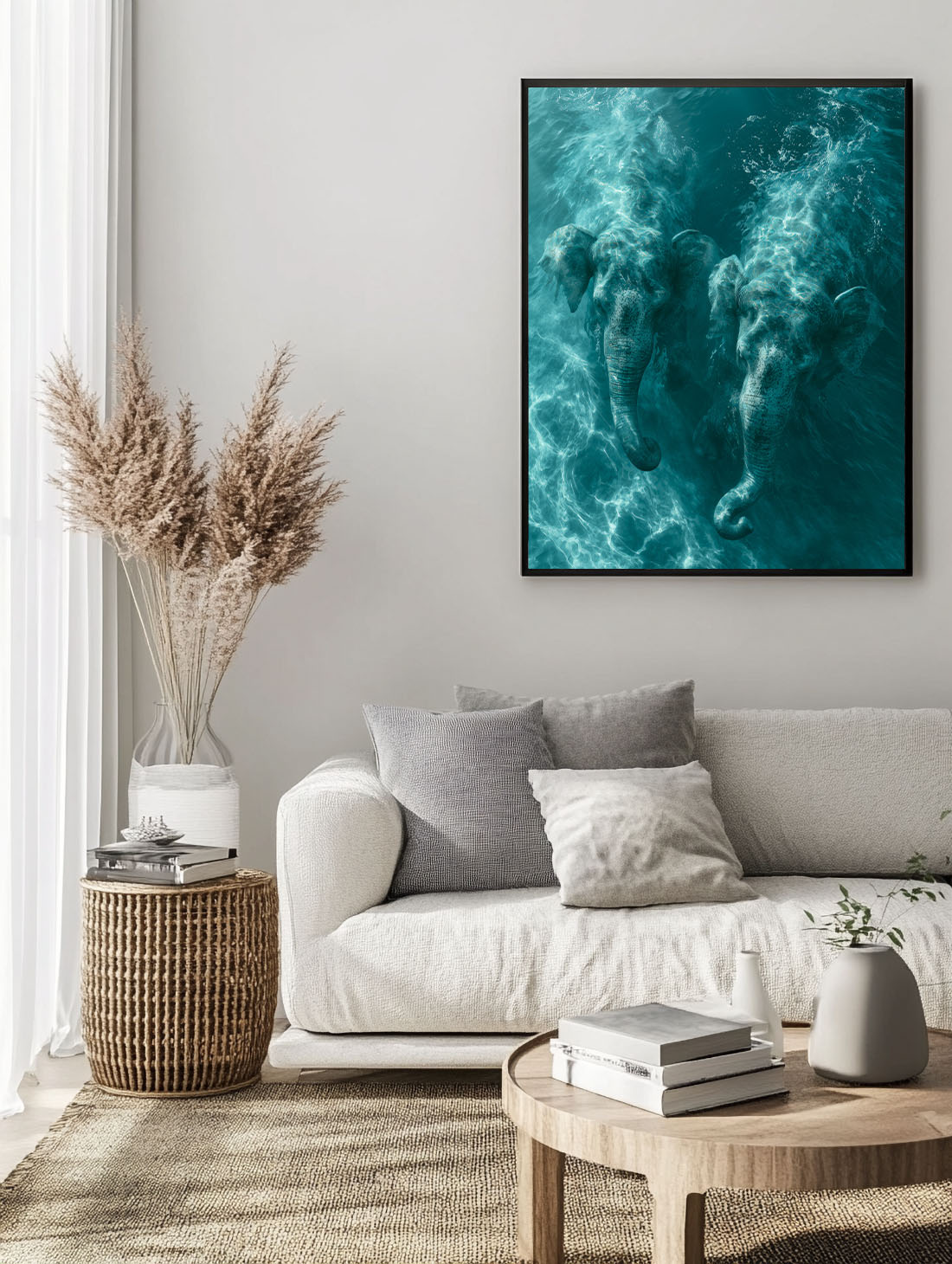
Art Styles That Suit Beige Walls Best
Botanical prints are the natural choice — they bring organic colour to a neutral wall without overwhelming it. A large-format botanical is one of the most reliable moves in interior design.
Prints that work here: the Ancient Olive Tree Framed Print, the Heirloom Tomatoes — Botanical Study Framed Print and the Andalusian Courtyard Framed Print — each available as a framed print, ready to hang. Browse the Botanical collection for more.
Mediterranean lifestyle art — pool scenes, coastal landscapes, aperitivo moments. The warm, sun-bleached palette of Mediterranean prints is almost purpose-built for beige walls.
Still life and food prints — terracotta tones, earthy greens, the warmth of ceramic and linen. These work particularly well in kitchens and dining rooms with beige or warm white walls.
Abstract prints with warm palettes — an abstract in ochre, sage, and cream reads quietly and confidently against beige without visual noise.
What to Avoid When Choosing Wall Art for Beige Walls
Cool greys and stark whites — against warm beige, cool-toned prints can look disconnected. If you want contrast, use warm contrast rather than cool.
Very pale prints without strong framing — a light print on a beige wall can disappear. Either go bold with colour, or compensate with a dark frame that gives the artwork definition.
Overly busy compositions — beige walls tend to be calming spaces. Very dense prints can feel jarring. Lean toward compositions that have space in them.
Frame and Format: The Finishing Details
For warm beige walls, natural wood frames — light oak, walnut, raw timber — are the most sympathetic choice. They stay in the same warm register as the wall. Warm brass frames also work beautifully. For format, portrait orientation tends to suit beige walls best. Aim for 50×70 cm or 70×100 cm for a standalone statement, or group smaller A3 prints in matching frames for a collected look.
Warm Beige or Cool Beige: Why Undertone Matters
Before you pick a print, look at the light. A warm beige with yellow or pink undertones glows in the afternoon and turns slightly orange in the evening. A cool beige with grey or green undertones looks flatter, especially in north-facing rooms. The print you choose should either echo the undertone or contrast with it on purpose.
For warm beige, lean into terracotta, ochre, deep green and honey tones, which feel like they belong to the same family. For cool beige, introduce a little contrast: navy, slate blue or a crisp black frame will stop the room from drifting into one flat note.
Test before you buy. Hold a printed colour swatch or a postcard against the wall in the morning, at noon and at night. If the print still looks good in all three, it will work on the wall.
Three Prints That Look Right on Beige
Sunken Courtyard — Andalusia brings architecture and shadow, which beige walls love: the warm stone and green foliage feel like an extension of the room.
Sierra Nevada from the Shore adds cool blues and a long horizon that open up a small beige room without changing the mood.
The Fig is the contrast option: deep purples and greens that give a neutral wall real depth. For more ideas, explore the full Mediterranean Mood collection.
The Simplest Rule for Wall Art on Beige Walls
Pick one colour from the artwork and repeat it somewhere else in the room — a cushion, a vase, a throw. That repetition is what makes wall art for beige walls feel intentional rather than accidental, and it’s the detail that separates a decorated room from a designed one.
Frequently Asked Questions
What colour wall art goes best with beige walls?
Terracotta, olive green, navy, deep burgundy and warm earth tones are the safest choices. For a bolder look, add one saturated accent colour and repeat it elsewhere in the room.
Should I use black or wood frames on beige walls?
Black frames add contrast and a more modern feel, while oak or walnut frames soften the room and suit warm beige. Avoid white frames on cream walls, as the difference can look dirty rather than intentional.
Can I hang colourful art on beige walls?
Yes. Beige is one of the best backdrops for colourful art because it stays quiet. Just keep the rest of the palette simple so the print remains the focal point.