
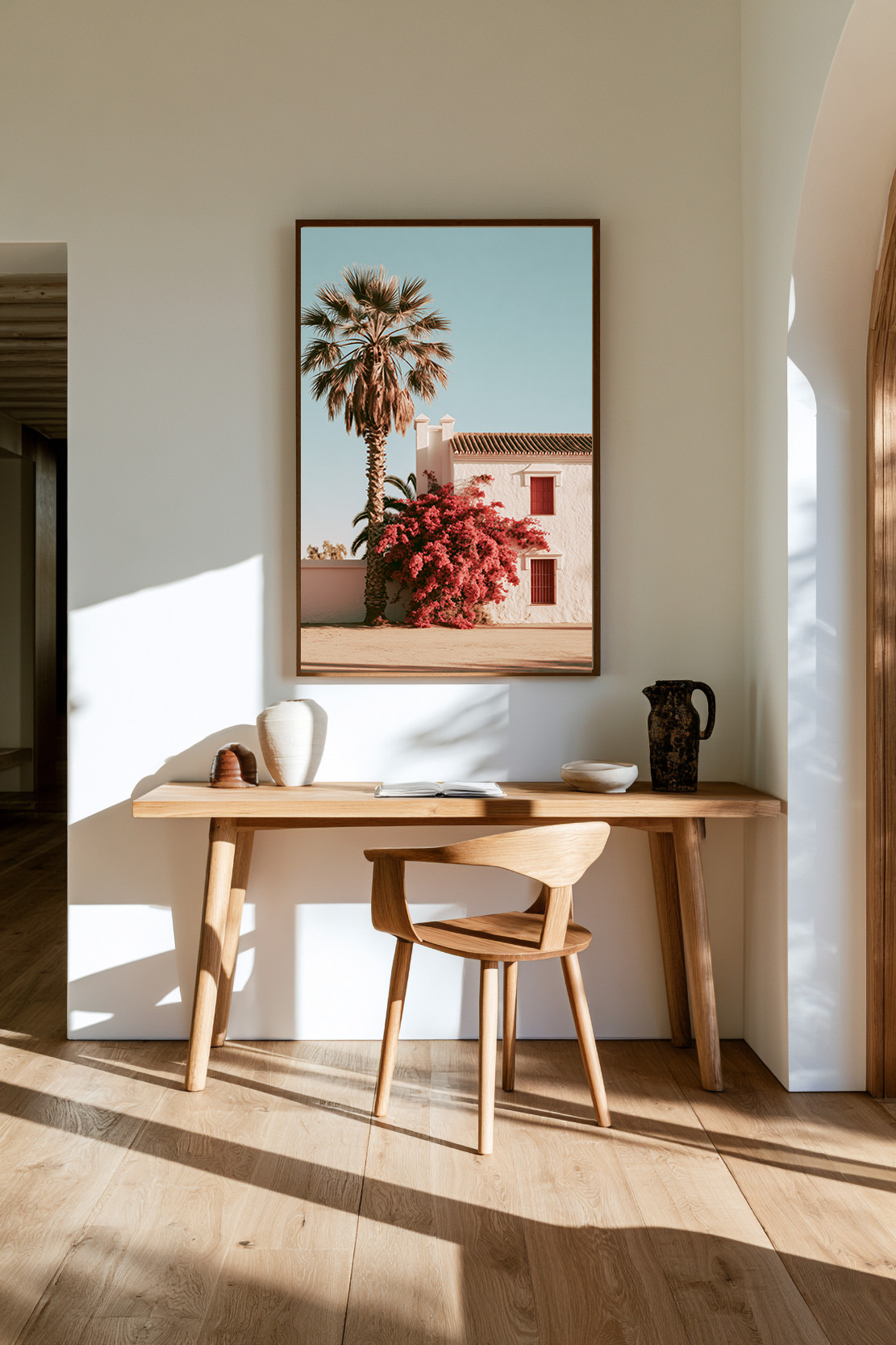
Abstract art prints are the most purchased and the most returned category in the art print market. The reason is almost always the same: people buy what looks good on a screen and discover it doesn’t work in their space. Or they buy something “safe” and end up with a piece that feels like it could have come from anywhere — because it could.
Choosing the right abstract print is a different skill from choosing a landscape or a portrait. There’s no subject to anchor you. No obvious narrative to follow. Just colour, form, and the feeling it creates in a room. Get it right and the piece becomes the quiet centre of gravity in a space. Get it wrong and it’s just something on a wall.
This guide cuts through the noise. Here’s how to choose an abstract wall art print that actually works — for your space, your palette, and your eye.
What Makes Abstract Art Work in an Interior
The question most people ask when looking at an abstract print is: “do I like it?” The better question is: “what does it do to the room?”
A successful abstract print does one of three things. It introduces a colour the room needs. It creates a visual anchor in a space that currently has no focal point. Or it brings an emotional tone — warmth, calm, energy — that the architecture and furniture alone can’t achieve.
When none of those three things are happening, the print is decorative in the worst sense: it fills a gap without adding anything. The goal isn’t decoration. The goal is atmosphere.
This is why abstract prints require more deliberate choices than other categories. With a landscape, the subject does some of the work. With an abstract, everything comes down to colour, composition, and execution.
The Three Types of Abstract Print — and Which One You Need
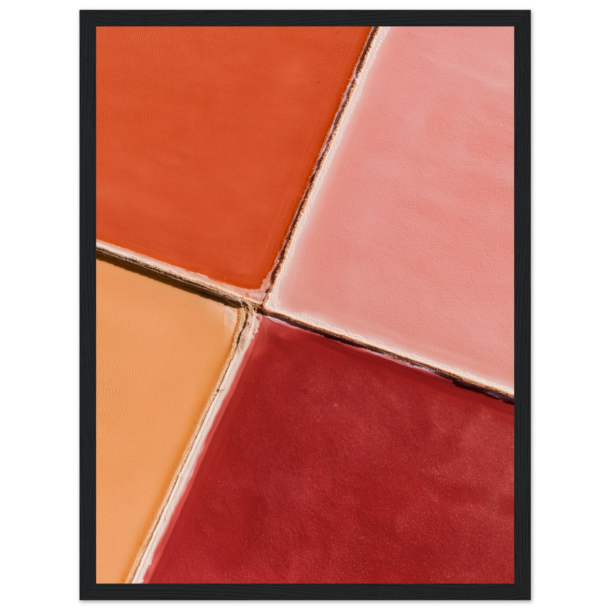
Abstract art is not a single category. Within it, there are three distinct types that behave very differently in an interior.
Colour Field and Gradient Abstracts
These are the most versatile. A colour field piece — horizontal bands of colour, soft gradients, washes of pigment — introduces tone and atmosphere without demanding attention. It works as a backdrop, deepening the colour story of a room without becoming its main subject.
This is the type of abstract print that works best in bedrooms, dining rooms, and any space where you want presence without noise. It’s also the most forgiving in terms of placement and scale.
Gestural and Expressive Abstracts
Gestural abstracts — brushstroke-heavy, energetic, with visible mark-making — bring movement and warmth. They feel human in a way that colour field pieces don’t. They’re also more demanding: they need space, and they need a room that can absorb their energy without feeling cluttered.
A large gestural abstract works brilliantly as a single statement piece in a living room or hallway. In a smaller space, the same energy can feel overwhelming.
Geometric and Structural Abstracts
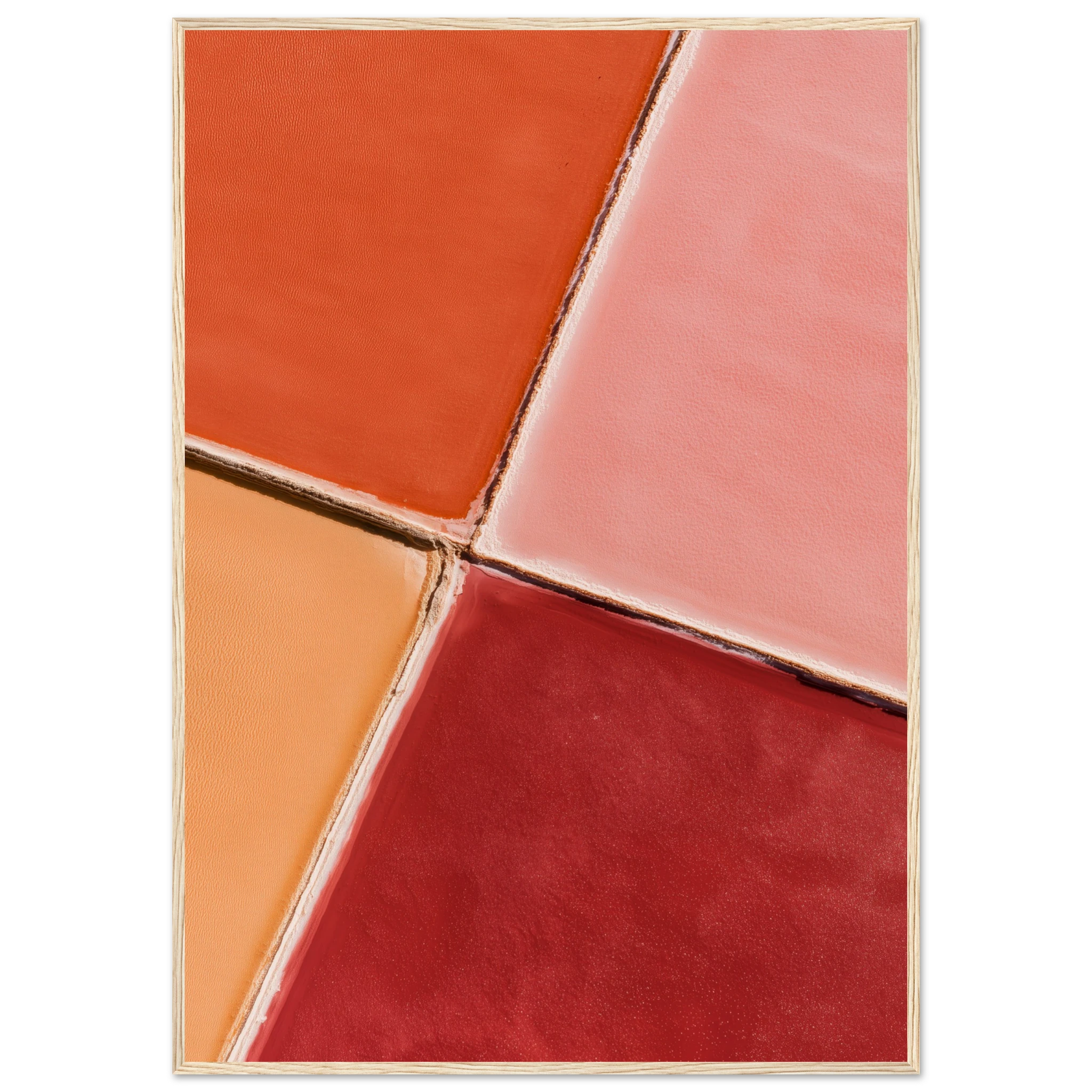
Clean geometry — precise lines, flat planes of colour, considered negative space — is the most architectural of the three types. It suits modern, minimal interiors and spaces with strong structural detail: exposed concrete, steel, dark timber. It can feel cold in warmer, more organic spaces unless the colour palette bridges the gap.
Colour: The Decision That Changes Everything
If you take one thing from this guide, let it be this: the colour of an abstract print is more important than its form.
Prints that work here: the Baroque Pool and Ocean Framed Print, the White Hat Infinity Pool Framed Print and the Aerial Infinity Pool and Sunbeds Framed Print — each available as a framed print, ready to hang. Browse the Abstract collection for more.
A print in the wrong colour will never work in a room, regardless of how well-composed it is. A print in the right colour can transform a space even if it’s compositionally simple.
Start with what the room already does. Look at the dominant tones in your flooring, walls, and largest pieces of furniture. A room built on warm neutrals — stone, oak, linen — responds well to abstracts in terracotta, ochre, warm olive, and dusty rose. A room with cooler, harder surfaces — concrete, white plaster, dark steel — suits abstracts in cobalt, sage, slate, and charcoal.
Then choose contrast or harmony. A print in a colour that already exists in the room creates harmony — safe, cohesive, occasionally too flat. A print that introduces one new colour — a single note that doesn’t appear elsewhere — creates interest. The best abstract prints in residential spaces tend to do the latter: they bring in one colour the room was missing, and anchor the entire palette around it.
The Mediterranean palette as a reference point. The colours of the Mediterranean — warm terracotta, dusty sage, deep cobalt, sun-bleached cream — work in almost any residential context because they carry natural light. They’re saturated without being loud. If you’re uncertain, these tones are a reliable starting point.
Browse our abstract art prints — each piece in the collection is available in multiple sizes, with a colour palette designed for residential interiors.
Scale, Format and Placement
The most common mistake with abstract prints is going too small. In a residential space, an abstract that isn’t large enough to command the wall it’s on will simply disappear. It won’t anchor the space. It won’t create atmosphere. It will be, as noted, just something on a wall.
As a general rule: the print should occupy at least two-thirds of the available wall width. For a standard wall in a living room or bedroom, this typically means a minimum of 70×100cm, and more often 100×140cm or larger.
Portrait vs. landscape format. Portrait format (taller than wide) suits walls with vertical emphasis — alongside a doorframe, above a console, in a hallway. Landscape format (wider than tall) suits walls with horizontal emphasis — behind a sofa, above a bed, over a sideboard.
Single piece vs. diptych. For wider walls, a single oversized abstract is almost always stronger than a pair of smaller pieces. The exception is a diptych — two pieces designed to work together — where the relationship between the two creates its own composition.
How to Tell Quality from Noise
The abstract print market is flooded with work that exists because it’s easy to produce, not because it deserves to exist. The challenge is learning to distinguish a piece with genuine compositional intelligence from one that was generated, tweaked, and uploaded.
Look at the negative space. In a well-composed abstract, the space that isn’t painted is as considered as the space that is. Negative space should feel intentional — not empty, but breathing. When negative space feels like a mistake, the composition usually is one.
Look at the edge behaviour. How a composition handles its edges — whether it extends beyond, stops cleanly, or fades — tells you a great deal about the thinking behind it. Pieces where the composition simply stops at the frame boundary feel arbitrary.
Look at the colour relationships. Two or three colours that genuinely work together — that create tension, harmony, or contrast with intention — are harder to achieve than they look. If a palette feels like it was chosen by algorithm rather than by eye, it probably was.
Test it in context. Most quality retailers offer digital room visualisation tools, or you can mock up the piece in a photo of your actual space. The difference between how a print reads on a white screen and how it reads surrounded by your actual walls, furniture, and light is significant. Always test before you commit.
The Atelier Marbella Approach to Abstract
The abstract prints in the Atelier Marbella collection are built around a specific visual logic: colour fields that carry Mediterranean light. Horizontal compositions in dusty sage and cobalt. Gradient washes in terracotta and warm sand. Pieces where the subject is atmosphere rather than form.
They’re not aggressively abstract — there’s no gestural drama, no dense mark-making. They’re quiet pieces that do their work slowly, changing how a room feels rather than demanding to be looked at. Which is, in most residential contexts, exactly what a good abstract should do.
Browse the abstract collection
FAQ
How do I know if an abstract print will work in my room?
Test it before you commit. Either use a digital visualisation tool, or photograph your wall and overlay the print at scale in any photo editing app. The key variable is colour — if the dominant tones in the print work with your walls and furniture, it will almost certainly work.
What size abstract art print should I buy?
Go larger than your instinct tells you. Most people underestimate how large a print needs to be to work on a wall. For most living room and bedroom walls, 70×100cm is a minimum; 100×140cm is the sweet spot.
Are abstract prints a good investment?
As decorative objects, quality abstract prints hold their value better than mass-produced work. Limited edition prints on fine art paper, in particular, tend to appreciate. But the better question is whether a piece improves your space — that’s where the real return is.
Can abstract art work in a traditional interior?
Yes — but the type of abstract matters. Colour field pieces and softer gradient abstracts tend to work well in traditional, warmer interiors. Hard geometric abstracts are more challenging to integrate. The key is colour: an abstract that picks up tones already present in the space will almost always feel at home.
Should I frame an abstract print?
A frame completes the piece and protects it. For colour field and gradient abstracts, a simple thin frame in natural oak or matte black allows the colour to do its work without competing. Avoid ornate or heavy frames — they create a visual mismatch with the abstraction of the subject.