
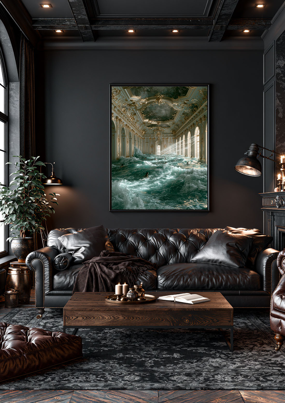
There is a persistent misconception about black and white art prints: that they are what you choose when you cannot decide, or when you want something safe. The opposite is true. Monochrome is a commitment. It is a design decision that says the composition is strong enough to carry the room without the assistance of colour.
This guide makes the case for monochrome wall art — and explains how to choose a black and white print that works, rather than one that merely exists on your wall.
Why Black and White Works in Every Room
Colour in art is immediate. It signals mood, temperature, and energy in the first second of perception. Black and white is slower. It asks you to look at form, contrast, texture, and composition — the bones of the image rather than its surface. This is why monochrome art tends to reward sustained attention more than colour work does.
It also solves one of the most common interior decorating problems: the clash. Colour art interacts — sometimes badly — with the palette of a room. A print with an ochre background may fight with orange undertones in the flooring. A vivid blue may vibrate against sage green walls. Black and white art sits cleanly in any palette. It does not compete. It anchors.
This is not a limitation. It is the reason monochrome wall art remains one of the most enduring choices in residential and commercial interior design. Hotels, galleries, and architects default to it not because it is neutral, but because it is versatile without being generic.
Subject Matter Matters More Than You Think
With colour removed, the subject and composition carry everything. A mediocre colour photograph becomes a flat monochrome print. A great composition — strong lines, interesting tonal range, a subject with genuine visual weight — becomes something striking in black and white.
Architecture and geometry gain authority in black and white. A villa facade, a curved staircase, a modernist pool — these become graphic in monochrome, almost sculptural.
Portraiture and fashion carry an editorial quality that colour often softens. The classic monochrome fashion portrait has an authority that resists ageing. It looks as relevant in ten years as it does now.
Animals with strong silhouettes — a giraffe, a leopard, a peacock — become graphic objects in black and white. The monochrome removes the literal and elevates the symbolic.
Cars and machines cross into the territory of sculpture in monochrome. The curves of a Porsche, the body of a Ferrari — mechanical forms become less about the vehicle and more about the form itself.
Mixing Black and White with Colour
One of the best uses of a black and white art print is as an anchor in a mixed gallery wall. A monochrome piece serves as a resting point — it allows the eye to settle before moving to colour.
Prints that work here: the Porsche 911 Classic and WW2 Planes Wall Art Framed Print, the Ferrari & Spitfire Framed Print and the Porsche & WWII Plane Framed Print — each available as a framed print, ready to hang. Browse the Cars collection for more.
The ratio that works: one monochrome print to two or three colour pieces. Too many monochrome prints in a colour-rich room and the space starts to feel clinical. One or two black and white prints in a warm, colourful room creates contrast without disruption.
When pairing monochrome with colour, pay attention to tone rather than hue. A cool-toned black and white print will sit more naturally alongside cool blues and greens. A warm sepia-leaning monochrome will feel more at home with earthy tones and warm neutrals.
Framing Black and White Art Prints
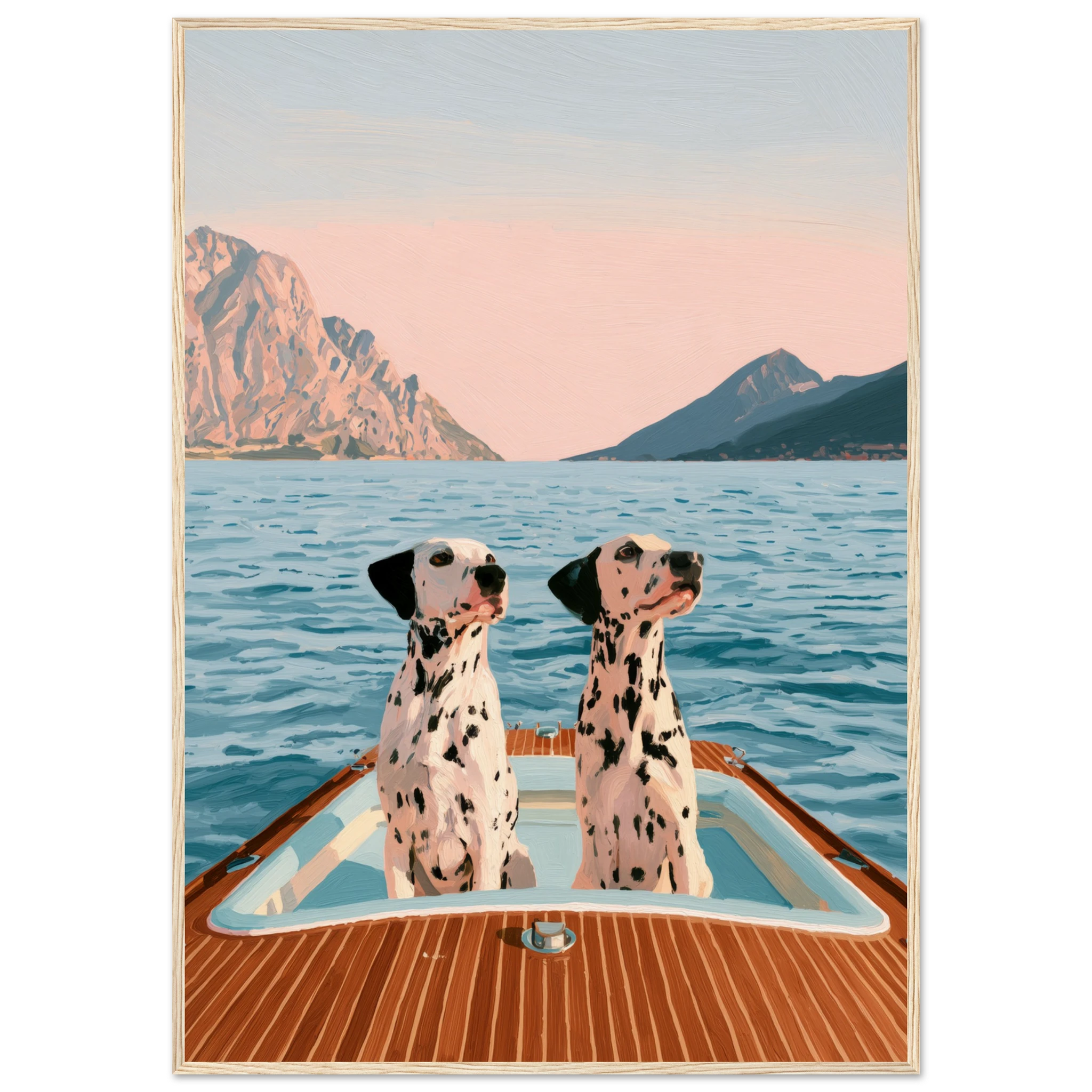
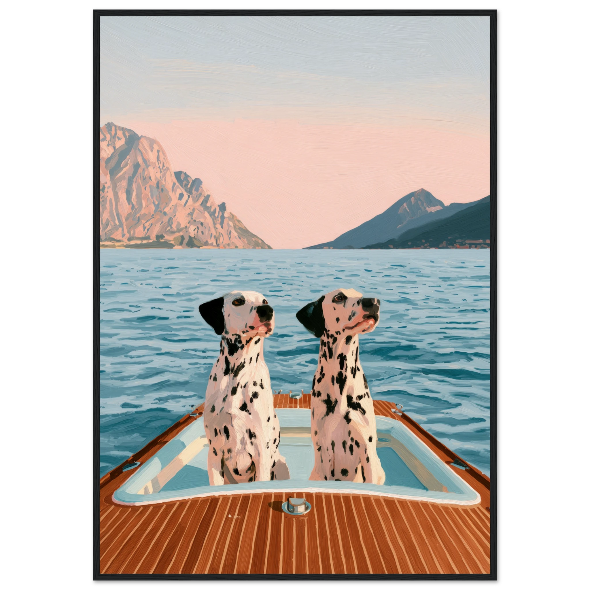
Black frame, no mat — clean, graphic, museum-like. Works best with architectural and fashion subjects.
White or natural wood frame with white mat — adds breathing room and gives a gallery quality. Works particularly well with portraits and animal prints.
Thin metal frame in black or brass — brass with a monochrome print creates unexpected warmth. The contrast between the cold palette of the image and the warmth of the frame is deliberate and effective.
→ Explore Atelier Marbella’s collection — framed, canvas, and matte prints available for every room and every palette.
Scale and Placement
Black and white prints tend to read better at larger scales than colour prints do. The tonal range of a monochrome image needs space to breathe. A small black and white print can feel dense and heavy. The same composition at 60×80cm or 70×100cm has room to develop.
If in doubt, go one size larger than you planned. This is true of wall art generally, but it is particularly true of monochrome work.
FAQ — Black and White Art Prints
Do black and white art prints go with everything?
Yes — monochrome wall art works with any colour palette precisely because it does not add colour to the equation. It anchors rather than competes.
What subjects work best as black and white prints?
Architecture, fashion portraiture, animals with strong silhouettes, and cars translate particularly well. The common thread is a strong composition with interesting tonal range.
How should I frame a black and white print?
A black frame reads as graphic and museum-like. A white frame with mat adds gallery breathing room. A thin brass frame adds unexpected warmth.
Can black and white prints work in a colourful room?
Yes — one or two monochrome prints in a colour-rich room create contrast without disruption. They serve as visual anchors.
Read Also:
→ Matte vs Canvas: Which Print Finish Is Right for You?
→ Living Room Wall Art: The Statement Piece That Anchors a Room