
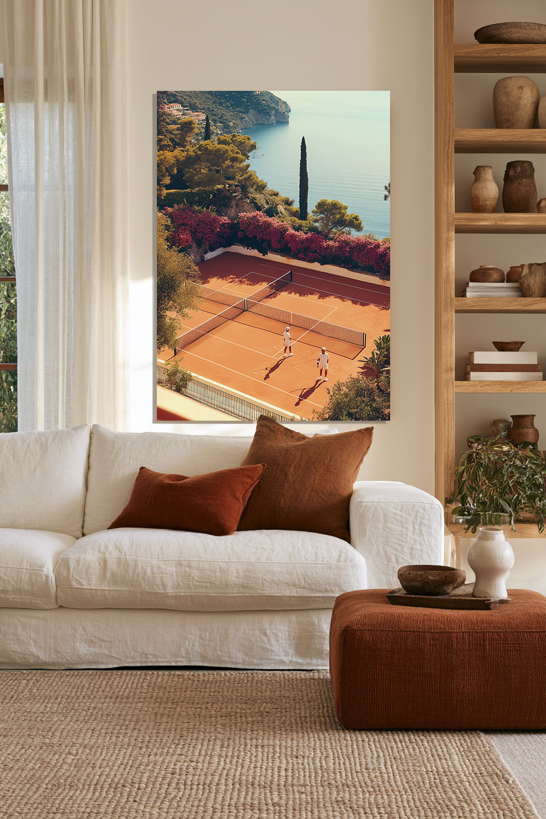
The hallway is the first thing anyone sees when they walk into your home. It sets the tone for everything that follows — the light, the scale, the sense of whether this is a space that was thought about or assembled by accident. Most hallways are assembled by accident. A coat rack, a mirror, a bare wall. Functional, forgettable.
Hallway wall art is the single fastest way to change that. One well-chosen print on the right wall doesn’t just decorate a corridor — it makes a statement about the rest of the house before anyone has seen the rest of the house. First impressions are set here, and they’re set quickly.
This guide covers what actually works in a hallway, why the usual advice gets it wrong, and how to choose a print that makes an entrance worth remembering.
Why the Hallway Is the Most Important Room for Art
Most interior design advice treats the hallway as secondary — the corridor between spaces that actually matter. This is exactly backwards. The hallway is where a visitor forms their first impression of your taste, your sense of scale, your relationship with colour. Everything they see in the living room or dining room will be interpreted through the lens of what they encountered at the front door.
A hallway with a strong piece of art signals something immediately: this is a space where decisions were made. The rest of the house may or may not live up to that promise — but the promise is made, and it raises expectations in the best possible way.
There’s also a practical dimension. Hallways are typically narrow and elongated. Art placed at the end of a hallway draws the eye through the space and makes the corridor feel longer, more architectural, more considered. Art placed on a side wall creates a moment — a pause in the transit — that changes how the space is experienced. Neither of these effects happens without the art.
What Actually Works in a Hallway
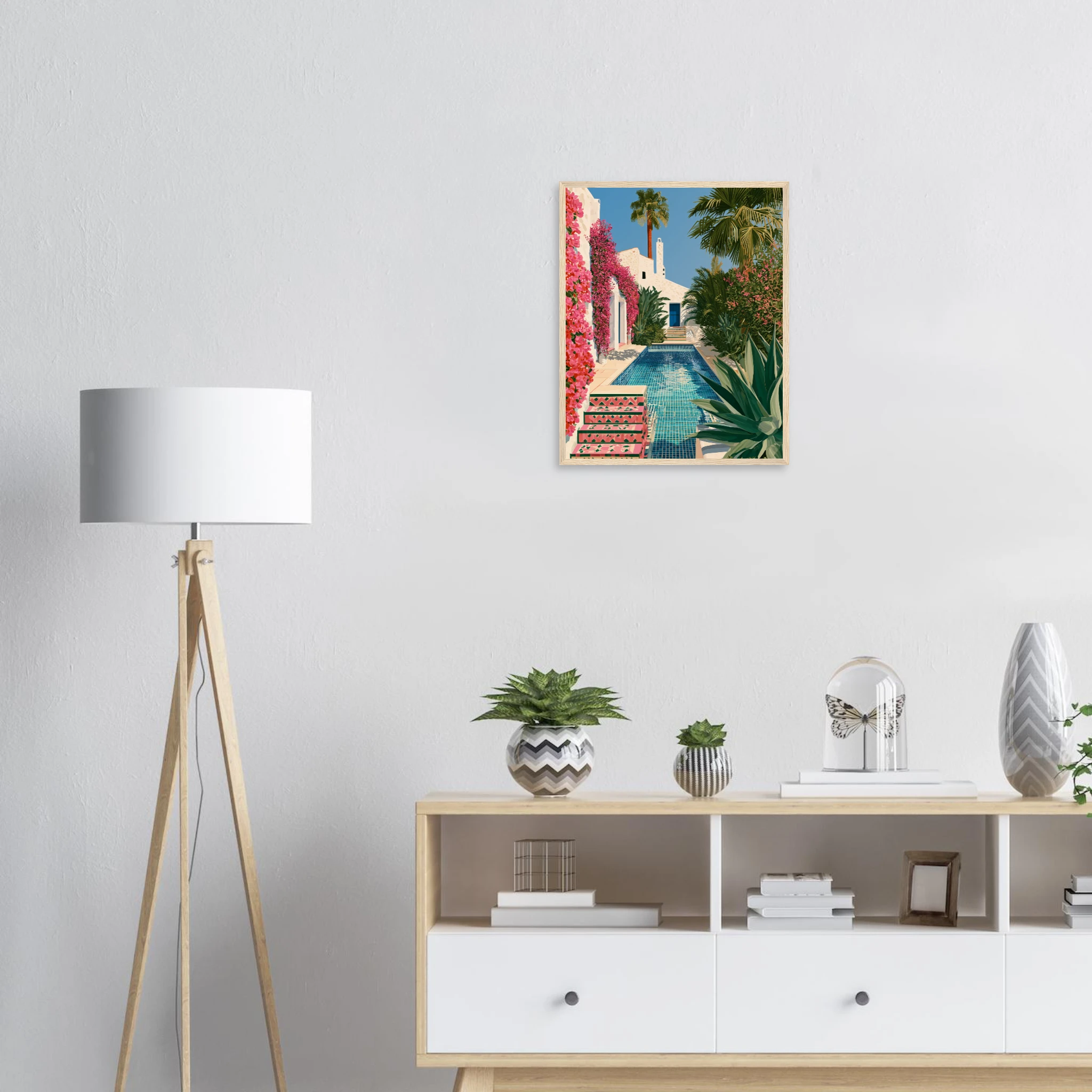
The hallway has specific constraints that determine what kind of art works in it. Understanding these constraints narrows the choice considerably — and makes the right decision clearer.
Viewing distance is limited. In most hallways, you’re never more than two or three metres from the wall you’re looking at. This means small, detailed work can read effectively — but it also means large, graphic pieces have maximum impact. A bold composition at close range is a very different experience from the same piece across a living room.
The space is transient. People move through hallways rather than inhabiting them. Art in a hallway needs to make its impression quickly — a strong composition, a striking colour, a clear subject. Pieces that reveal themselves slowly, that reward sustained looking, tend to be wasted in a hallway. Save those for rooms where people sit.
Light is often imperfect. Hallways frequently have limited natural light — no windows, or windows too small to fully illuminate the space. Art that depends on natural light to show its best should be carefully considered here. Pieces with strong inherent contrast — bold colour, graphic composition — perform more consistently under artificial light.
The format matters more than elsewhere. Tall, narrow hallways suit tall, vertical prints. Prints that emphasise horizontal breadth can feel incongruous in a space that naturally emphasises height and length. Portrait format — taller than wide — is the default choice for most hallway placements.
The Best Art Styles for a Hallway
Bold Graphic Art
The hallway rewards graphic confidence. A single large-format print with strong composition — clear subject, decisive colour, minimal visual noise — works better here than in almost any other space. The transient quality of the hallway means you want art that communicates immediately, and graphic work does exactly that.
Prints that work here: the Andalusian Courtyard Framed Print, the Porsche Springs Framed Print and the Spanish Cortijo Bougainvillea Framed Print — each available as a framed print, ready to hang. Browse the Mediterranean Mood collection for more.
This is where a bold editorial photograph — a Ferrari on a coastal road, an aerial view of a Mediterranean beach club, a fashion portrait with striking contrast — can be used to its full effect. The hallway gives it permission to be the dominant statement in the space because there’s nothing else competing.
Statement Photography
A single large-format photograph at the end of a hallway or on a prominent side wall is one of the most effective uses of photography in residential interiors. The image draws the eye through the corridor and gives it somewhere to arrive. The subject should have enough presence to sustain the encounter — a landscape with depth, an architectural detail with geometry, a portrait with gravity.
Black and white photography in particular suits hallways. The tonal contrast reads strongly under imperfect light, and the absence of colour allows the composition to do all the work.
Vertical Abstract Prints
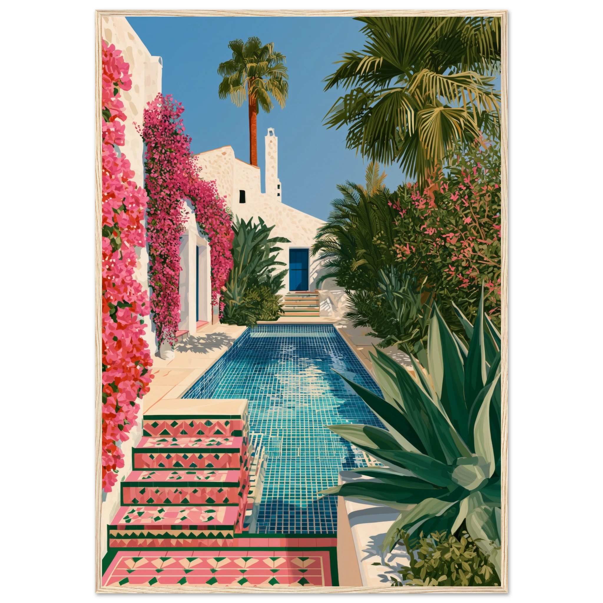
A tall abstract print — a colour field that reads vertically, a gestural piece with upward energy — suits the proportions of most hallways perfectly. The height of the composition reinforces the architectural height of the space, making the hallway feel more generous than its actual dimensions allow.
Abstracts also have a practical advantage in hallways: they don’t demand narrative interpretation. In a space where people are moving rather than contemplating, an abstract creates atmosphere and colour without requiring any particular engagement from the viewer.
A Gallery Wall
A hallway gallery wall — a curated grouping of related prints on a longer side wall — is one of the most satisfying uses of the space when done well. The key word is curated: related prints, consistent framing, deliberate spacing. A gallery wall that looks intentional creates the impression of a collector’s sensibility. A gallery wall that looks like accumulation creates visual chaos in a narrow corridor where there’s no escape from it.
For a Mediterranean-influenced hallway, a grouping of coastal prints, botanical studies, and architectural details — all in consistent thin black frames — creates a coherent identity that sets the tone for the whole house.
Size, Scale and Placement
The most common mistake in hallway art is the same as everywhere else: going too small. A print that is proportionally correct for a hallway is usually larger than instinct suggests — because instinct tends to scale down in narrow spaces, when the correct response is to scale up.
End-of-hallway placement. A print placed at the end of a corridor acts as a destination — the eye travels down the hallway and arrives somewhere. For this placement, the print should be large enough to fill the sightline: width approximately two-thirds of the wall, hung so the centre is at eye level. A piece that is too small here fails to anchor the space and makes the hallway feel unresolved.
Side wall placement. A print on a side wall creates a moment in the transit of the hallway — a reason to pause. For a standard hallway, 50×70cm is a workable size for side wall placement; 70×100cm is more commanding and suits longer hallways. Hang at standard eye level — approximately 150cm from floor to centre of print.
Height and proportion. In a hallway with high ceilings, consider a vertically oriented print that takes advantage of the height. In a standard ceiling hallway, a taller print still works — the vertical emphasis pulls the eye upward and makes the space feel more generous. Avoid wide horizontal prints in narrow hallways; they emphasise the width constraints rather than counteracting them.
Browse our hallway wall art collection — large format prints, bold editorial photography and vertical abstracts designed for impact at close range.
Framing for a Hallway
The hallway is a high-traffic space and framing decisions are therefore more consequential here than in rooms where the art is seen from a fixed position. A few principles apply.
Consistent framing across multiple pieces. If you’re hanging more than one print in a hallway, consistent framing — same profile, same colour, same material — makes the grouping look deliberate. Mixed framing in a hallway reads as accumulation rather than curation.
Slim profiles work best. Heavy, ornate frames add visual mass to a space that typically can’t absorb it. Thin frames in black, natural oak, or brushed metal suit both the proportions of the hallway and the practical need to minimise projection from the wall in a narrow corridor.
Glazed frames for high-traffic spots. If the hallway is particularly narrow or if prints are placed near coat storage or doorways, glazed frames provide protection from incidental contact and make cleaning easier.
The Atelier Marbella Approach to Hallway Art
At Atelier Marbella, we think of hallway art as the opening statement — the piece that tells a visitor immediately what kind of house this is and what kind of eye curated it. The prints we’d recommend for a hallway are those with the clearest graphic presence: editorial photographs with strong composition, bold Mediterranean landscapes, architectural details with genuine weight.
For a Mediterranean or contemporary villa aesthetic, a single large-format editorial print at the end of a hallway — a Capri aerial, a Porsche on a coastal road, a Mykonos village at golden hour — makes an immediate and unambiguous statement. It says the rest of the house will be worth the visit.
FAQ
What size art should I put in a hallway?
Larger than instinct suggests. For a side wall, 50×70cm is a minimum and 70×100cm is more effective. For end-of-hallway placement, go as large as the wall allows — the print needs to fill the sightline and act as a destination for the eye.
Should hallway art be portrait or landscape format?
Portrait format (taller than wide) is almost always the right choice for a hallway. The vertical emphasis suits the proportions of a corridor and makes the space feel taller. Landscape prints tend to emphasise the horizontal constraints of a narrow hallway.
How high should I hang art in a hallway?
Standard eye level — approximately 150cm from floor to the centre of the print. In a hallway with high ceilings, you can hang slightly higher to take advantage of the vertical space, but maintain a consistent hanging height across multiple pieces.
Can I do a gallery wall in a narrow hallway?
Yes — but keep it tightly curated. Consistent framing, related subjects, deliberate spacing. In a narrow hallway, a gallery wall that looks intentional is impressive; one that looks busy is claustrophobic. When in doubt, fewer pieces at larger sizes is the safer choice.
What style of art works best in a hallway?
Art that communicates quickly — bold composition, strong colour, clear subject. Because hallways are transient spaces, art that rewards sustained contemplation tends to be wasted here. Save the nuanced pieces for rooms where people sit. In the hallway, graphic confidence wins.