
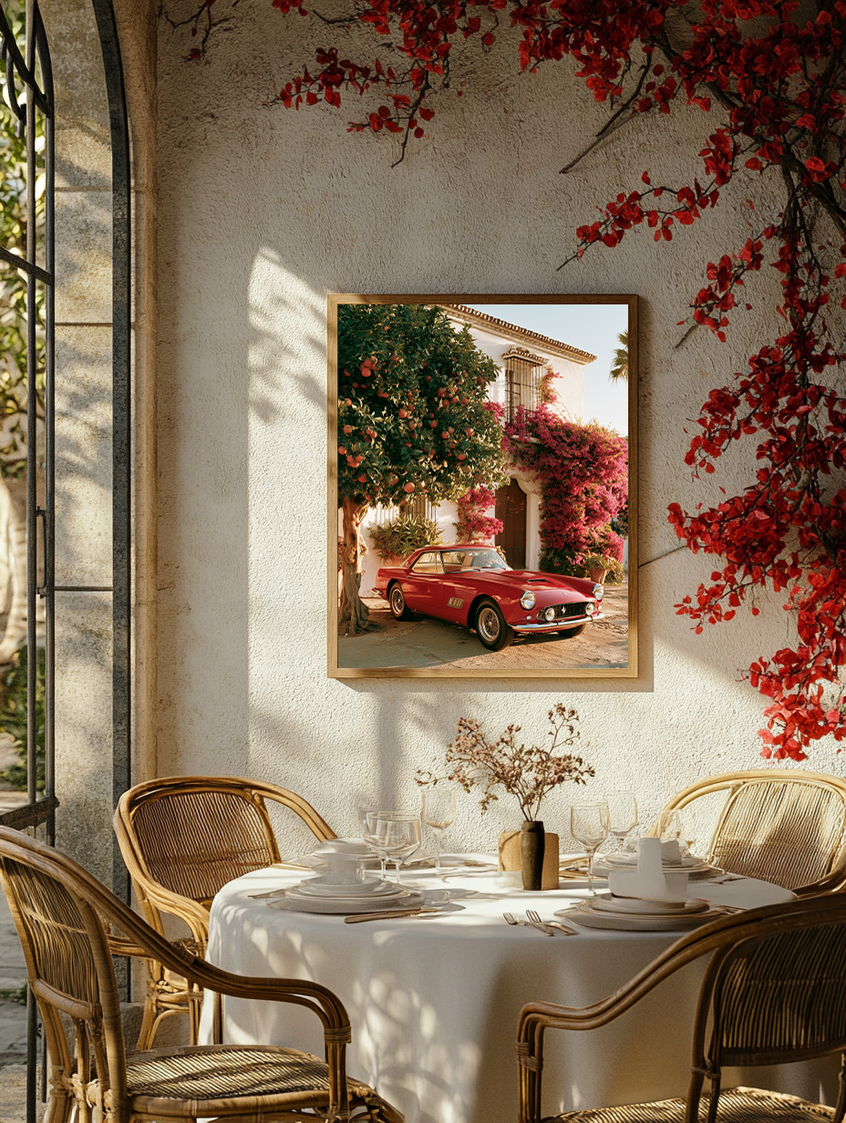
Ferrari wall art is unlike any other automotive subject. The car carries decades of mythology — race victories, cinematic appearances, an almost irrational beauty — and a great photograph reduces all of that to a single image. One print, properly chosen and placed, brings that energy into a room without a word of explanation needed.
In This Article
- Why Ferrari Works as Wall Art
- The Models Worth Hanging: 250, F40, and the Modern Era
- How to Choose Your Ferrari Print
- Where to Place It
- What to Pair It With
- FAQ
Why Ferrari Works as Wall Art
Ferrari occupies a unique position in automotive culture — it is both a racing machine and a design object, both a status symbol and a genuine work of engineering art. That duality is exactly what makes it such compelling subject matter for wall art. A great Ferrari art print doesn’t read as a poster. It reads as a statement about taste, precision, and the belief that beauty and performance are not opposites.
The colours alone tell a story. Rosso Corsa — the specific red that Ferrari has made its own — is one of the most recognisable colours in the world. In the right print, with the right light, it can anchor an entire room. But Ferrari photography also works brilliantly in monochrome: the silhouette of a 250 GTO or the wing profiles of a modern hypercar become almost abstract when stripped of colour, gaining a sculptural quality that belongs in any serious interior.
What separates Ferrari from most automotive wall art subjects is that the cars were designed to be looked at. Enzo Ferrari famously said he built cars that made people stop in the street. That quality — the involuntary second glance — is precisely what a strong piece of wall art should do in a room.
The Models Worth Hanging: 250, F40, and the Modern Era
Not every Ferrari translates equally well into wall art. The most compelling prints tend to focus on cars with a strong visual narrative — models that carry a story most viewers either know or feel instinctively.
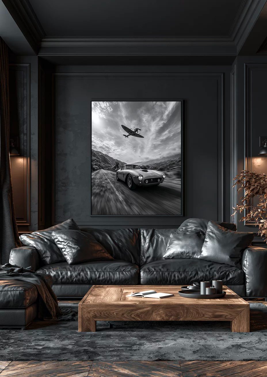
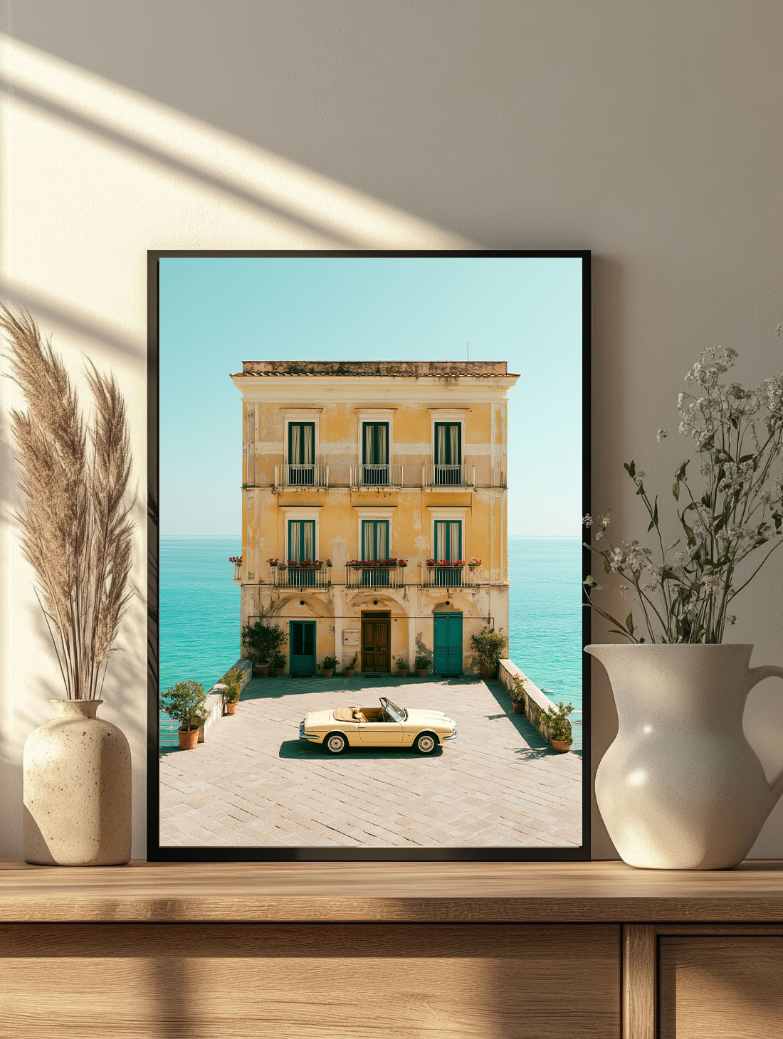
Prints that work here: the Vintage Red Ferrari Marbella Framed Print, the Ferrari & Spitfire Framed Print and the Fiat 500 Amalfi Framed Print — each available as a framed print, ready to hang. Browse the Cars collection for more.
The 250 GTO is the purest choice: considered by many the most beautiful car ever made, it has a timeless quality that belongs in a room the way a great sculpture does. Photographs of the 250 in Rosso Corsa against a clean background — track, road, or studio — have an almost classical composure. They age with a room rather than dating it.
The F40 is the choice for those who want tension on the wall. Launched in 1987 as Enzo Ferrari’s final project, the F40 has an aggressive, uncompromising silhouette — low, wide, with that iconic twin-turbo rear — that generates energy from across the room. A large-format F40 print in black and white is one of the most powerful automotive images available.
For the modern era, the LaFerrari and SF90 Stradale offer more graphic, angular compositions that work well in contemporary interiors. Their complexity rewards close looking — every angle reveals something new — making them particularly effective in a study or library where the viewer has time to engage.
How to Choose Your Ferrari Print
The first decision is colour versus black and white. Colour Ferrari prints — particularly in Rosso Corsa — work best when the room can absorb that intensity: dark walls, natural materials, a palette that leans warm. Rosso against navy, charcoal, or deep olive feels intentional and precise. Against pale walls or light furniture, the red can fight rather than anchor.
Black and white Ferrari prints are more versatile. They bring the graphic power of the subject — the silhouette, the light on bodywork, the composition — without introducing a dominant colour. In a room with a strong existing palette, a monochrome Ferrari print integrates without disruption while still commanding attention.
Format matters as much as subject. Ferrari prints work well both as single large-format statements (100×150 cm and above) and as part of a diptych or triptych — two or three prints of different angles of the same model, or different cars from the same era, hung with deliberate spacing. The latter approach suits longer walls and creates a gallery-within-a-gallery feeling.
Where to Place It
A Ferrari wall art print earns its place in rooms where it can be properly seen and where its energy suits the space. A living room feature wall, a study, a dedicated games or media room — these are the natural homes. Above a fireplace is the obvious choice for a single large-format print: the proportions work, the focal point is established, and the print has room to breathe on either side.
In a home office or study, a Ferrari print positioned at desk level or slightly above — directly in the eyeline when seated — works as both inspiration and visual anchor. The car’s association with precision and performance suits a space dedicated to focused work.
One placement to avoid: anything below 130 cm from the floor. Ferrari prints — and automotive art generally — lose their commanding quality when they sit low. The centre of the print should land at 145–150 cm from the floor, the standard eye-level position for art in domestic settings.
What to Pair It With
Ferrari art pairs naturally with interiors that share its values: precision, materials with integrity, a certain restraint that makes every element count. Leather, steel, dark wood, concrete — these materials create the right context. An overly soft or maximalist interior can work against the print rather than with it.
In terms of other art, a Ferrari print holds its own as a single statement. If building a gallery wall around it, choose works that offer contrast in subject and scale rather than competition — an abstract piece, a landscape, or a close-up detail shot that doesn’t draw the same kind of direct attention. The Ferrari should remain the primary subject.
If you’re drawn to a broader automotive theme — Porsche alongside Ferrari, or a Le Mans scene with a single-car portrait — keep the tonal palette consistent across all prints. Black and white throughout, or colour prints that share a similar warmth or saturation, will hold the grouping together visually.
FAQ — Ferrari Wall Art
What size Ferrari print works best for a living room?
For a living room feature wall, 100×70 cm is a solid starting point — large enough to read clearly from across the room, proportioned well for standard wall heights. For a truly statement piece above a sofa or fireplace, 120×80 cm or 150×100 cm gives the print the presence it deserves. Avoid anything below 60×40 cm as a standalone piece — the detail in automotive photography needs room to breathe.
Does Ferrari wall art only work in a masculine interior?
Not at all. The assumption that automotive art is exclusively masculine is a decorating cliché rather than a design principle. A 250 GTO in Rosso Corsa against a white wall with natural linen and warm wood reads as sophisticated and design-literate, not gendered. The key is choosing a print with real photographic quality — composition, light, intention — rather than a generic promotional image.
Which finish is best for a Ferrari art print?
Matte finish is almost always the right choice for automotive photography. It eliminates reflections — which can obscure detail at certain angles — and gives the print a gallery-quality seriousness that suits the subject. Canvas adds texture that can work well for larger, more painterly compositions, but for precision photography of a precision machine, the clean surface of a matte print is the better match.
Can I hang a Ferrari print in a bedroom?
Yes, with the right approach. A large, calm composition — a Ferrari at rest rather than in motion, or a close-up detail of the bodywork — suits a bedroom better than an action shot. The energy of a racing image works in a living room or study; in a bedroom, choose something that rewards quiet looking. A monochrome 250 GTO in a clean studio setting, for example, is a genuinely beautiful image that works in any room.