
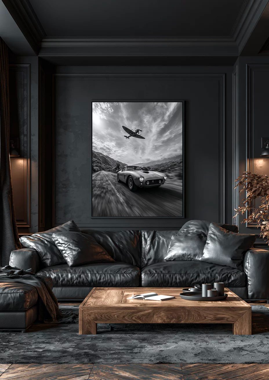
There’s a reason professional interior designers reach for matte art prints before anything else. It’s not just about aesthetics — it’s about what a matte surface does to a room that no other finish can replicate.
What a matte art print actually is
A matte art print is produced on a non-coated, non-reflective paper stock. Unlike glossy or satin finishes, it absorbs light rather than bouncing it back. The result is an image that reads as pure colour and form — no glare, no hot spots, no surface interference.
In practical terms, this means matte prints look equally good under natural daylight, warm LED lighting, and even direct spotlighting. They adapt to the room rather than fighting it.
Most art museums print their exhibition posters on matte stock for exactly this reason. The image is what matters — the surface shouldn’t compete with it.
Why interior designers prefer matte over glossy
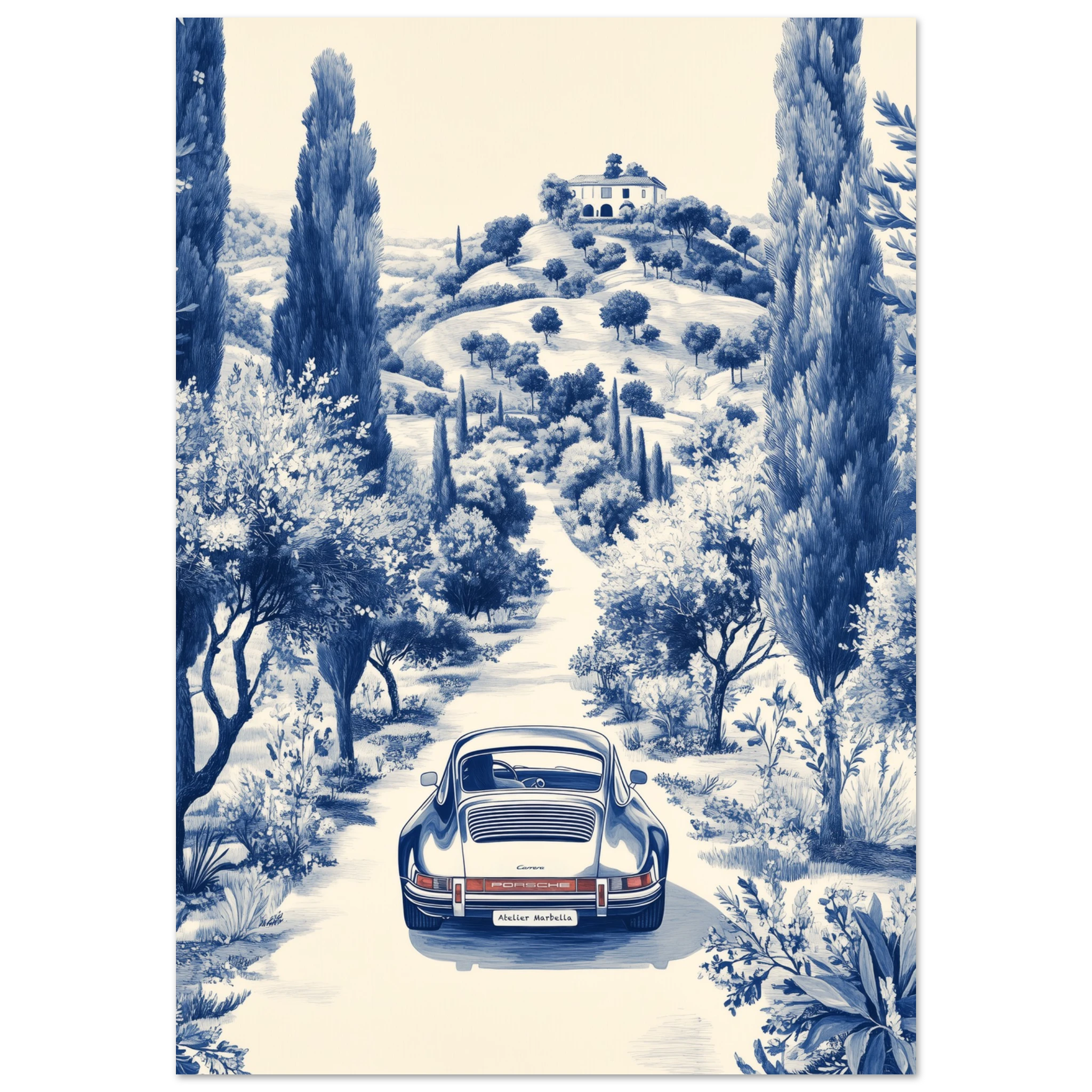
Glossy prints have their place — in product photography, in certain graphic contexts. But in residential interiors, the reflective surface creates constant visual noise. Every light source in the room appears as a competing element on the print’s surface.
Matte art prints eliminate that problem entirely. You can hang a matte print opposite a window without any loss of legibility. The image stays constant regardless of where you’re standing or what time of day it is.
For art prints in particular — where the image is the whole point — that consistency is everything. Interior designers know this. It’s why matte is almost always the default recommendation.
The rooms where matte prints perform best
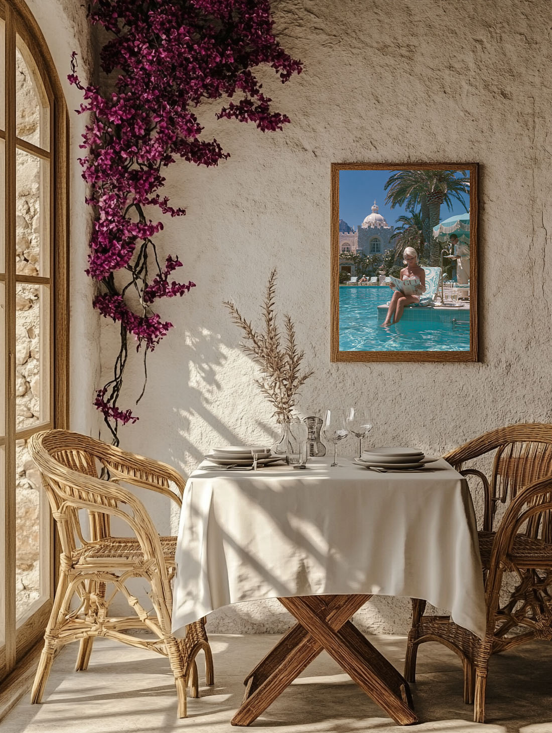
Matte art prints work in every room, but they excel in certain contexts. Living rooms with large windows, where light conditions change throughout the day, benefit enormously from a non-reflective surface. The print looks the same at 9am as it does at 9pm.
Prints that work here: the Ancient Olive Tree Framed Print, the Amalfi Giallo Framed Print and the Zoée in the Sun Framed Print — each available as a framed print, ready to hang. Browse the Botanical collection for more.
Bedrooms are another natural home for matte prints. The quietness of a matte surface suits the lower light levels and the overall mood of a bedroom. Glossy in a bedroom feels slightly clinical by comparison.
In hallways and entryways — where artificial lighting often hits prints at an angle — matte is the only finish that works reliably. A glossy print in a hallway almost always shows glare at some point in the day.
Discover art prints made for interiors that have taste.
Explore the collection →Matte vs canvas vs framed prints — understanding the difference
Canvas prints have a textural quality that matte prints don’t — the weave of the canvas is visible up close, which gives the image a more painterly feel. That quality suits certain interiors (warm, eclectic, maximalist) but can feel heavy in cleaner, more minimal spaces.
Framed prints — whether on matte or glossy stock — add a sense of formality. The frame defines the artwork’s boundaries clearly and suits gallery-style arrangements, statement walls, and formal rooms.
Matte art prints sit in the middle: more refined than canvas, less formal than framed. They work as standalone pieces or in grouped arrangements, and they suit almost every interior style from Japandi to warm contemporary.
How to hang a matte print without damaging it
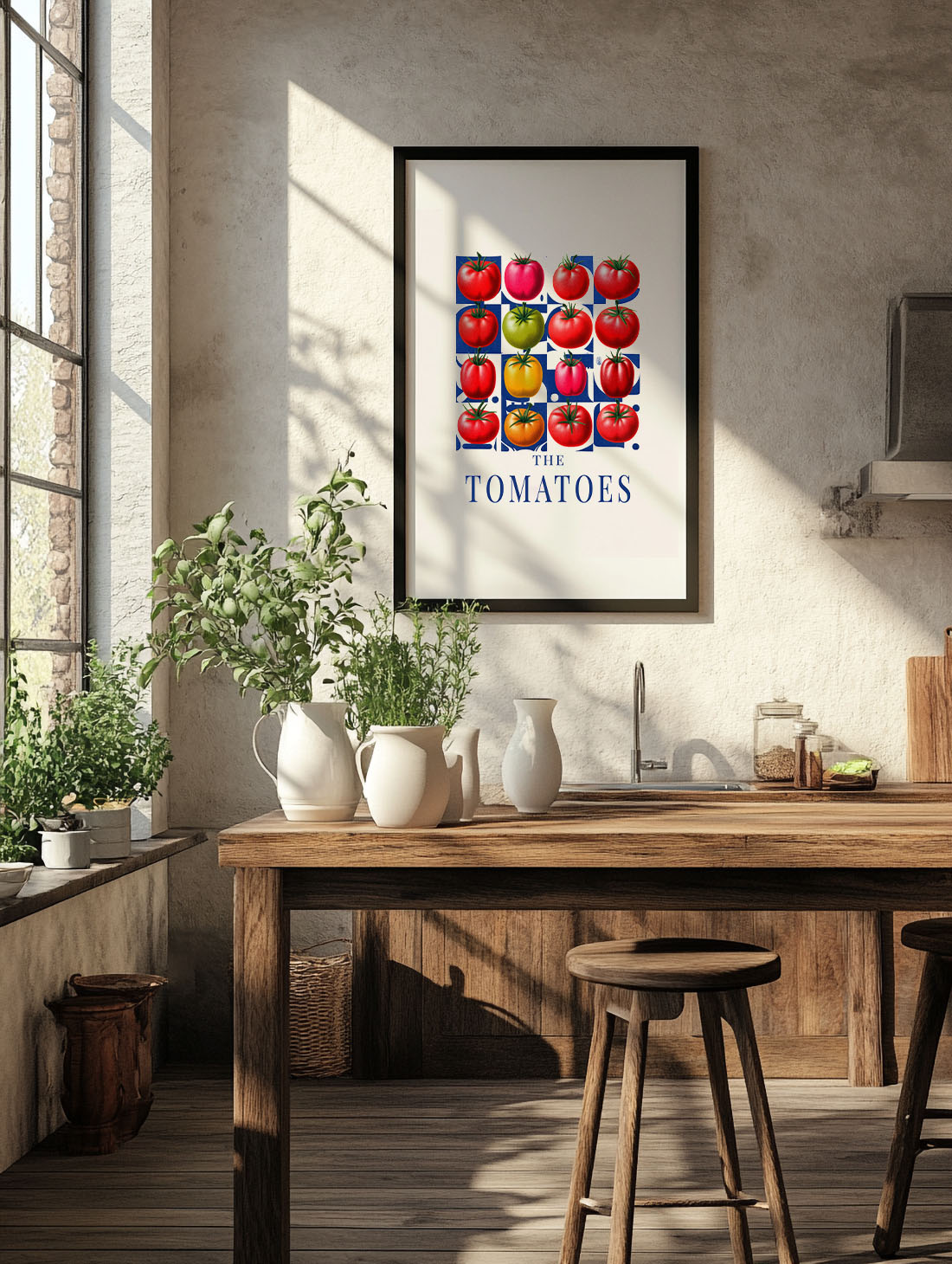
Matte prints are more sensitive to moisture and fingerprints than glossy or framed alternatives. Always handle from the edges. If you’re framing the print yourself, use acid-free mat board and UV-protective glass or acrylic to prevent yellowing over time.
When hanging, use picture hooks rated for the weight of the frame. For larger prints (70×100 cm and above), use two hooks to distribute the weight and keep the print level. A laser level — or even just a good phone app — saves a lot of readjusting.
Avoid hanging matte prints in bathrooms or kitchens where humidity is high. The paper can warp over time in damp conditions, even behind glass.
FAQ — matte art prints
Is a matte art print better than a glossy one for home interiors?
In most cases, yes. Matte prints avoid glare and work under any lighting condition. Glossy prints can look sharp, but they reflect light sources in ways that reduce the readability of the image.
Can you frame a matte art print yourself?
Absolutely. Most standard frame sizes (50×70, 60×90, 70×100 cm) are widely available. Use acid-free backing and UV-protective glazing to protect the print over time.
Do matte prints fade faster than other finishes?
It depends on the inks used, not the surface finish. Archival pigment inks on quality matte stock can last 80 to 100 years without significant fading when kept out of direct sunlight.
What’s the ideal room for a matte art print?
Any room where lighting conditions change (living rooms, bedrooms) or where artificial light hits at an angle (hallways). Matte performs reliably in all these contexts.
Can matte prints work in a gallery wall arrangement?
Yes — and they’re often the better choice for groupings, since the consistent surface across multiple prints creates a more cohesive look than mixing finishes.