
A dark wall changes how a room feels. Navy, forest green and oxblood make a space quieter, warmer and more intimate, and they also make weak art disappear. Choosing wall art for dark walls is less about finding something “dark” than about finding images that glow against the paint: light grounds, warm tones, strong shapes. This guide covers what works on each colour, which frames to pick, and how to hang a print so the wall looks deliberate rather than heavy.
Why Art Behaves Differently on Dark Walls
On a white wall, a print has to compete with the light in the room. On a dark wall, the print becomes the light. Pale paper, cream borders and warm highlights jump forward, while mid-tone, muddy images sink into the paint and look flat. Three rules follow. Choose images with real contrast. Favour warm accents, such as terracotta, ochre, cream and fig red, over cool greys. And leave a little breathing room around each print, because a dark wall already feels full.
If you are coming from a pale scheme, our guide to wall art for beige walls covers the opposite problem. Here we go the other way.
Oxblood and Burgundy Walls
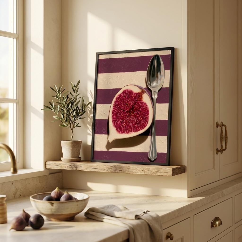
Oxblood is the warmest of the dark colours. It loves cream, gold and a touch of green. The Fig is built for it: a halved fig in deep plum and raspberry on a striped cream ground, which echoes the wall colour without matching it exactly. A cream mount and a dark wood frame finish the look. For a bolder version, The Blood Pomegranate pushes the same idea into ruby reds and works especially well in a dining room.
Avoid prints with a lot of pink or pale blue here, which turn sugary against a burgundy wall. Keep the palette in the red-cream-gold family.
Navy and Midnight Blue Walls
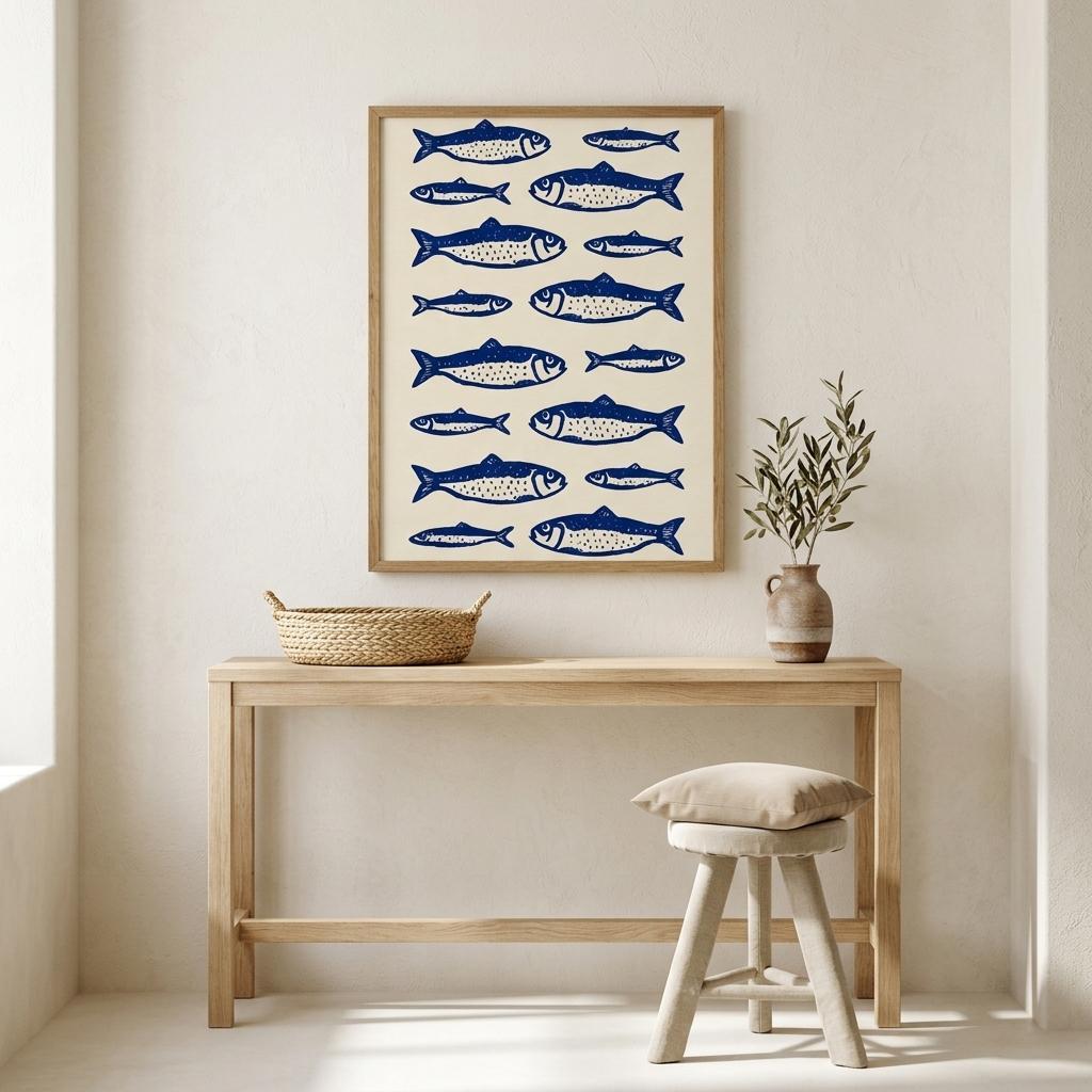
Navy is the easiest dark colour to live with, and it flatters almost any warm print. Cream grounds are the classic answer, and Sardines — Cobalt Edit is a good example: cobalt fish on an off-white background, graphic enough to hold the wall and light enough to lift it. A black frame sharpens the contrast, while an oak frame softens the whole composition and suits a coastal or kitchen setting.
For a more dramatic room, try a night scene. Marbella Nights shows a lit villa and pool under a deep blue sky, and the turquoise glow of the water sings against navy paint. Hang it in a bedroom or a snug, where the mood can be quiet and cinematic.
Forest Green Walls
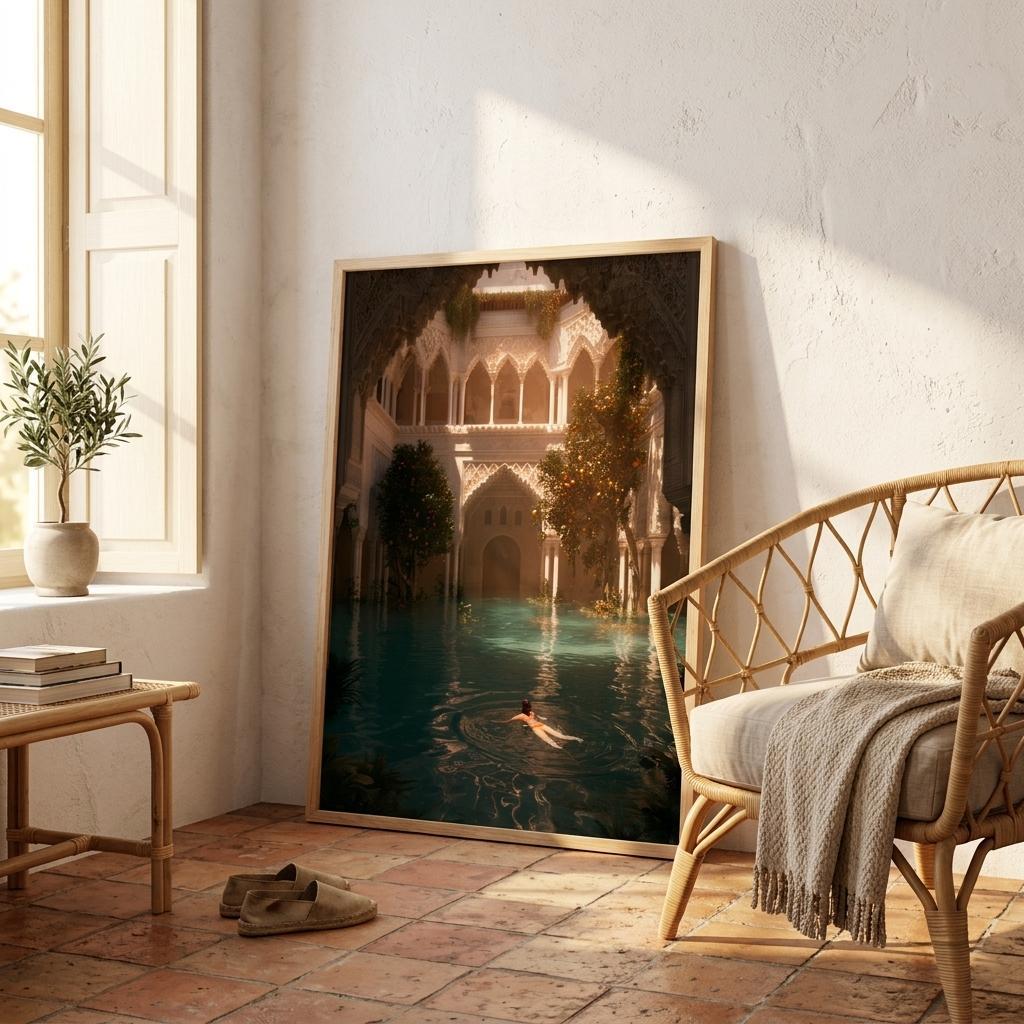
Forest green asks for warmth. Terracotta, ochre, brass and wood all work, because they sit opposite green on the colour wheel and make it richer. Sunken Courtyard — Andalusia is the print for the job: an arched Moorish courtyard in amber light, deep teal water and carved stone. Its warm highlights glow against green paint, and its dark values blend with the wall so the image feels built into the room. If you want more on this palette, see terracotta wall art and Old Money aesthetic wall art.
Frames, Mounts and Hanging Height
Frames. Black frames give the strongest contrast but can feel heavy on very dark paint. Dark walnut and oak add warmth and are the safest options. White frames look crisp on navy but can look stark on oxblood. Our comparison of black frames and wood frames goes into more detail.
Mounts. A generous cream mount acts as a halo and stops the print from sinking into the wall. If your artwork has a dark background, a mount is almost essential.
Height and spacing. Hang the centre of the artwork at about 145 cm from the floor. Above a sofa or console, leave 15 to 25 cm of wall below the frame. Use one large print instead of many small ones whenever you can.
Light. Dark rooms need a light source on the art. A picture light, a wall sconce or a table lamp placed beside the frame makes the print glow in the evening. You can find more ideas in our living room wall art guide, and every print above is available in the Mediterranean Mood collection or the kitchen collection.
Room by Room: Where Dark Walls and Art Work Best
Bedroom. A navy or deep green bedroom wall is restful, and a single large print above the bed becomes the focal point. Choose calm scenes and soft light, and avoid anything too busy to look at before sleep.
Dining room. This is where oxblood and forest green shine, because candlelight and warm bulbs make the paint glow. Food-led prints, such as figs or pomegranates, feel natural here and start conversations.
Living room. Dark paint on one wall, the one behind the sofa, gives depth without making the whole room feel small. Pair it with a large cream-toned print and keep the other walls light.
Hallway and snug. Small rooms painted dark feel like jewel boxes. A single well-lit print is enough, and the smaller space makes the colour feel intentional.
Common Mistakes to Avoid
The first mistake is hanging dark art on dark paint with no mount and no light. The second is mixing too many frame colours, which breaks the calm that dark walls create. The third is hanging prints too high: on a dark wall, the artwork should feel anchored to the furniture below it, not floating near the ceiling. Fix those three and most dark rooms look instantly more polished.
Frequently Asked Questions
What colour art looks best on a dark wall?
Pieces with a cream or pale ground and warm accents. Terracotta, ochre, fig red and soft gold stand out against navy, green and oxblood without clashing.
Should art be light or dark on a dark wall?
Both can work, but lighter art creates contrast and draws the eye. Dark artwork needs a cream mount and good lighting, otherwise it disappears into the wall.
Which frame colour suits dark walls?
Dark walnut or oak are the safest choices. Black gives strong contrast on mid-dark paint, while white frames suit navy better than oxblood or forest green.
Is it better to hang one large print or several small ones?
One large print usually looks calmer and more intentional on dark paint. If you prefer a gallery wall, keep the frames the same colour and the spacing consistent.