
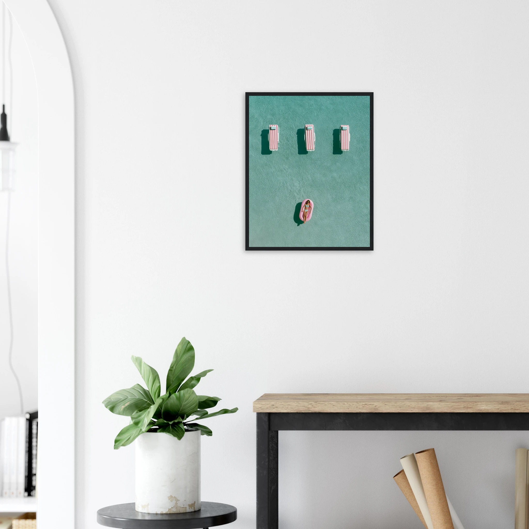
Above the TV wall art is the decorating question nobody wants to ask out loud. The television is the least beautiful object in the living room and, in most homes, the one everything is arranged around. Hanging art above it feels like drawing attention to the problem. Done well, it does the opposite: the print becomes the focal point, the screen becomes a black rectangle underneath it, and the wall finally looks intentional.
This guide covers what actually works above a TV — sizes, heights, subjects, the console-wall alternative — and the mistakes that make a screen look even more like a screen.
Why the TV Wall Is Different From Every Other Wall
On a sofa wall or a bed wall, the art is the only thing competing for attention. Above a TV, the print has to share the wall with a large, dark, glossy rectangle that is either switched off (a black hole) or switched on (moving light). The art has to hold its own in both states.
That changes the rules. Small, delicate prints disappear. Busy gallery walls fight with the screen. Very dark prints merge with it. What works is a single confident piece, or a calm pair, with enough colour and scale to read as the main event.
The second difference is viewing distance. You look at the TV wall from three to four metres away, sitting down. The art has to work at that distance — bold composition, clear subject, generous size.
What Size Art Goes Above a TV
The instinct is to match the width of the screen. Resist it — a print exactly as wide as the TV creates a stacked-boxes effect. Two rules work reliably:
Go wider than the TV, or clearly narrower — never the same. Above a 55-inch screen (about 122 cm wide), a single print of 100×140 cm hung landscape, or two 50×70 cm prints side by side, reads as a deliberate composition. A single 50×70 cm centred above a 55-inch TV looks like an afterthought.
Match the visual weight, not the dimensions. A 70×100 cm print in a black frame with a strong image has more presence than a larger, paler piece. If the TV is the darkest object on the wall, the art should be the most colourful.
For a wall-mounted TV with no console, leave 20–30 cm between the top of the screen and the bottom of the frame. Closer than that and they read as one object; further and the art floats.
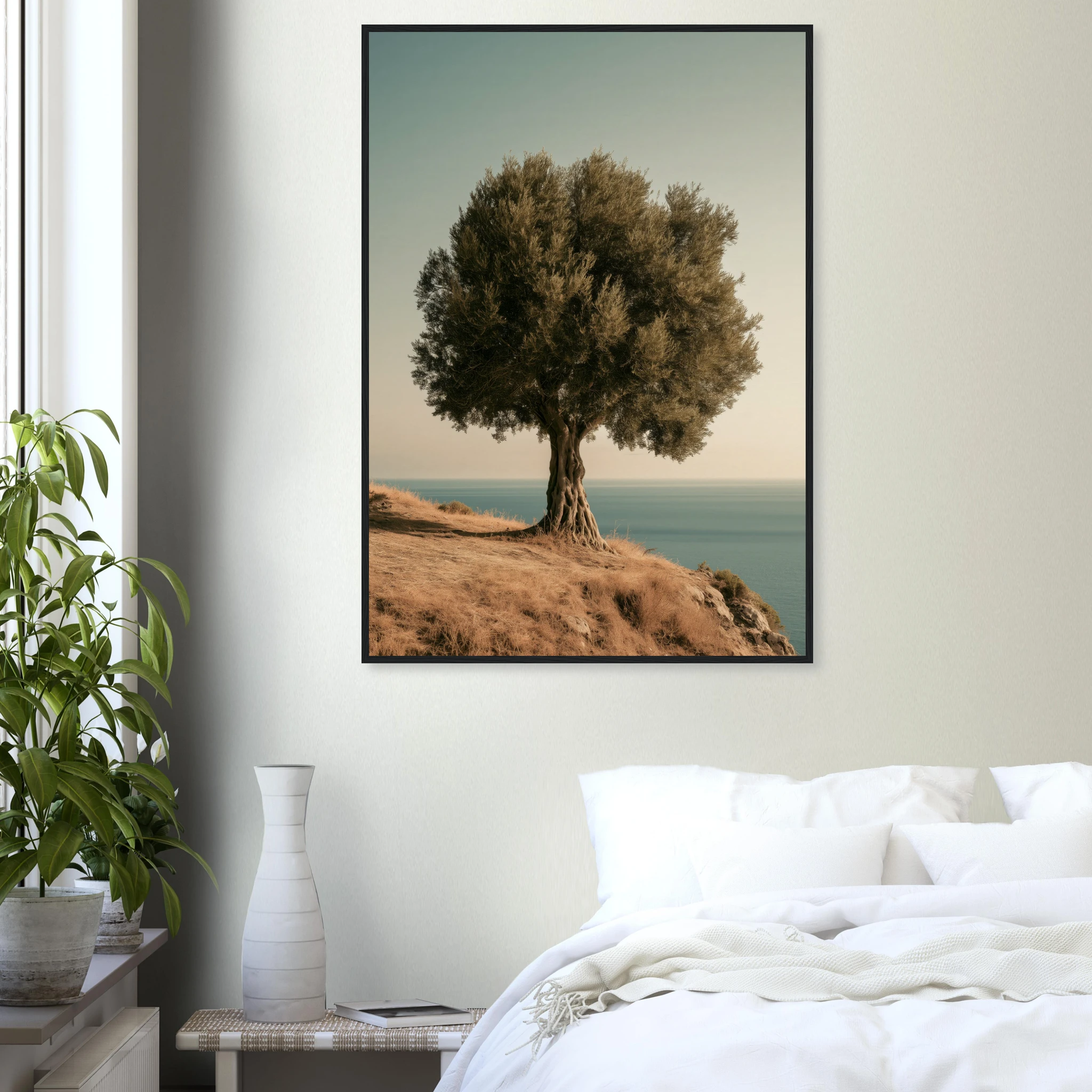
A large, quiet subject like the Ancient Olive Tree Framed Print works above a screen precisely because it does not compete: one strong silhouette, warm tones, and enough scale to anchor the wall when the TV is off.
The Best Subjects for Above the TV
Landscapes and aerial views. A horizon line above a screen gives the eye somewhere to rest. Aerial pool scenes, coastlines and courtyards all work — they carry colour without clutter.
Warm, saturated colour. A black screen pulls light out of a wall. Terracotta, ochre, bougainvillea pink and Mediterranean blue push it back in. This is the one place in the house where a muted, tonal print underperforms.
A single clear subject. One car, one tree, one building. Detail-heavy illustrations and dense gallery walls turn into visual noise next to a moving image.
Avoid: black-and-white photography directly above the screen (it disappears when the TV is off), glossy finishes (reflections double up), and anything with small text.
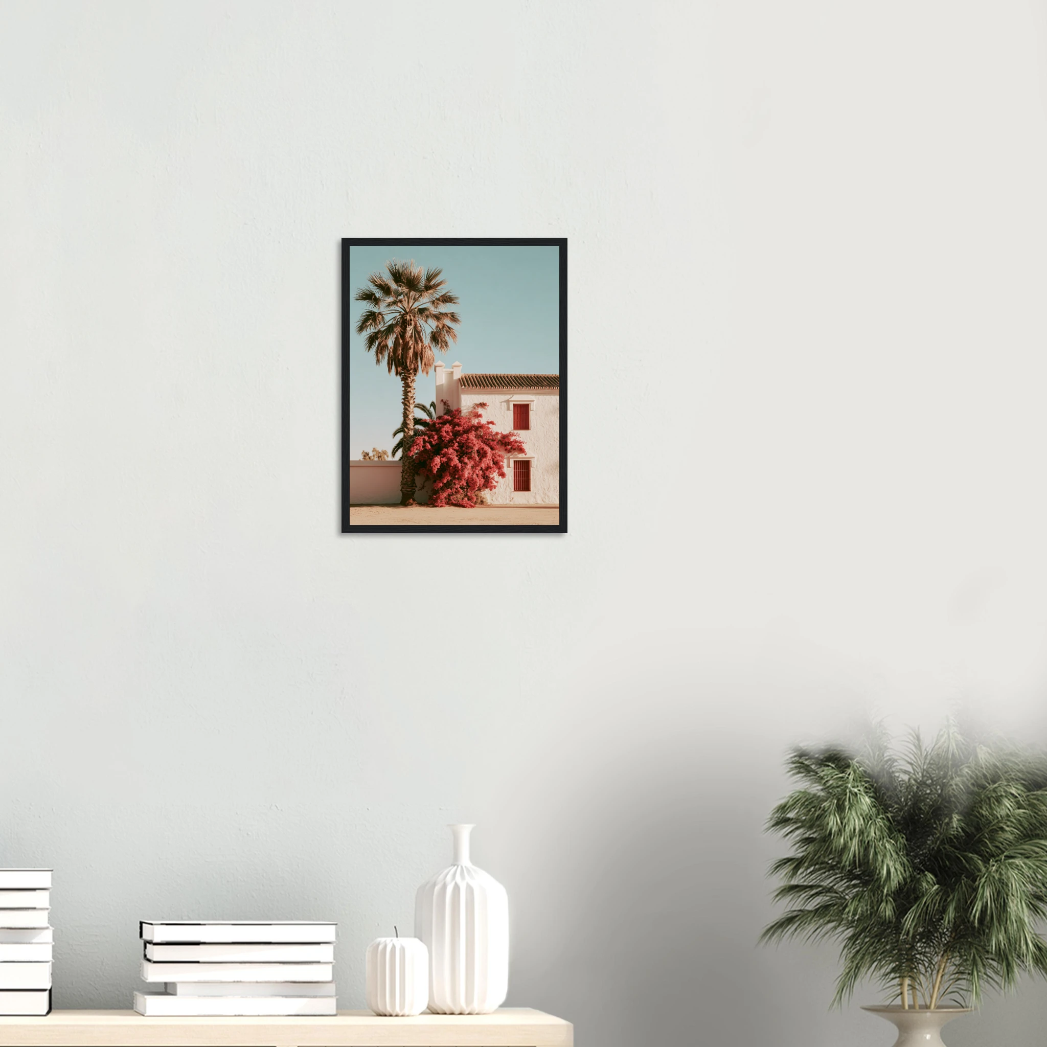
The Spanish Cortijo Bougainvillea Framed Print is a good example of colour doing the work: white wall, magenta bloom, blue sky — three tones that read from across the room and stay bright next to a dark screen.
Single Print, Pair or Triptych?
Single large print is the safest and usually the best. It gives the wall one focal point above the screen and keeps the composition simple. Go 70×100 cm minimum for a 50-inch TV or larger.
A pair works when the TV sits on a wide console and the wall is much wider than the screen. Two matching frames, same size, hung with the centre gap aligned to the centre of the TV. Choose two prints from the same series so they read as one piece.
A triptych or row of three suits very wide walls in open-plan rooms. Keep the frames identical and the gaps consistent — 8–10 cm. This is the only version where smaller frames (40×50 cm) can work, because the row itself supplies the scale.
What rarely works: a full gallery wall around the TV. It was a trend, and it reliably makes the screen look like one more frame in a cluttered arrangement.
The Console-Wall Alternative
If the TV sits on a low sideboard rather than on the wall, you have a better option: hang the art to one side, above the console, and let the TV sit off-centre. This is how most interior designers handle it. The art becomes the focal point, the screen becomes furniture, and the wall stops looking like an electronics display.
In this layout the print can be portrait, which opens up the whole catalogue: a vertical car print, a tall pool scene, a botanical study. Hang it so its centre is at roughly 150 cm from the floor and its bottom edge sits 15–20 cm above the console.
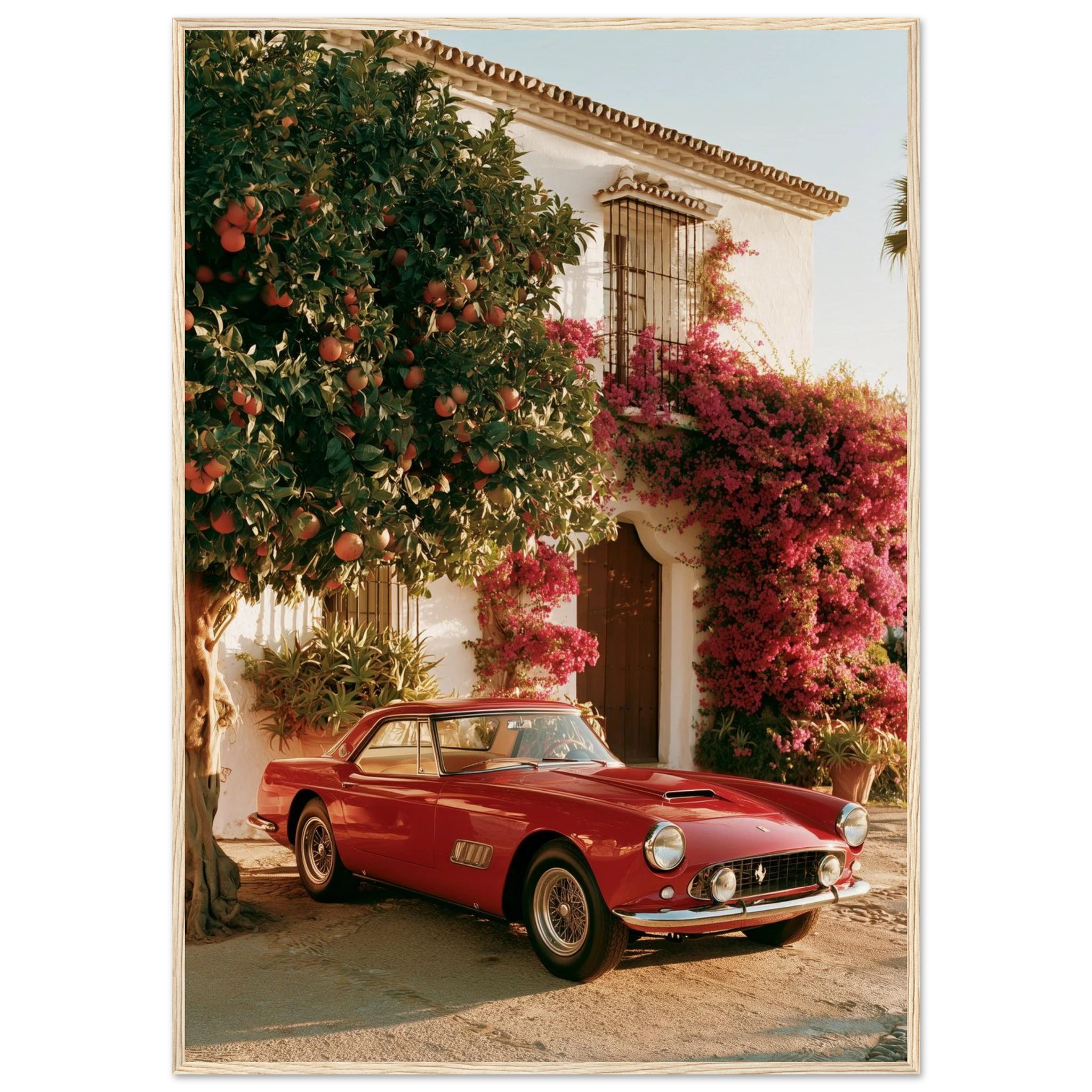
Something with presence and warmth, like the Vintage Red Ferrari Marbella Framed Print, is made for the console wall — the red carries across the room, and hung to the side of the screen it becomes the thing people look at first.
Frames, Finishes and Practical Details
Matte paper, always. A TV wall has light coming from the screen and usually from a window opposite. Glossy prints and glass-fronted frames reflect both. Our framed prints use matte 200 gsm paper behind a non-glare finish, which is the right choice here.
Frame colour: black frames tie the art to the black screen and make the pair look designed; natural wood softens the tech feel and suits warmer rooms. White frames tend to look thin above a TV.
Cable management matters more than you think. A visible cable between the screen and the frame ruins the composition. Route cables inside the wall or behind a cable cover painted to match.
Heat: modern screens run cool, but leave the 20–30 cm gap anyway — it looks better and keeps the frame away from any warmth.
Browse the Mediterranean Mood collection for aerial pools, coastlines and courtyards that carry colour and scale above a screen.
Read Also
→ What to Put Above a Sofa
→ Living Room Wall Art: The Statement Piece That Anchors a Room
→ Above the Fireplace Wall Art
FAQ — Above the TV Wall Art
Is it OK to hang art above a TV?
Yes — it is one of the most effective ways to stop the screen dominating the room. The key is scale and colour: a single large, colourful print hung 20–30 cm above the screen makes the art the focal point and the TV secondary.
How big should a picture be above a TV?
Either clearly wider than the screen or clearly narrower — never the same width. Above a 55-inch TV, a 100×140 cm landscape print or two 50×70 cm prints side by side work well. Avoid a single small print centred above the screen.
How high should art be above a TV?
Leave 20–30 cm between the top of the screen and the bottom of the frame. If the TV is wall-mounted at the standard 100–110 cm centre height, the art will sit naturally in the upper third of the wall.
What kind of art looks best above a TV?
Landscapes, aerial views and single-subject prints in warm, saturated colours. Avoid black-and-white photography, glossy finishes and busy gallery walls, which either disappear next to a dark screen or compete with it.
Read next: Marbella Wall Art: A State of Mind, Not a Postcard.