
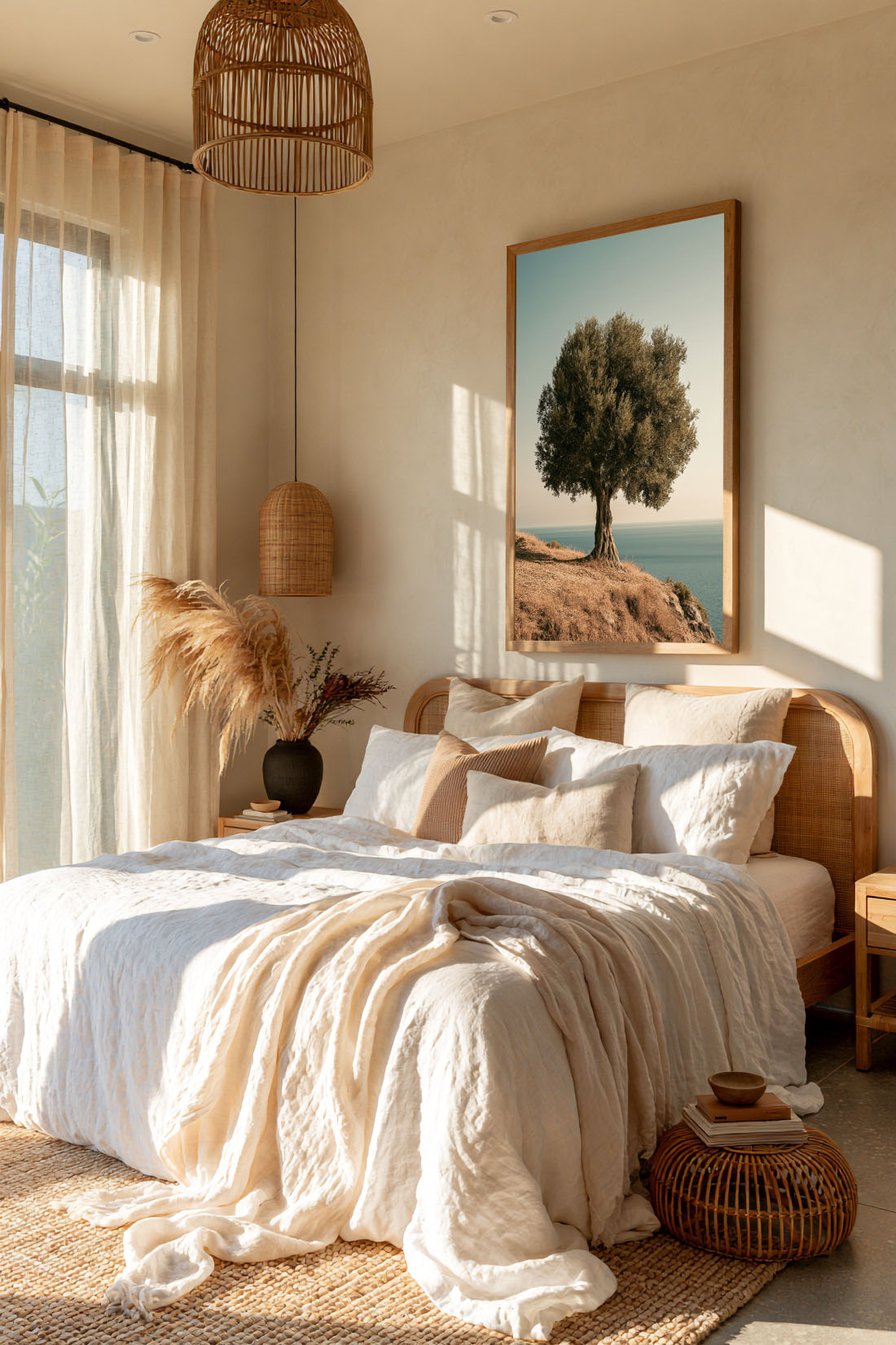
The most common mistake in interior design isn’t choosing the wrong thing — it’s choosing too many things. Minimalist wall art operates on the opposite principle: one piece, chosen well, does more for a room than a dozen pieces chosen carelessly. The challenge is knowing what “chosen well” actually means.
What Minimalist Wall Art Actually Means
Minimalist wall art isn’t just art that looks simple. It’s art that earns its place on the wall — that creates silence rather than noise, that makes the room feel more itself rather than busier. A single large abstract print on an otherwise bare wall is minimalist. A small decorative print surrounded by clutter is not, regardless of how clean the image itself looks.
Minimalism in art is about intention: every element present is there for a reason, and nothing is there without one. That applies to subject, to scale, to placement, and to the relationship between the artwork and the space around it.
The Best Subjects for Minimalist Wall Art
Abstract prints
Abstract art is the natural companion of minimalist interiors. Without a literal subject to compete with the room’s other elements, a well-chosen abstract print integrates rather than intrudes. Look for works with a limited palette — two or three tones at most — and a composition that has a clear visual centre. Abstract prints with too much going on defeat the purpose.
Black and white photography
Black and white prints are the most versatile minimalist wall art you can buy. They work in virtually any room, against any wall colour, beside almost any furniture. The absence of colour removes the risk of clashing; the presence of contrast ensures the image holds its own. A single large black and white photograph on a white wall is one of the most reliably successful things you can do in an interior.
Botanical line art
Fine line botanical illustrations — a single stem, a leaf study, a minimal floral — bring organic warmth to minimalist spaces without crowding them. They’re quieter than photographic prints but no less considered. In a bedroom or bathroom, a framed botanical line print can be the only thing on the wall and it will be enough.
Landscape with negative space
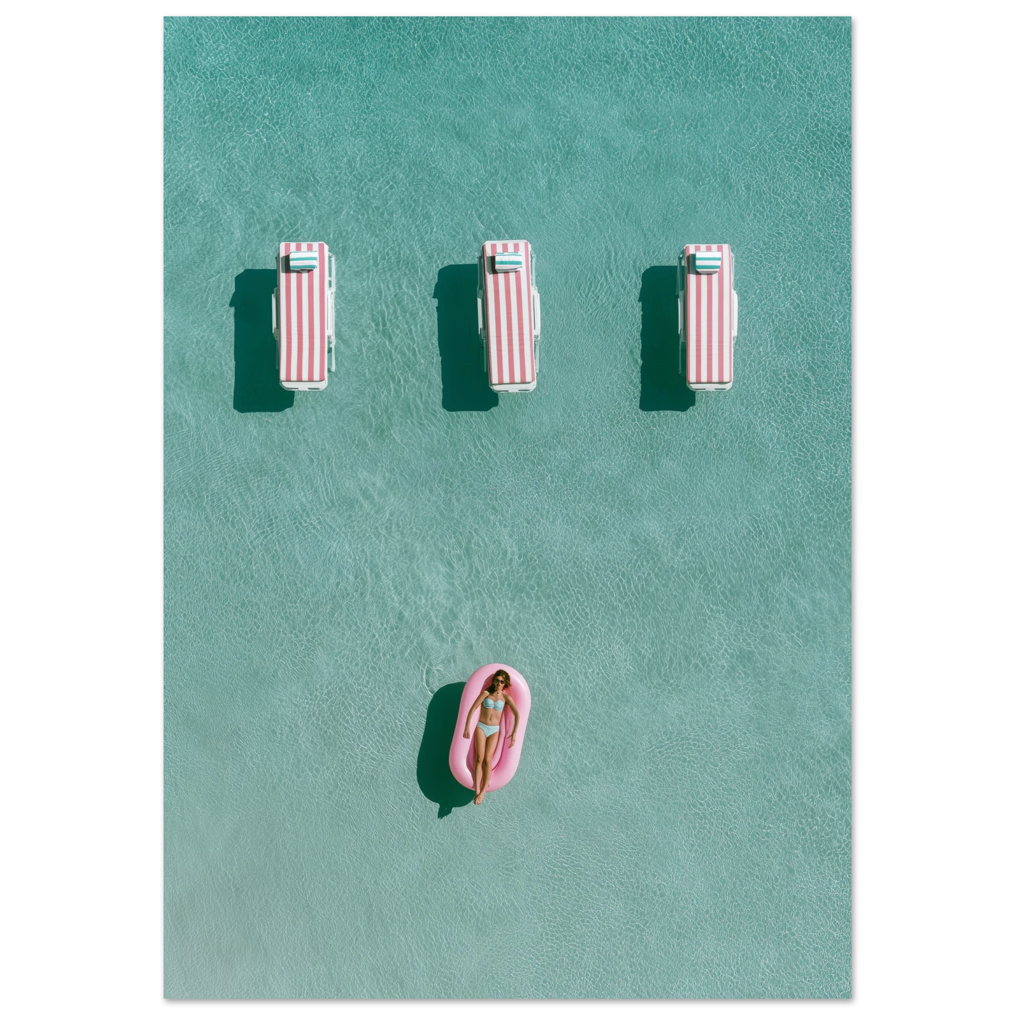
A landscape where sky or water dominates — where the subject occupies a small portion of the frame and the rest is light and space — works perfectly as minimalist wall art. The negative space in the image extends the room visually and creates calm rather than stimulation. Coastal subjects, in particular, carry this quality naturally.
How to Choose Minimalist Wall Art That Works
Go bigger than you think
The most common sizing mistake in minimalist interiors is going too small. A small print on a large wall doesn’t look minimal — it looks lost. In a minimal space, one large piece has more presence and more confidence than several small ones. If you’re unsure between sizes, size up. A print that fills its wall anchors the room; one that doesn’t looks like it’s waiting for company.
Prints that work here: the Ancient Olive Tree Framed Print, the White Cactus Bloom Framed Print and the Solitude Framed Print — each available as a framed print, ready to hang. Browse the Botanical collection for more.
Keep the palette tight
Minimalist wall art should either echo the room’s existing tones or introduce a single deliberate contrast. A warm cream room with a single deep charcoal print. A cool white space with one warm terracotta abstract. The print doesn’t need to match — but it does need to have a clear relationship with its surroundings. Multiple competing colours, even in a single artwork, undermine the effect.
Frame with intention
In a minimalist interior, the frame is part of the artwork. A thin black metal frame on a white wall disappears and lets the image speak. A wide natural oak frame adds warmth and weight. An unframed canvas print makes the image feel built-in rather than hung. Choose the frame the same way you chose the print — with intention, not as an afterthought.
Where to Place Minimalist Wall Art
Placement matters more in minimalist interiors than anywhere else because there’s less to distract from it. A few principles that hold consistently:
- Centre at eye level — the visual midpoint of the artwork should sit at roughly 145–155cm from the floor. Higher looks like it’s escaping the room; lower looks like it was placed by accident.
- Give it breathing room — in a minimalist space, the wall around the artwork is part of the composition. Don’t crowd it with furniture or other objects. The space around the print is what makes it feel considered.
- One wall, one statement — in a minimal room, resist the urge to fill every wall. One well-chosen piece per visual plane is almost always the right call.
Shop Minimalist Wall Art
The Atelier Marbella collection is built around restraint — prints that earn their place on the wall rather than filling it. Browse abstract works, botanical prints, and Mediterranean subjects for pieces that work in minimal spaces. Every print is available as matte, canvas, or framed — choose the format that fits the wall.