
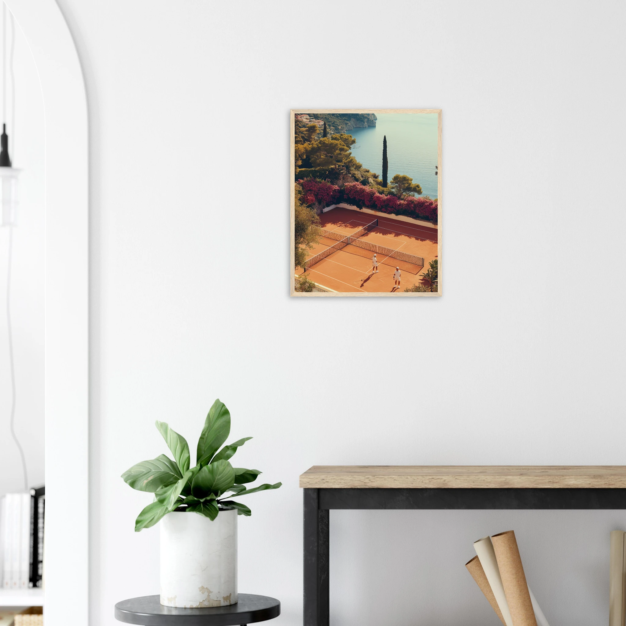
Terracotta wall art is the print category that finally makes an autumn palette feel intentional rather than seasonal. Clay reds, sun-baked oranges and warm rust tones have moved from Mediterranean courtyards straight into interior design’s colour reports for 2026, and a good terracotta print does more for a room than a fresh coat of paint ever could — it brings in warmth, texture and a sense of somewhere real without committing a whole wall to colour.
Why Terracotta Is Having a Moment in 2026
Every autumn-winter trend report for 2026 lands on the same family of tones: powdery terracotta, chocolate and hazelnut browns, oxblood, plum, deep teal, forest green, and mineral blues, all set against warm metals and dark wood. It reads less like a colour trend and more like a correction — after several seasons of cool greys and clinical whites, interiors are being asked to feel lived-in again. Terracotta sits at the centre of that shift because it is warm without being loud, earthy without being rustic, and it photographs beautifully against both white walls and the darker, richer tones the same trend reports are pushing for winter.
For a wall art collection built around the Mediterranean, terracotta was never really a trend to chase. Clay tennis courts, sun-baked Andalusian courtyards, desert roads at golden hour — the colour has been in the catalogue since the beginning. What changed in 2026 is that the rest of the design world finally caught up.
What Terracotta Wall Art Actually Looks Like
Terracotta wall art is not a single shade of orange stretched across a canvas. The strongest pieces use terracotta as a temperature rather than a colour: the warm clay of a tennis court, the rust of a vintage car left in the desert sun, the ochre plaster of a courtyard wall in Andalusia. That range matters, because it means terracotta prints can slot into almost any room without matching furniture or repainting a wall — the warmth does the work, not a single exact hue.
Pairing Terracotta With the Rest of Your Palette
Terracotta is one of the easiest warm tones to build a room around because it sits between red and brown, which means it pairs cleanly with almost everything in the 2026 palette. Against forest green or deep teal, it reads Mediterranean and slightly botanical. Against oxblood or plum, it leans richer and more autumnal. Against travertine, cream and warm white — the easiest and most forgiving pairing — it simply looks like sunlight on stone. The one combination worth avoiding is terracotta next to a cool grey: the two fight rather than complement, and the print will read orange instead of warm.
If the walls themselves are already a warm neutral, a terracotta print needs almost no other styling to work. If the room leans cooler, pair the print with one or two warm textiles — a linen cushion, a wood frame, a rattan chair — so the wall art isn’t the only warm note in the space.
Riviera Clay Court: The Case for Warm Sport Prints
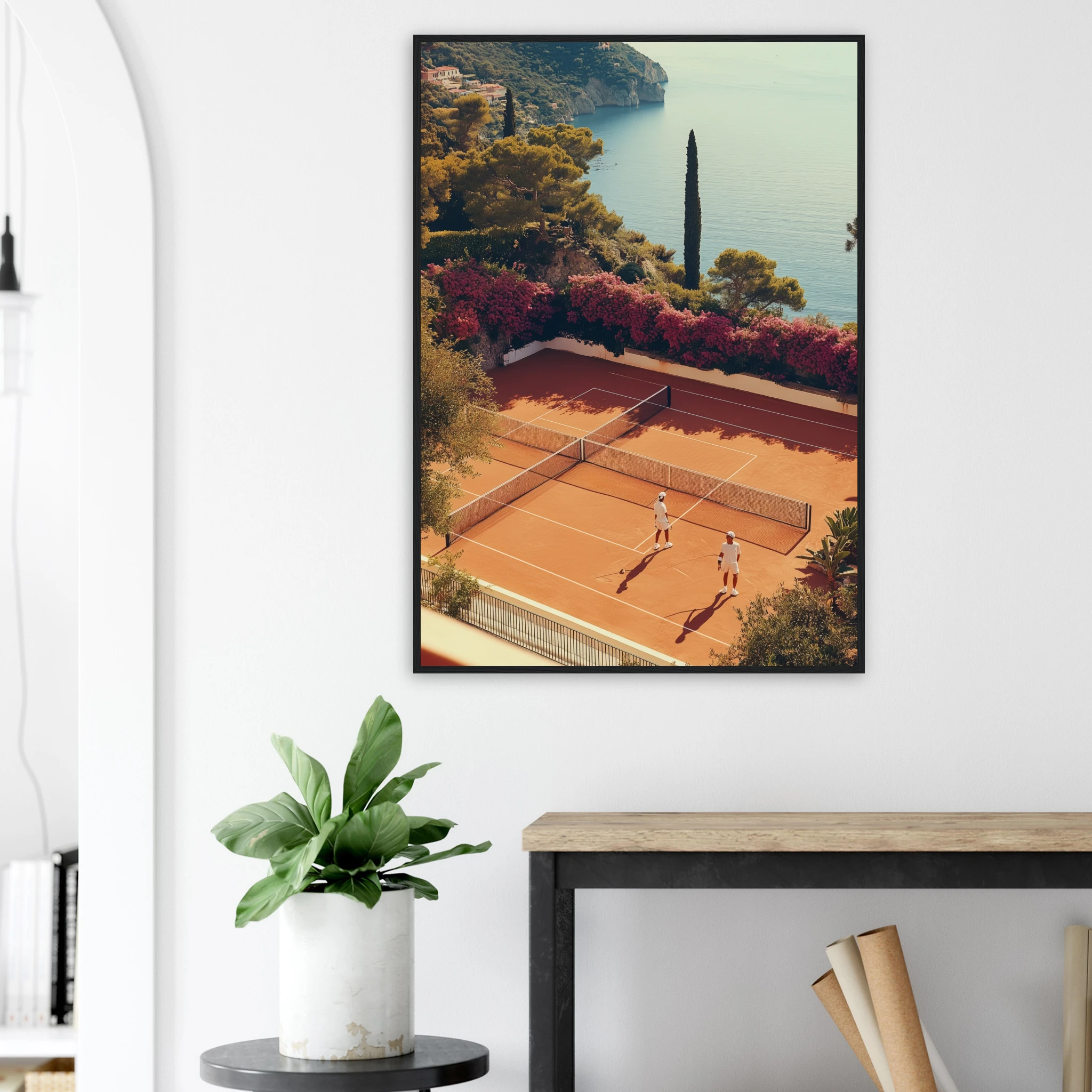
Riviera Clay Court — Mediterranean Tennis is the clearest example of terracotta wall art done properly: a clay court, sun and shadow, and none of the sporting cliché that usually comes with tennis prints. It works precisely because the terracotta isn’t decorative — it’s the actual colour of a real surface, which is what keeps the print from feeling like a trend piece that will date in a year. Hung in a hallway, home office or reading corner, it brings warmth into a room that rarely gets direct sunlight.
Andalusian Courtyards and Desert Roads: The Catalogue’s Warmest Corners
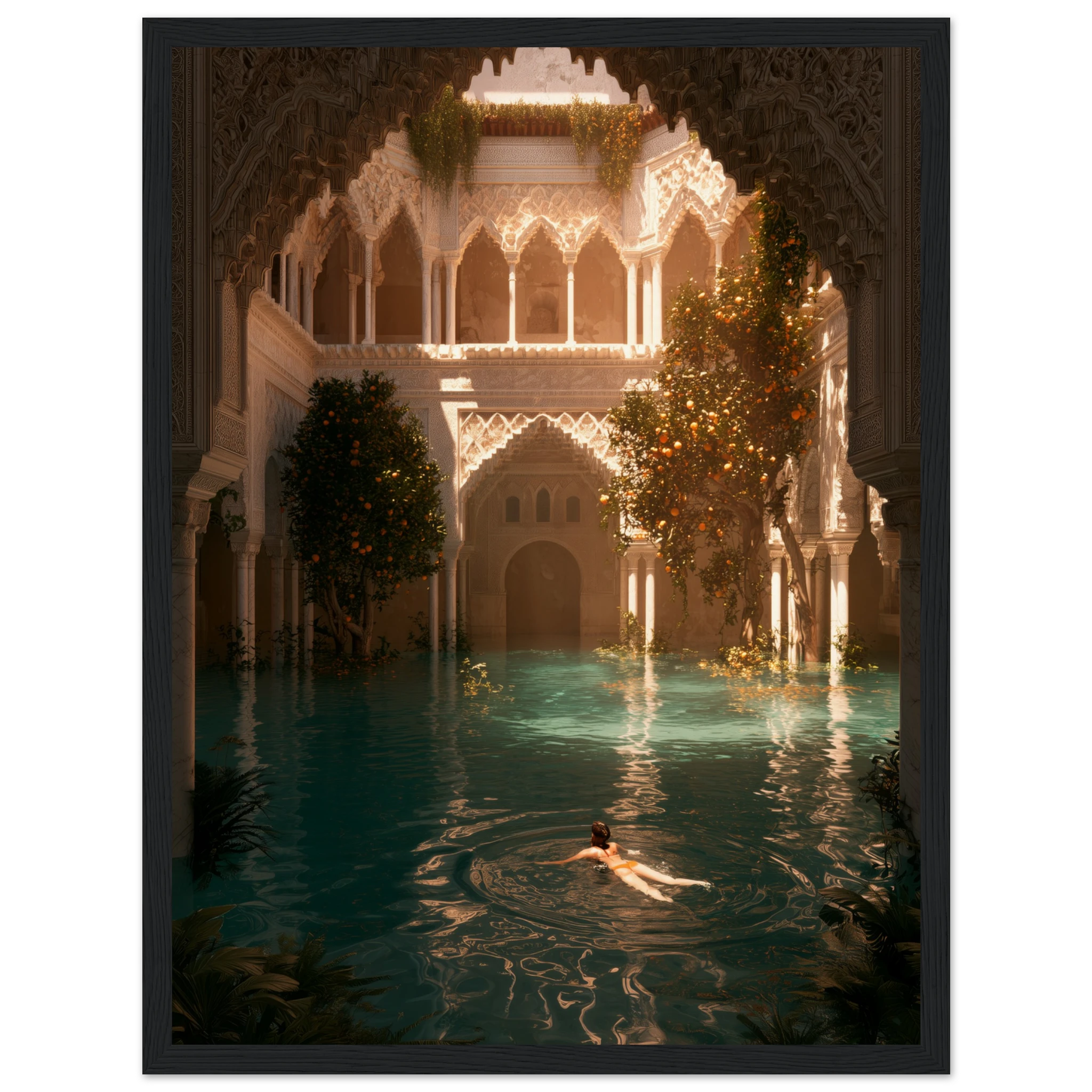
Sunken Courtyard — Andalusia leans into ochre plaster and terracotta tile, the kind of interior courtyard that stays warm long after the sun has moved. It’s a natural fit for a dining room or entryway wall, where the print can do the work of a feature colour without the commitment of paint. For a slightly bolder, more automotive take on the same palette, Desert Thunderbird puts a vintage car against rust-red desert road — proof that terracotta wall art doesn’t have to stay in the Mediterranean villa lane to work.
Framed, Canvas or Matte for a Terracotta Palette
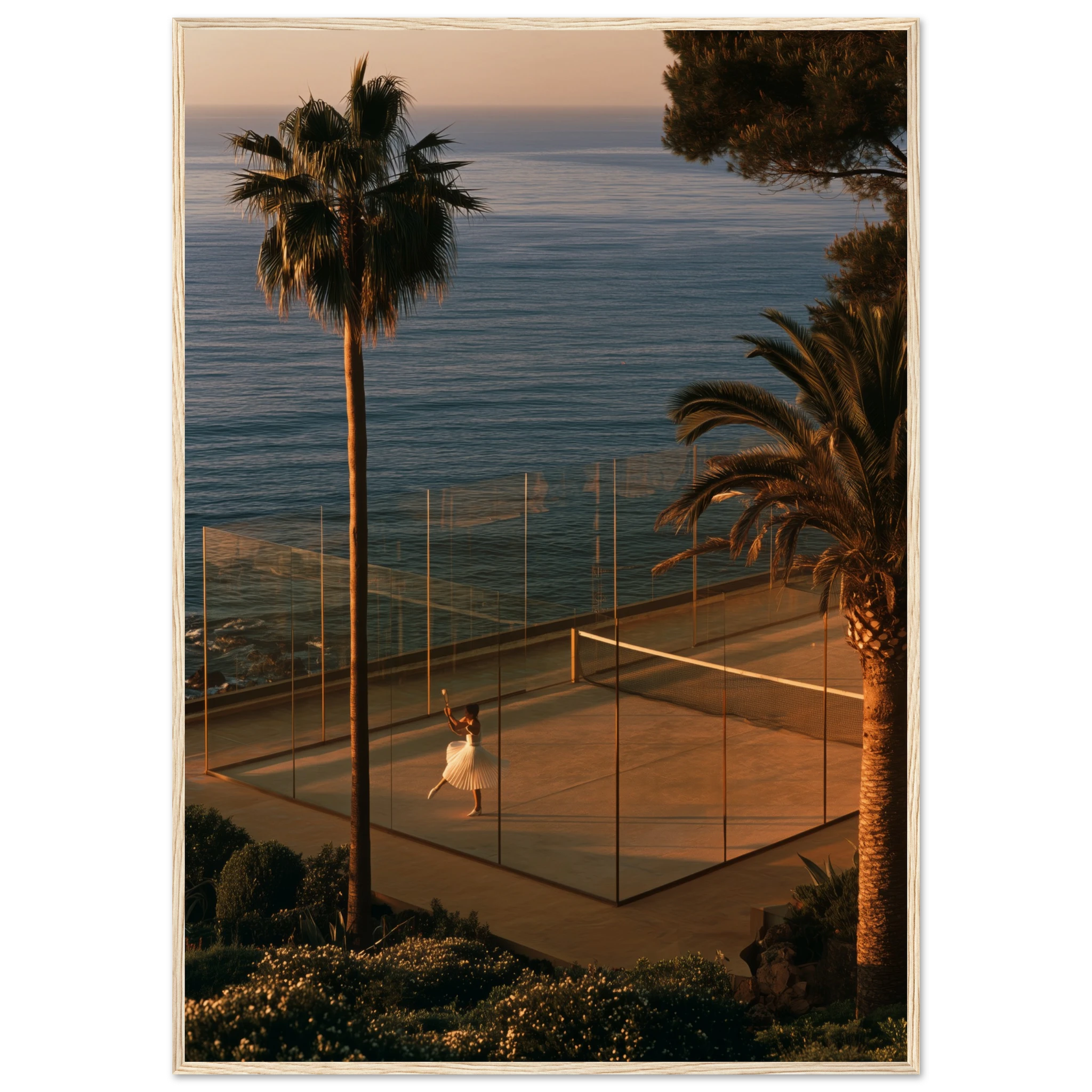
Warm tones generally read best framed rather than in a raw matte print — a dark wood or black frame gives terracotta a clean edge instead of letting it bleed into the wall around it, which matters more with warm colours than with black-and-white or cooler palettes. Canvas works well for a larger, more textural piece where the terracotta is one of several tones rather than the dominant colour, as in Sunset Padel — Riviera Court, where the clay court is balanced by a deep evening sky. For a full terracotta-led room, browse the rest of the Mediterranean Mood collection, where most of the warmest, clay-toned pieces in the catalogue live.
Frequently Asked Questions
Does terracotta wall art work with grey or cool-toned interiors?
It can, but it needs help. Terracotta next to a cool grey wall tends to read as orange rather than warm, so add a wood frame and one or two warm textiles nearby to bridge the two tones rather than hanging the print on its own.
Is terracotta too trend-driven to invest in for a living room?
Terracotta has been part of Mediterranean interiors for centuries, which is a different proposition from a seasonal accent colour. Choosing a print where the tone comes from a real place — a court, a courtyard, a stretch of road — keeps it from reading as a 2026 trend piece a few years from now.
What room works best for a terracotta print?
Entryways, dining rooms and home offices benefit the most, since these are often the rooms with the least natural warmth and the most wall space for a single statement piece. A large terracotta print above a console or dining table does more for the room’s temperature than a lamp ever could.
Framed or canvas for a warm, terracotta-toned print?
Framed is the safer choice for a single terracotta-dominant print, since the frame keeps the warm tone contained. Canvas suits pieces where terracotta is one note among several, giving the print a softer, more textural finish.